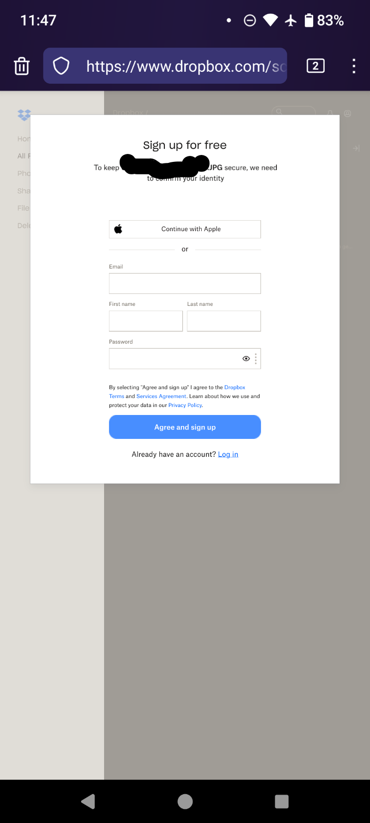
On mobile, it prompts you to either "get the app" or "open app" with no way to click past. Screenshot won't upload.
This is worse from several months ago https://lemmy.today/post/8935690
This is a community for designs specifically crafted to make the experience worse for the user. This can be due to greed, apathy, laziness or just downright scumbaggery.
On mobile, it prompts you to either "get the app" or "open app" with no way to click past. Screenshot won't upload.
This is worse from several months ago https://lemmy.today/post/8935690
Paid. There may have been something that affected it but we don't know what. Can you do your own tests and report back?
Both on mobile and desktop there's a "login wall" but it can be dismissed by pressing on the X.
Still, it's a dark pattern that I don't like, tomorrow at work we will discuss alternatives as we subscribed (one single account shared between everyone) just for sending attachments with filelink using thunderbird - and with a "login wall" it no longer fits the purpose
What fucking X? Where is it?
On the top right. Maybe it's some a/b testing to see which one "converts" (=annoys) more. I don't have the "just take me to the download" link like in the other image, just the X to close the login popup
Unacceptable IMHO, I just want to give my clients an easy link to download the huge files I'm sending them without ads or tricks. With this wall many users will get confused and create a new account
Yeah it's gotta be A-B testing. Switching to
dl=1just returned a passive-aggressive "Hmm that doesn't look right" page. I didn't check the error code because mobile.