Wuuttup. I'm here complaining again about Framework's Linux unfriendly display. The new one this time.
https://frame.work/products/display-kit?v=FRANJF0001
Old display, 2256 x 1504 (3:2)
GNOME
100% scale
- Nothing looks blurry
- Everything is tiny
- Unusable
100% scale + large text accessibility
- Nothing looks blurry
- Most apps scale appropriately
- Some apps don’t respect GNOME’s large text setting (Alacritty)
125% scale
- Most apps look blurry (Picard, Firefox, Spotify, Alacritty)
200% scale
- Everything is way too big
- Unusable
Plasma
100% scale
- Nothing looks blurry
- Everything is tiny
- Unusable
125% scale + Apply scaling themselves
- Nothing looks blurry
- Most apps scale appropriate
- Some apps can’t scale themselves and look tiny (Picard)
125% scale + Scaled by system
- Most apps look blurry (Picard, Firefox, Spotify, Alacritty)
200% scale
- Everything is way too big
- Unusable
New display, 2880 x 1920 (3:2)
GNOME
100% scale
- Nothing looks blurry
- Everything is tiny
- Unusable
100% scale + large text accessibility
- Nothing looks blurry
- Most apps scale appropriately
- Some apps don’t respect GNOME’s large text setting (Alacritty)
- Everything is tiny
150% scale
- Most apps look blurry (Picard, Firefox, Spotify, Alacritty)
200% scale
- Everything is way too big
- Unusable
Plasma
100% scale
- Nothing looks blurry
- Everything is tiny
- Unusable
150% scale + Apply scaling themselves
- Nothing looks blurry
- Some apps can’t scale themselves, but look a little better here? (Picard)
150% scale + Scaled by system
- Most apps look blurry (Picard, Firefox, Spotify, Alacritty)
200% scale
- Everything is way too big
- Unusable
tl;dr
In the old display, GNOME at 100% + large text was the best compromise. In the new display, Plasma at 150% + Apply scaling themselves is the best compromise.
Interestingly, Picard scaling itself looks super tiny in the old display, but in the new display it looks... better. It's still not correctly scaled like native Wayland apps, but it's better.
Warning
If you can't stomach moving from GNOME to Plasma, then 🚨 DO NOT BUY THE NEW DISPLAY 🚨. The new display is worse for GNOME.
Once again
I am once again begging Framework to just give us a damn regular DPI display that works! Without workarounds. Without forcing users on specific DEs. Without forcing users to stop using their favorite apps. This new display has basically all of the flaws as the previous one.

I have basically zero issues with fractional scaling with Gnome on Wayland, I thing you probably have something configured wrong.
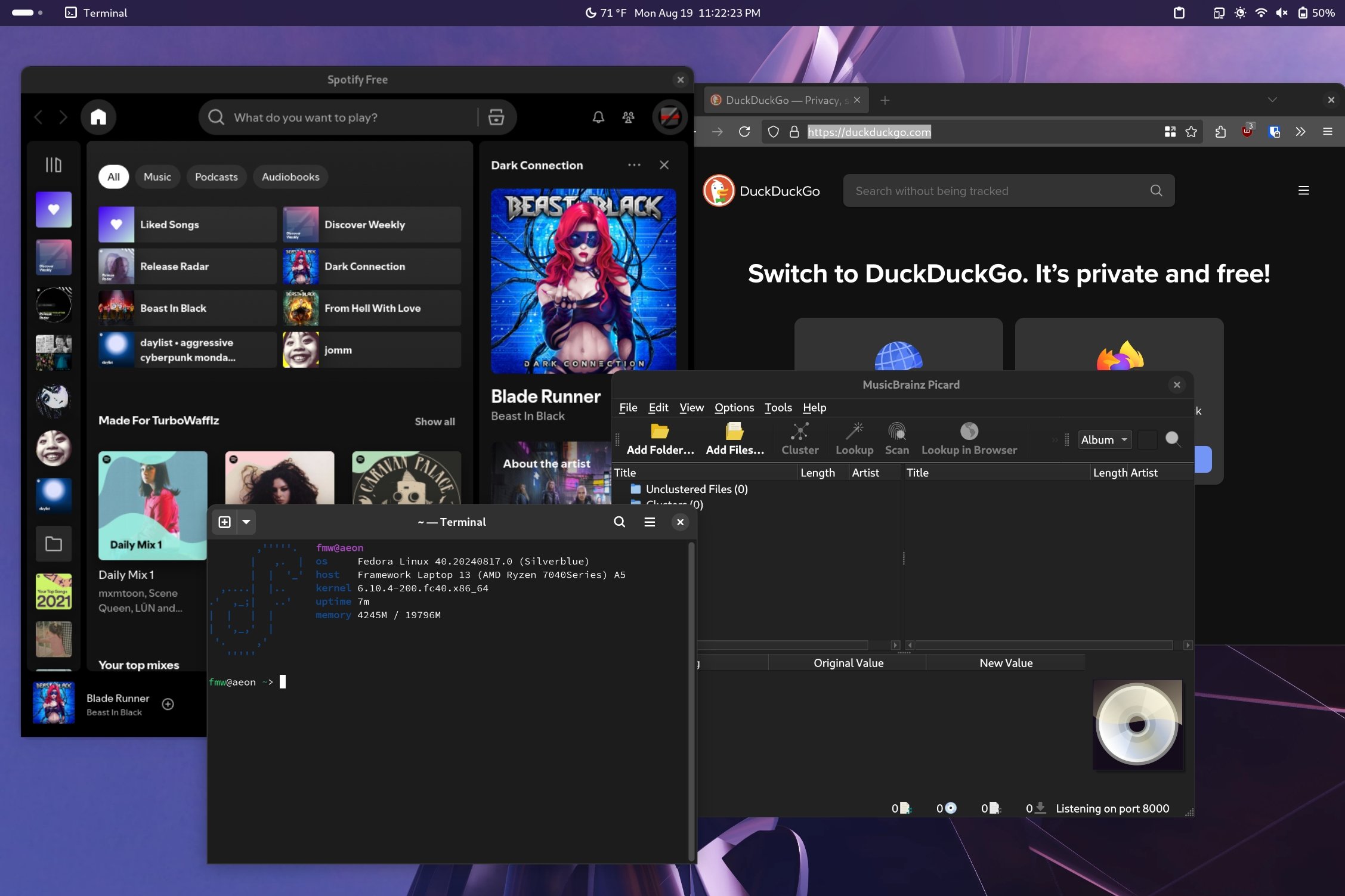
Here's a screenshot of how a few programs look for me with 125% scaling on my original framework display. The only thing slightly blurry is spotify but it's not enough to be noticeable in normal use.
Edit: Looks like lemmy actually compressed my screenshot a fair bit but I think you can still tell that things are scaling properly
You can launch spotify under native wayland instead of xwayland, it gives scaling without blur
https://wiki.archlinux.org/title/Spotify#Running_under_Wayland
this way works for all electron programs like discord, motrix
Ayy, beast in black! Saw those guys live (and barely knew them, lol). They make good music (their "beast in black" song seems to be my favourite).
😮i already was happy finding a new dubstep artist seeing that cover only zo find out that it was metal🤣
Hahahaha yeah, its power metal
Are you into UK old school dubstep or the stuff skrillex made 10 years ago?
cloZee, LSDream, Dirt Monkey, subtronic, Zingara, liquid stranger, svdden death, mellow head, Griz, Jantsen, SoDown, LUZCID, champagne drip, Ganja White Night, Zomboy, Blunts and Blondes, Austeria
And some more are what I am listening most right now. I think most of it is 2020 and newer, so not exactly oldScool, but, even tho I like Skrilex as well, would not place them into the same category 🤔 dubstep is very diverse..
But is funny, get this question a lot, and always be like 🤷🏻♀️non of both, really