this post was submitted on 19 Sep 2024
134 points (99.3% liked)
Climate - truthful information about climate, related activism and politics.
5243 readers
363 users here now
Discussion of climate, how it is changing, activism around that, the politics, and the energy systems change we need in order to stabilize things.
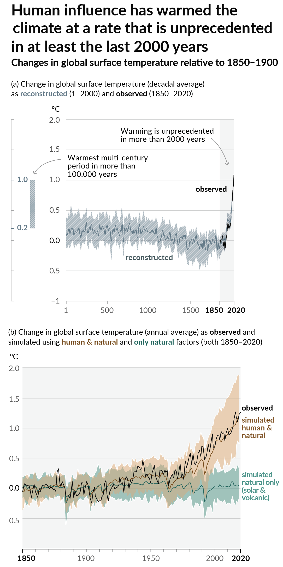
As a starting point, the burning of fossil fuels, and to a lesser extent deforestation and release of methane are responsible for the warming in recent decades:

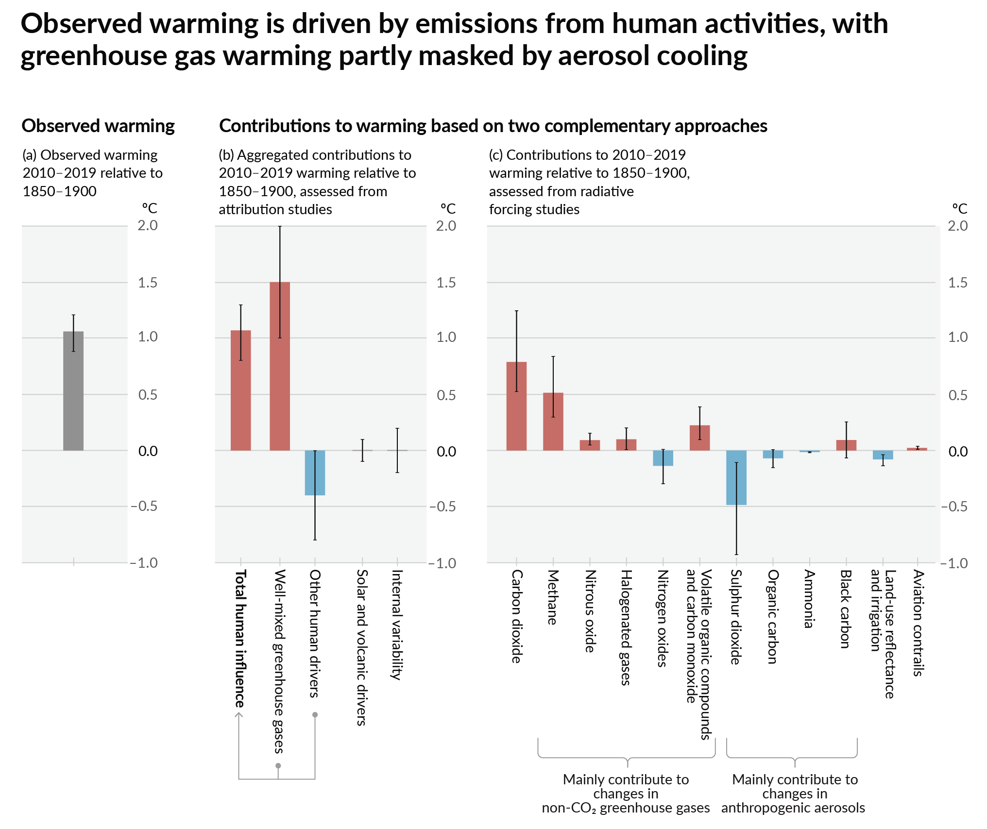
How much each change to the atmosphere has warmed the world:

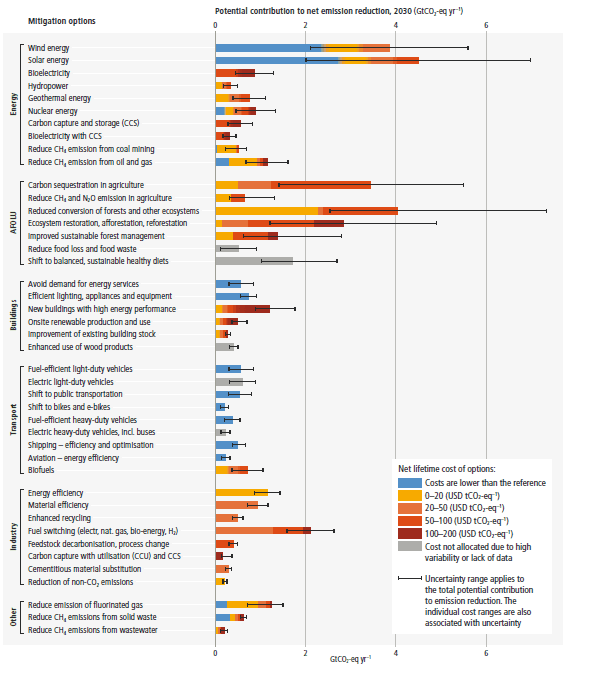
Recommended actions to cut greenhouse gas emissions in the near future:

Anti-science, inactivism, and unsupported conspiracy theories are not ok here.
founded 1 year ago
MODERATORS
you are viewing a single comment's thread
view the rest of the comments
view the rest of the comments

I disagree because it portrays whether they are meeting their goals and a lot more information.
Compare the two columns and if they are the same color, they are meeting their goals.
Compare two countries to see which sets stricter goals compared to each other, or is achieving better results compared to each other.
You're right. However, I feel like the left and right columns could've been linked with a gradient to more clearly show their relationship.
I always struggle with colors because I'm colorblind, and grokking this chart at a glance is hard.
Even if we ignore the fact it is talking about emission goals, but the metrics are in celcius. A good graphic would include an indication that they're meeting their goals. Either having two groupings or an additional column to provide a quick way to see that information.