this post was submitted on 26 Sep 2024
518 points (94.5% liked)
Games
32558 readers
1615 users here now

Welcome to the largest gaming community on Lemmy! Discussion for all kinds of games. Video games, tabletop games, card games etc.
Weekly Threads:
Rules:
-
Submissions have to be related to games
-
No bigotry or harassment, be civil
-
No excessive self-promotion
-
Stay on-topic; no memes, funny videos, giveaways, reposts, or low-effort posts
-
Mark Spoilers and NSFW
-
No linking to piracy
More information about the community rules can be found here.
founded 1 year ago
MODERATORS
you are viewing a single comment's thread
view the rest of the comments
view the rest of the comments

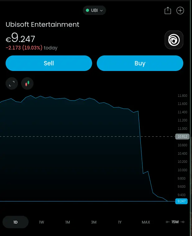
That's pretty normal for financial charts like this though.
And it's dumb. It says all you need to know about the ethical integrity of most economists. Lying for profit.
Jesus fuck no, it's a valid graph. It shows the relative trend over time and the sudden change. It may show less of a change if it was zero based, but a drastic change that is well off the normal trend is important to visualize. Also like, all exchanges have a toggle to flip to the zero based.
I'd argue it doesn't accurately show the relative value at a cursory glance. The chart shows the area under the curve having decreased over 90%, but when looking at the y-axis, you can see that initial assessment was misled.
In a speculative industry like finance, shouldn't we try our best to make charts less... alarmist?