this post was submitted on 21 Aug 2023
33 points (76.2% liked)
Sync for Lemmy
15146 readers
2 users here now
👀
Welcome to Sync for Lemmy!

Welcome to the official Sync for Lemmy community.
The rules for posting and commenting, besides the rules defined here for lemmy.world, are as follows:
Community Rules
1- No advertising or spam.
All types of advertising and spam are restricted in this community.
Community Credits
Artwork and community banner by: @MargotRobbie@lemmy.world
founded 1 year ago
MODERATORS
you are viewing a single comment's thread
view the rest of the comments
view the rest of the comments

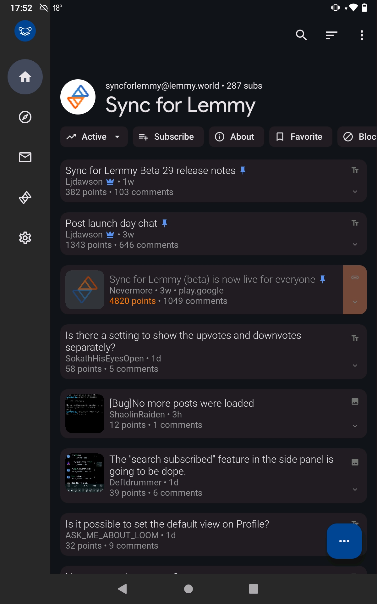
A bit of space is nice sometimes, especially around titles
That's a lot more than "a bit," and spacing above titles only really makes sense when there's content above it. This just suffocates the space available for the scrollable content.
All part of material design
One of my favorite things about the app is how it always conforms so perfectly to whatever Google's design guidelines are at the time. Makes it feel coherent, like it really belongs on the phone.