this post was submitted on 29 Dec 2024
916 points (96.9% liked)
Firefox
20024 readers
63 users here now
A place to discuss the news and latest developments on the open-source browser Firefox
founded 5 years ago
MODERATORS
you are viewing a single comment's thread
view the rest of the comments
view the rest of the comments

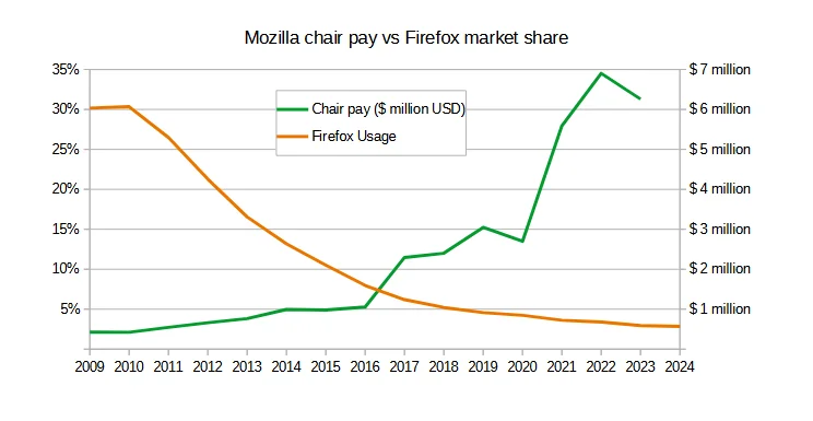
This graph shows a disingenuous relationship between revenue and the market share of a free and open source project within the walls of a not-for-profit organization. Firefox is not a revenue stream in the traditional sense. In fact, most of Mozilla 's money comes from grants and donations for projects and research they do.
I get that CEO=EVIL is a viral topic these days but if all you know about Mozilla is that they make the Not Chrome browser, then you should really educate yourself on what it is that Mozilla actually does for the internet. Then you might feel a little better with this pay scale graph.
That all aside, this graph shows the market share of Mozilla when there were 5 browsers available to the vast majority of users, Internet Explorer, Firefox, chrome, Opera, and safari. It's also before chrome took over the market share from IE at the same time that it pushed out Firefox as the leading browser because chrome was available on the iPhone and was the default browser on Android devices. Hardly a surprise to see that when the internet exploded in users and literally every human being started to carry around a chrome device in their pockets that Mozilla Firefox's market share went down.
The Mozilla foundation's largest source of revenue is Google, who is also their largest source of competition. To simply keep increasing the pay of their chief executive officer, to keep them kissing the ass of Google, seems like a strategy that doesn't align with what many would consider metrics of a successful project, like active users........
Looks like you missed the point of the graph.
Graph doesn't even show active users. It shows market share which is totally different. Market share is percentage of total users regardless of how many users are out there. Active users can go up while market share goes down. That's why this graph is disingenuous.