this post was submitted on 25 Dec 2023
7 points (58.5% liked)
Vexillology
2160 readers
14 users here now
A community dedicated to flags and discussion about flags.
Other communities:
- Vexillologyjerk /c/vexillologyjerk@lemmy.antemeridiem.xyz
founded 1 year ago
MODERATORS
you are viewing a single comment's thread
view the rest of the comments
view the rest of the comments

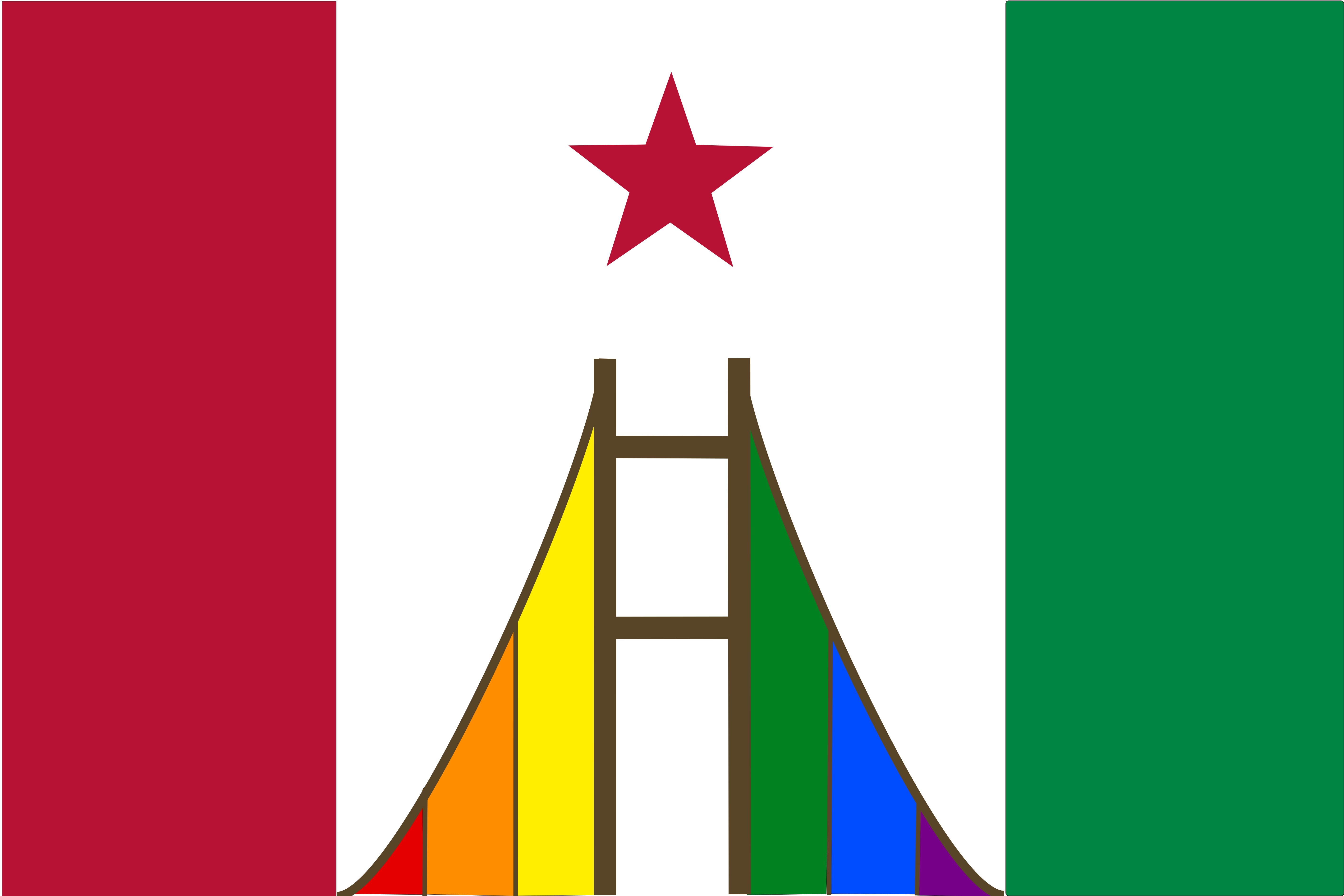
The first thing that sticks out to me, is that there are too many colours.
Red 1 (stripe/Star)
Red 2 (bridge)
Orange
Yellow Green (stripe)
Green (bridge)
Blue
Purple
Brown
White
Black
Edit- there was one less red than I thought.
Red 1 and 2 are the same. The brown of the bridge and green are from the current flag. I just added the six rainbow colors. There is no black or yellow green. Maybe it's too much.
Sorry, you are right about the reds. But there is a black line between the red and white stripes, and there is yellow and green in the rainbow.
I'm not sure what the correct number of colours would be, but 11 is probably too many.
But your flag doesn't have any words on it, which is a vast improvement over the current California flag.
Red, white, green brown + 6 rainbow colors = 10 (probably too many anyway) But I like the rainbow motif for California. I like it's contrast with the white (for the white supremacists that still call this state home).
No black between red and white (at least not intentional).