Cool Guides
Rules for Posting Guides on Our Community
1. Defining a Guide Guides are comprehensive reference materials, how-tos, or comparison tables. A guide must be well-organized both in content and layout. Information should be easily accessible without unnecessary navigation. Guides can include flowcharts, step-by-step instructions, or visual references that compare different elements side by side.
2. Infographic Guidelines Infographics are permitted if they are educational and informative. They should aim to convey complex information visually and clearly. However, infographics that primarily serve as visual essays without structured guidance will be subject to removal.
3. Grey Area Moderators may use discretion when deciding to remove posts. If in doubt, message us or use downvotes for content you find inappropriate.
4. Source Attribution If you know the original source of a guide, share it in the comments to credit the creators.
5. Diverse Content To keep our community engaging, avoid saturating the feed with similar topics. Excessive posts on a single topic may be moderated to maintain diversity.
6. Verify in Comments Always check the comments for additional insights or corrections. Moderators rely on community expertise for accuracy.
Community Guidelines
-
Direct Image Links Only Only direct links to .png, .jpg, and .jpeg image formats are permitted.
-
Educational Infographics Only Infographics must aim to educate and inform with structured content. Purely narrative or non-informative infographics may be removed.
-
Serious Guides Only Nonserious or comedy-based guides will be removed.
-
No Harmful Content Guides promoting dangerous or harmful activities/materials will be removed. This includes content intended to cause harm to others.
By following these rules, we can maintain a diverse and informative community. If you have any questions or concerns, feel free to reach out to the moderators. Thank you for contributing responsibly!
view the rest of the comments

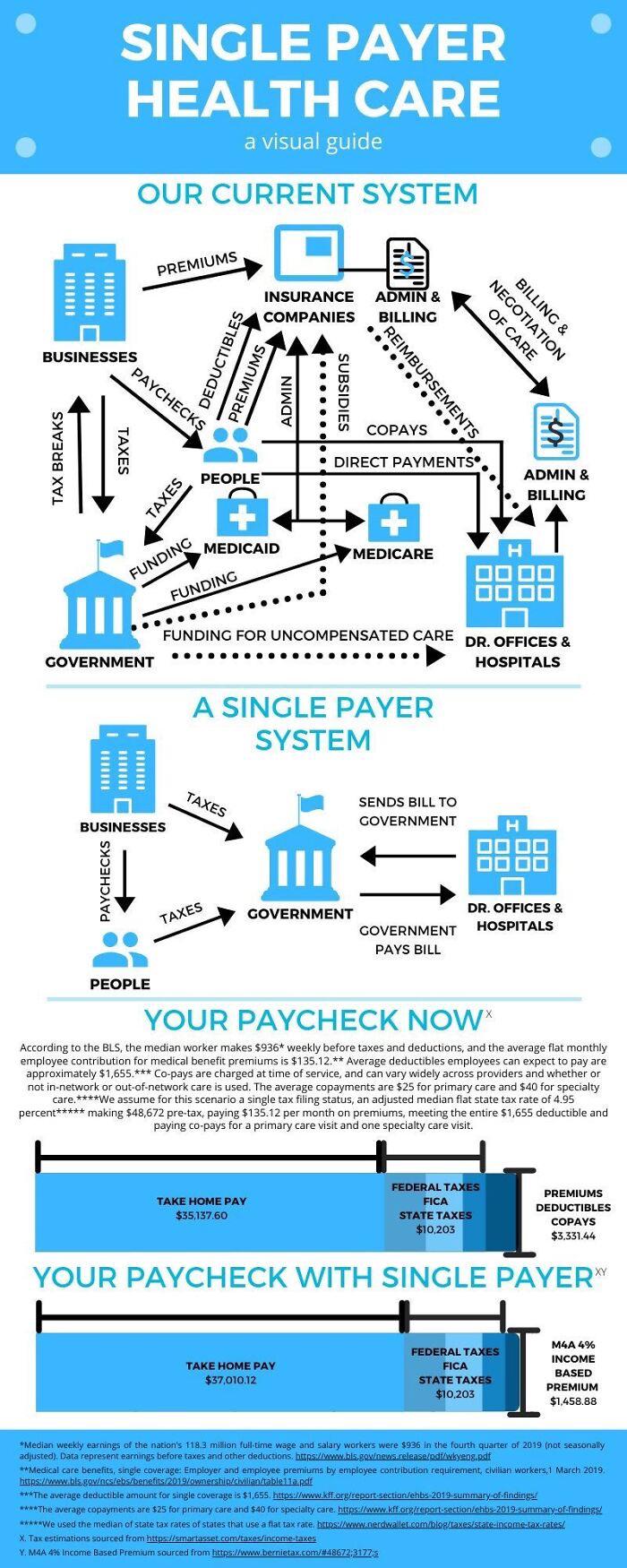
I did not compare it to Germany. I used Germany only as a step into my post. It is over-simplified as it is not how it will be in the US. Can you draw a chart for the UK Health System without once mentioning the NHS or describe the German Health System without mentioning once the Krankenkassen? Between the government and the Doctors will be at least one institution that most possibly will be named "American Health Service" or something like that. Drawing a line from the Doctors to the Government makes it sound like people gonna send their bills to the White house. The reality is that the Government will only allocate the Funds for a certain subsidiary unit that will handle that worksload. The NHS in the UK employed 1.2 Million people. Leaving out that aspect is critical in a chart like that. In my view, the graph is too simplified. If you feel it is telling all you need to know, good for you. Apparently rough outlines like that are all you need. I would at least insert one shape between the Doctors and the Government as there will be hundrets of thousand of workers who will do the actual work. Government will only decide on the funding.
EDIT: Man you must be mad. Downvoting me one minute after I post this. Using your alt accounts to give yourself 3 upvotes one minute after you posted it? Crazy. But who cares.
I didn't use any alt or downvote anyone. But why would I draw a chart of Germanys system without insurance companies? That wouldn't be the German system.
And that's my point. This isn't showing the German system. So your initial assessment of this being oversimplified because it's different in Germany doesn't make any sense.