this post was submitted on 26 Mar 2024
192 points (88.1% liked)
MapPorn
3203 readers
1 users here now
Discover Cartographic Marvels and Navigate New Worlds!
Rules
- Be respectful and inclusive.
- No harassment, hate speech, or trolling.
- Engage in constructive discussions.
- Share relevant content.
- Follow guidelines and moderators' instructions.
- Use appropriate language and tone.
- Report violations.
- Foster a continuous learning environment.
founded 1 year ago
MODERATORS
you are viewing a single comment's thread
view the rest of the comments
view the rest of the comments

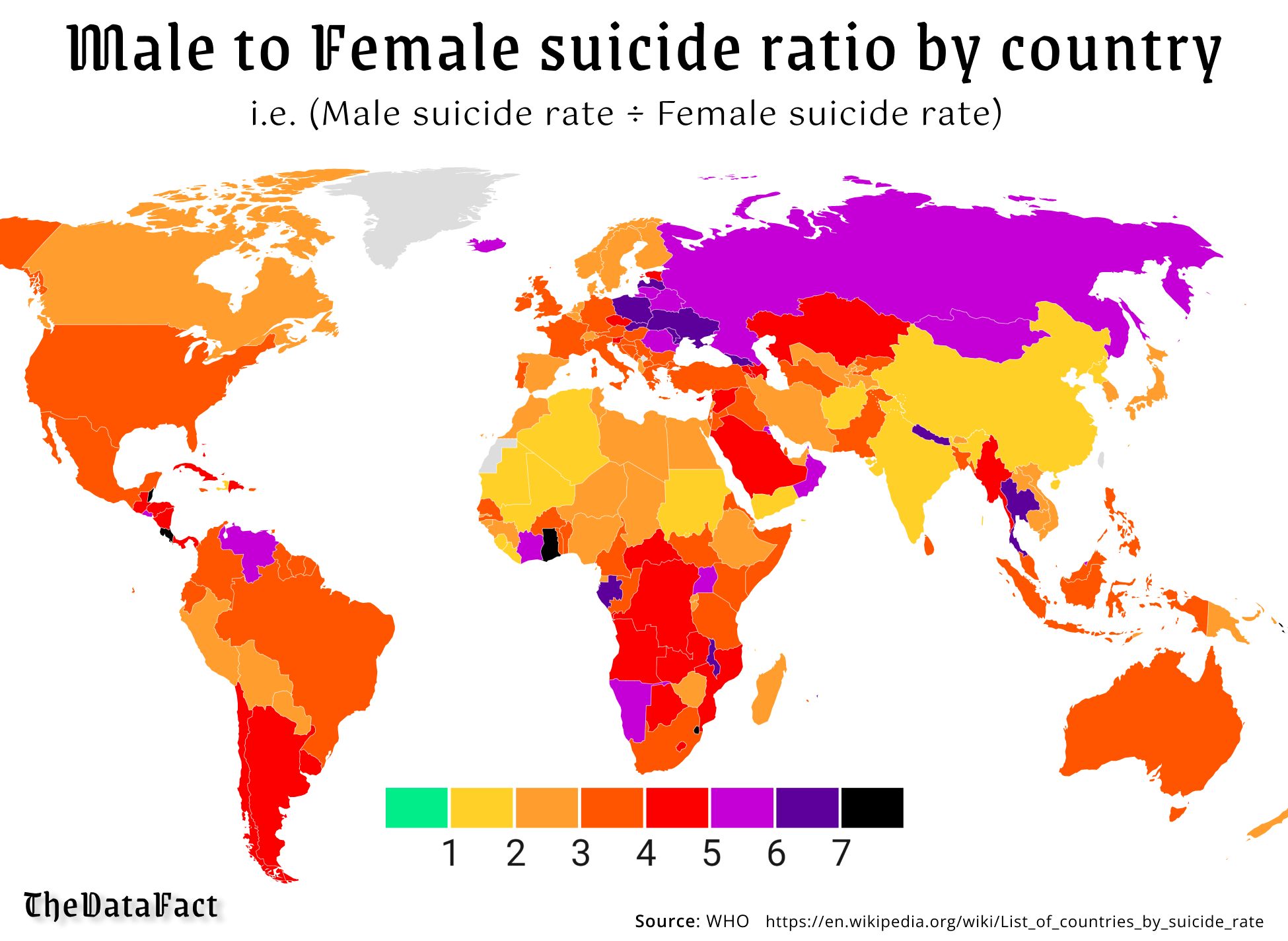
It would be interesting to find a way to also represent the overall rate. Some of these countries really stand out for their high male:female ratio even though their overall rates are not particularly high.
Total numbers aren't relevant for ratios unless the numbers are low enough that the ratio swings wildly from year to year.
Low numbers could also mean that the tracking/reporting in that country isn't very good and therefore the data isn't reliable.
In some cultures suicide has a very negative stigma attached to it, which can result in suicide deaths being reported with other causes.
Aka in the In-Famous Korean Fan Deaths
https://en.m.wikipedia.org/wiki/Fan_death
https://www.ksby.com/sponsored/balance-treatment-center/2017/11/30/suicides-are-often-underreported-and-ignoredbut-why
Do you think that the consistent trend worldwide of male suicides being a higher proportion that female suicides is actually incorrect and it is either balanced or the ratio actually skews towards more female suicides?
If not, what is the purpose of trying to undermine the overall results by focusing entirely on the possibility that they might not be exactly correct?
The map itself focuses on the proportion. Wanting better data doesn't need an agenda.
Yeah, data could be skewed for countries with very low populations. That could be why Greenland is left out, despite data being available from the wikipedia page that the data is taken from.