this post was submitted on 11 Jun 2024
53 points (100.0% liked)
art
22376 readers
20 users here now
A community for sharing and discussing art, aesthetics, and music relating to '80s, '90s, and '00s retro microgenres and also art in general now!
Some cool genres and aesthetics include:
- outrun
- vaporwave
- mallsoft
- future funk
- city pop
- synthwave
- laborwave
If you are unsure if a piece of media is on theme for this community, you can make a post asking if it fits. Discussion posts are encouraged, and particularly interesting topics will get pinned periodically.
No links to a store page or advertising. Links to bandcamps, soundclouds, playlists, etc are fine.
founded 4 years ago
MODERATORS
you are viewing a single comment's thread
view the rest of the comments
view the rest of the comments

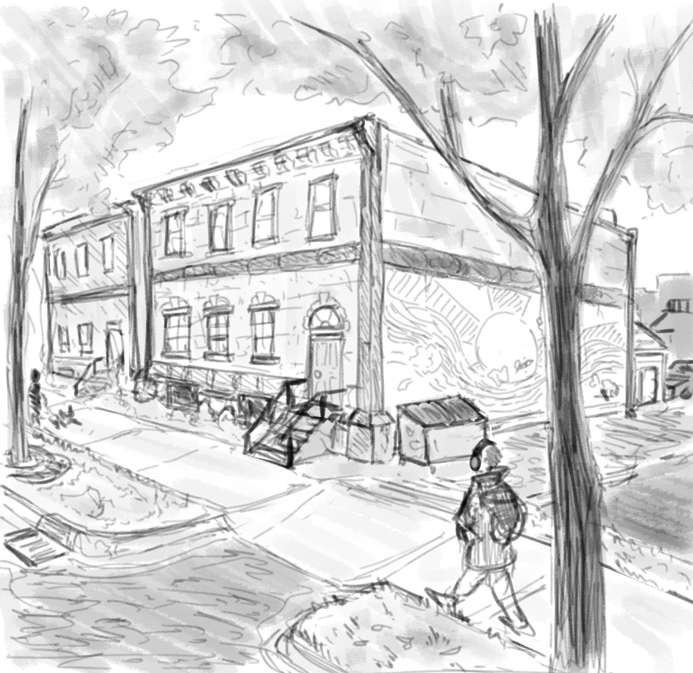
No I like it that size. I imagine the upper windows are just a clearstory and the inside is huge.
I like the stone lintels. And the belt course and cornice are neat on such a small scale. They all look kind of Italianate.
It’s been quite a long time since I took an architectural history course, but do you happen to live in a Midwestern city?
Yep this is very much an Italianate building as were commonly built in Midwestern downtowns, probably around the late 19th, early 20th century.
Neat! Hope your pencils stay busy!