this post was submitted on 16 Jun 2024
268 points (92.9% liked)
Data Is Beautiful
8407 readers
1 users here now
A place to share and discuss data visualizations. #dataviz
founded 4 years ago
MODERATORS
you are viewing a single comment's thread
view the rest of the comments
view the rest of the comments
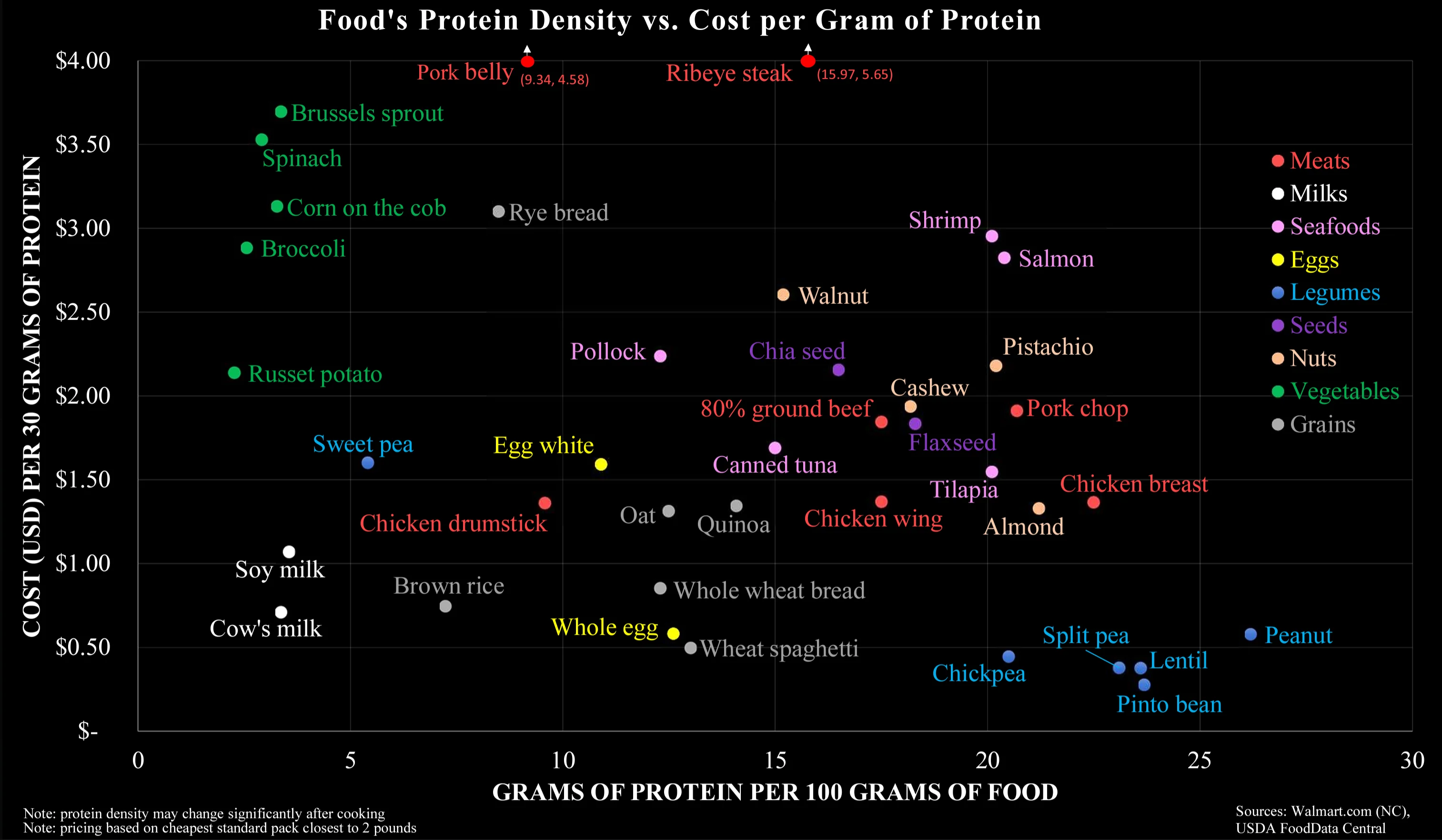
So much wrong about this chart. It is factually correct, but it answers the wrong question.
This chart makes it way too easy to optimise for cheap protein, which is misleading. It is not this what it takes to have a healthy organism. It takes a varied diet, with balanced quantities of liquids (see milk), vitamins (see sprouts), fatty acids (see salmon), minerals (see shrimps, eggs, walnuts), actually carbs (potatoes, rice, spaghetti), and much more...
I think it's specifically meant to debunk the idea that meat is the only affordable source of protein-dense food, when in reality there are vegan protein-dense foods that are even more affordable.
That doesn't conflict with the fact that a well balanced diet is important; it's just addressing one sticking point that tends to come up in these conversations.
To me it seems that your interpretation completely disregards the Y-axis. On the other hand, I wouldn't think the colour coding does a good job in separating along the carnivorous-vegetarian-vegan scale.
It's not that they are separated on the chart, but that they are comparable (on both axes), that impressed me.