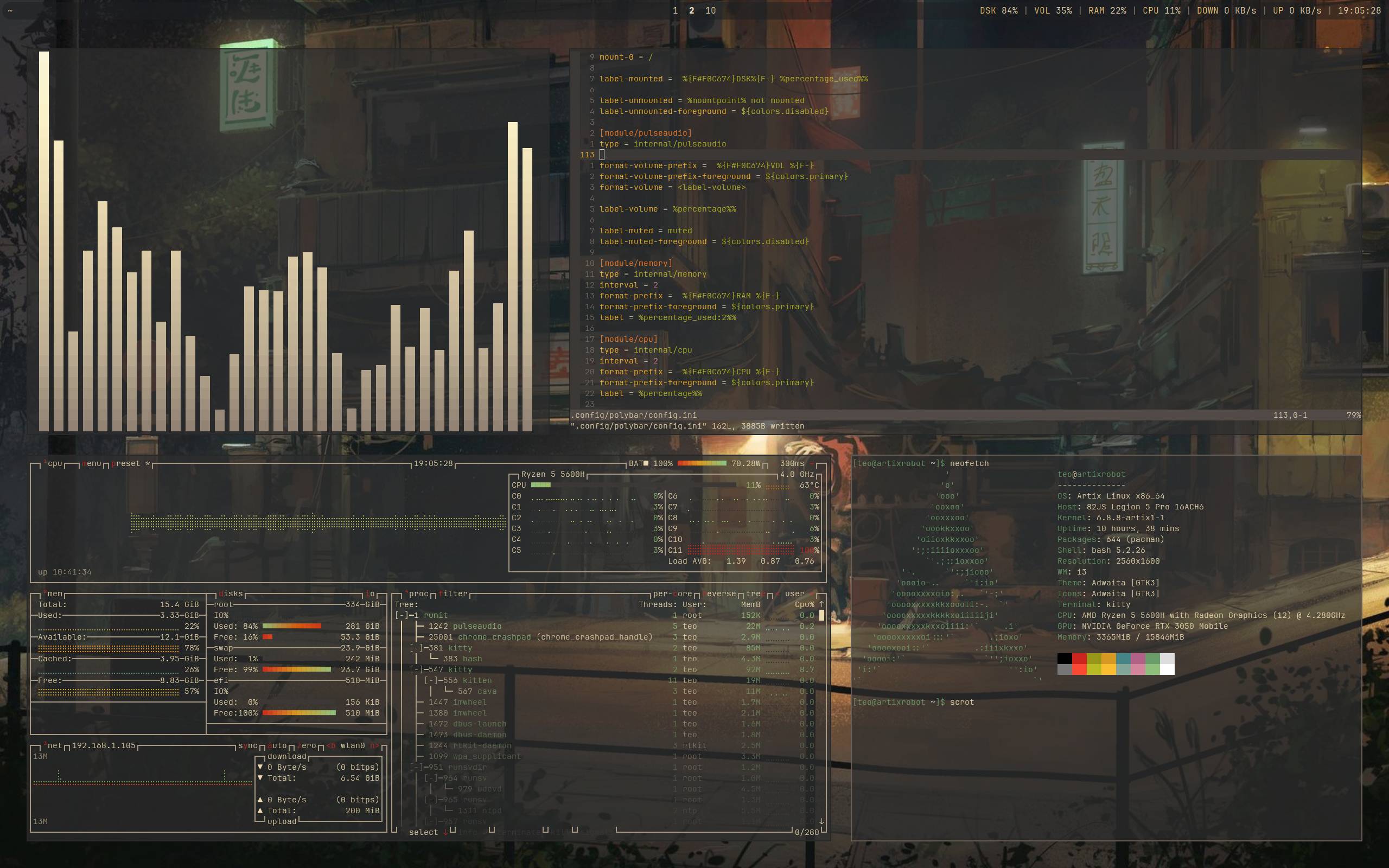
Gruvbox is the color scheme I call home. I always come back to it.
Submit screenshots of all your *NIX desktops, themes, and nifty configurations, or submit anything else that will make themers happy. Maybe a server running on an Amiga, or a Thinkpad signed by Bjarne Stroustrup? Show the world how pretty your computer can be!
Gruvbox is the color scheme I call home. I always come back to it.
Could someone explain what's up with the massive spacing? I don't really see it usable unless it's like on a TV that is 5 meters away from the user
Reasons:
In any case I agree with you and I make my gaps as small as possible while still visually sensible. Even on a large monitor there is not much point making gaps larger past some point.
For a TV, those fonts are tiny as hell.
You can always zoom in using ctrl + or whatever the key binding is and make it smaller when making screenshots
Sexy!
i like the non-smooth edges! though, the transparency of the windows (and the wallpaper) make the text quite hard to read (or is it just me?) ((or is it just the font size???)) anyways, cool setup! i like it