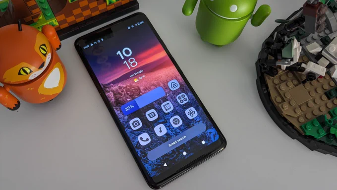
I enjoy Material You design overall, the themed icons though are not my flavor, I would much prefer icons following a strict guideline like on IOS and still remain very differentiated.
Android
The new home of /r/Android on Lemmy and the Fediverse!
Android news, reviews, tips, and discussions about rooting, tutorials, and apps.
🔗Universal Link: !android@lemdro.id
💡Content Philosophy:
Content which benefits the community (news, rumours, and discussions) is generally allowed and is valued over content which benefits only the individual (technical questions, help buying/selling, rants, self-promotion, etc.) which will be removed if it's in violation of the rules.
Support, technical, or app related questions belong in: !askandroid@lemdro.id
For fresh communities, lemmy apps, and instance updates: !lemdroid@lemdro.id
📰Our communities below
Rules
-
Stay on topic: All posts should be related to the Android OS or ecosystem.
-
No support questions, recommendation requests, rants, or bug reports: Posts must benefit the community rather than the individual. Please post to !askandroid@lemdro.id.
-
Describe images/videos, no memes: Please include a text description when sharing images or videos. Post memes to !androidmemes@lemdro.id.
-
No self-promotion spam: Active community members can post their apps if they answer any questions in the comments. Please do not post links to your own website, YouTube, blog content, or communities.
-
No reposts or rehosted content: Share only the original source of an article, unless it's not available in English or requires logging in (like Twitter). Avoid reposting the same topic from other sources.
-
No editorializing titles: You can add the author or website's name if helpful, but keep article titles unchanged.
-
No piracy or unverified APKs: Do not share links or direct people to pirated content or unverified APKs, which may contain malicious code.
-
No unauthorized polls, bots, or giveaways: Do not create polls, use bots, or organize giveaways without first contacting mods for approval.
-
No offensive or low-effort content: Don't post offensive or unhelpful content. Keep it civil and friendly!
-
No affiliate links: Posting affiliate links is not allowed.
Quick Links
Our Communities
- !askandroid@lemdro.id
- !androidmemes@lemdro.id
- !techkit@lemdro.id
- !google@lemdro.id
- !nothing@lemdro.id
- !googlepixel@lemdro.id
- !xiaomi@lemdro.id
- !sony@lemdro.id
- !samsung@lemdro.id
- !galaxywatch@lemdro.id
- !oneplus@lemdro.id
- !motorola@lemdro.id
- !meta@lemdro.id
- !apple@lemdro.id
- !microsoft@lemdro.id
- !chatgpt@lemdro.id
- !bing@lemdro.id
- !reddit@lemdro.id
Lemmy App List
Chat and More
Could you explain how the guidelines are stricter on iOS? I'm not familiar with Apple guidelines.
Btw, just to give a bit of context for the Dynamic Icons: In Android, the notification icons need to be monochrome. Samsung is the odd one out and allows colors.
As such, devs are already sort of expected to develop a monochrome variation of the App Icon to be used as the notification icon. using the same design for the Dynamic Icon shouldn't really ask more from developers. Issue is that some devs don't even do the bare minimum, some apps just use a filled circle as a notification icon cause they forgot to check it.
Plus, there was a whole category of monochrome Icon Packs in the Play Store. I personally used Whicons for instance. So, making it official also helps with that.
The notification icons are definitely better than the colored ones. I probably exaggerated a bit about the “guideline”. What I really meant is that on iOS all icons have to be exactly the same size and shape, and they all look crisp, on Android it’s not guaranteed.
...it's been years since Android implemented the idea of Adaptive Icons. Which was made precisely so that icons have the same size and shape. Even if the Dev didn't update the icons in the last 5 years, the background would default to white.
Nice.
