this post was submitted on 08 Aug 2024
62 points (89.7% liked)

Male Fashion Advice

1658 readers
1 users here now

founded 1 year ago
MODERATORS
 

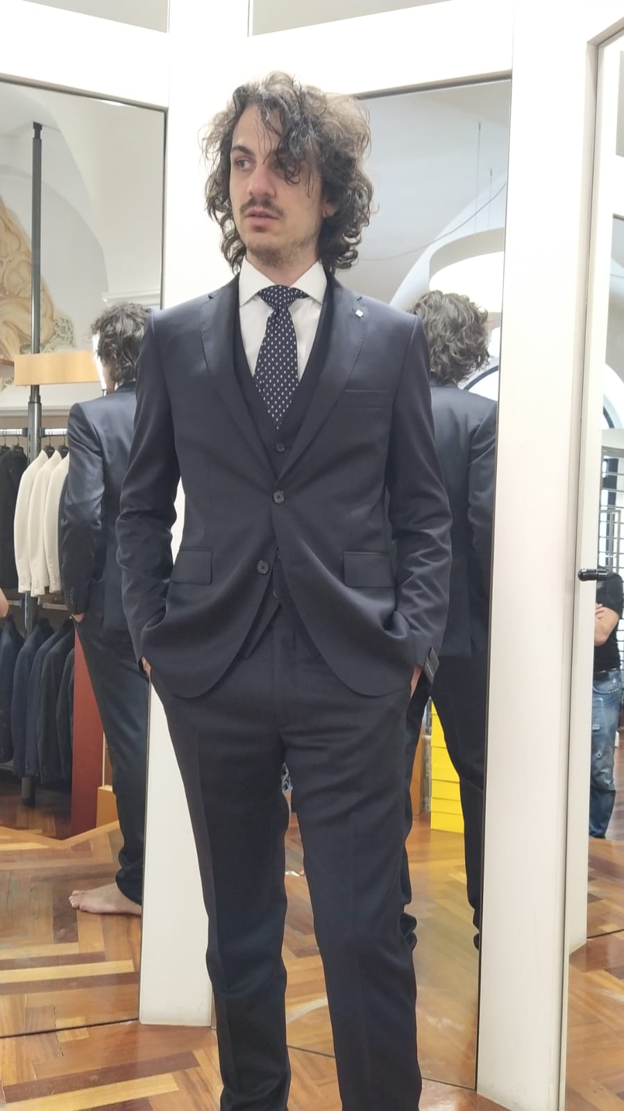
Ignore the messed up face!

top 22 comments
sorted by: hot top controversial new old
[–] Gradually_Adjusting@lemmy.world 21 points 3 months ago (1 children)

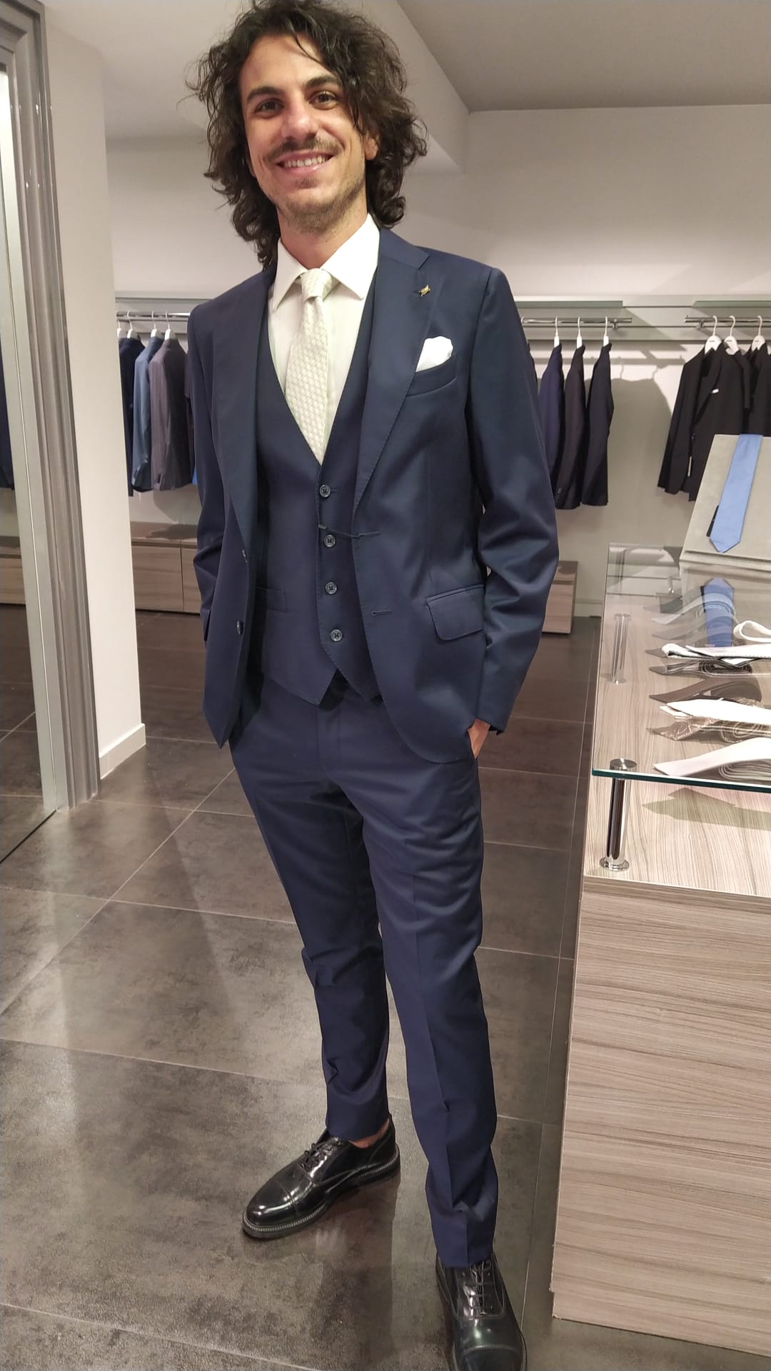
The shirt pocket and the smile are keepers. Not sure about white tie on white shirt, the contrast helps create visual interest.

Thought about double breasted at all? If you're going for a rakish look, a fashion forward choice like that would be helpful. As it is, your looks don't sit well with the safe choices being made here. If you're going to shave and cut the hair, it'll come together as-is.
[–] iagomago@feddit.it 9 points 3 months ago (1 children)

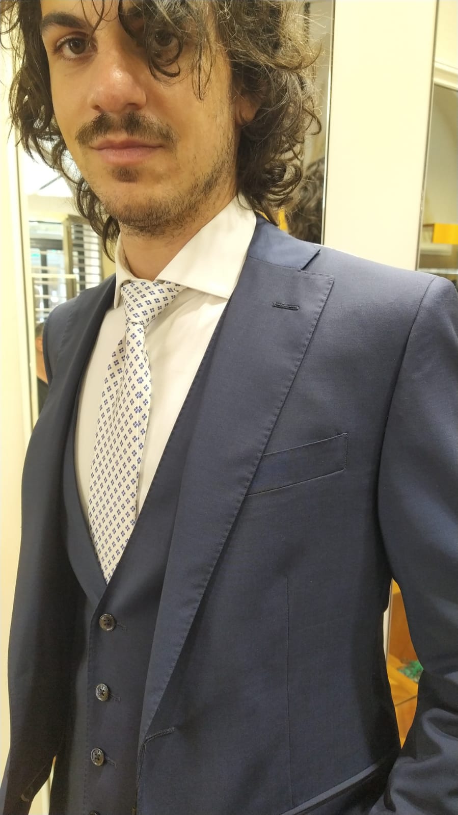
The "white" tie actually has a small deep blue pattern in it, the photo really doesn't make it justice (but I'm still open for changing things up). I tried some double breasted but none of the models I tried on felt "right"; and yeah of course I'm going to try to fix up some of the hair ahahahah

[–] Gradually_Adjusting@lemmy.world 8 points 3 months ago

Very good. Caveat emptor here, you're getting advice from a man who fashioned a toy goldfish into a lapel pin for a trip to the zoo. My advice is always to take risks, for better or worse.

[–] cyborganism@lemmy.ca 14 points 3 months ago

For a wedding where you're the groom, go with number 2.

For any other formal event, go with number 1.

And your messed up face looks great. You got a kind of Timothy Chalmet thing going on with that hair and all.

[–] Pandantic@midwest.social 12 points 3 months ago

Second one!

[–] DrBob@lemmy.ca 12 points 3 months ago (1 children)

Are you the groom or a guest? Guest I would do dark. Groom the white.

[–] iagomago@feddit.it 19 points 3 months ago (4 children)
[–] Gradually_Adjusting@lemmy.world 8 points 3 months ago

Well that really moves the needle with my white tie comment. I'd say go for it. And congrats!

[–] phdepressed@sh.itjust.works 7 points 3 months ago

Ask your fiancee or her mother(if she likes you) for opinions as well. As it stands option 2 but maybe a darker tie to make it easier on the photographer.

[–] DrBob@lemmy.ca 5 points 3 months ago

Congratulations! White all the way then!

[–] TTH4P@lemm.ee 4 points 3 months ago

They both look good on you, but I prefer the white with blue pattern. Congrats!!!

[–] Mechanize@feddit.it 9 points 3 months ago

Without a doubt, the second one. White tie and handkerchief.

Congratulations!

[–] iamericandre@lemmy.world 9 points 3 months ago

I like the first one. Congratulations on your big day!

[–] Barzaria@lemmy.dbzer0.com 6 points 3 months ago

I vote the second option with the tire from the first. Looking good bro!

[–] not_that_guy05@lemmy.world 6 points 3 months ago

#2

But change the tie. Differentiate the colors even if it's a little darker, but over all you look good and congrats.

[–] Cosmonaut_Collin@lemmy.world 5 points 3 months ago (1 children)

I think the white tie makes the chest space feel too open at least from these pictures. I know you mentioned the pattern in a comment, but when you look back at pictures from the wedding,it'ds going to look a lot like these photos. I would stick with the dark tie, although I also think I like to keep suits more classic anyway. Just my personal opinion.

[–] Cosmonaut_Collin@lemmy.world 6 points 3 months ago* (last edited 3 months ago)

Actually, I have just changed my mind. I have been looking at the white tie one for so long I forgot what the dark tie looked like. White tie better.

[–] verity_kindle@sh.itjust.works 2 points 3 months ago

I like your face, especially with the confident smile. Wear that and you will look sharp. Congratulations!

[–] MagicalHammer@lemmynsfw.com 2 points 3 months ago

The one with socks.

[–] Agrivar@lemmy.world 1 points 3 months ago

Bro, there's nothing wrong with your face that a razor can't fix - just shave and you'll look sharp! (I wouldn't even change the hair, the messy chaos of it suits you)

[–] funkless_eck@sh.itjust.works 1 points 3 months ago

I don't like the margin between vest and jacket in 1, looks unbalanced.