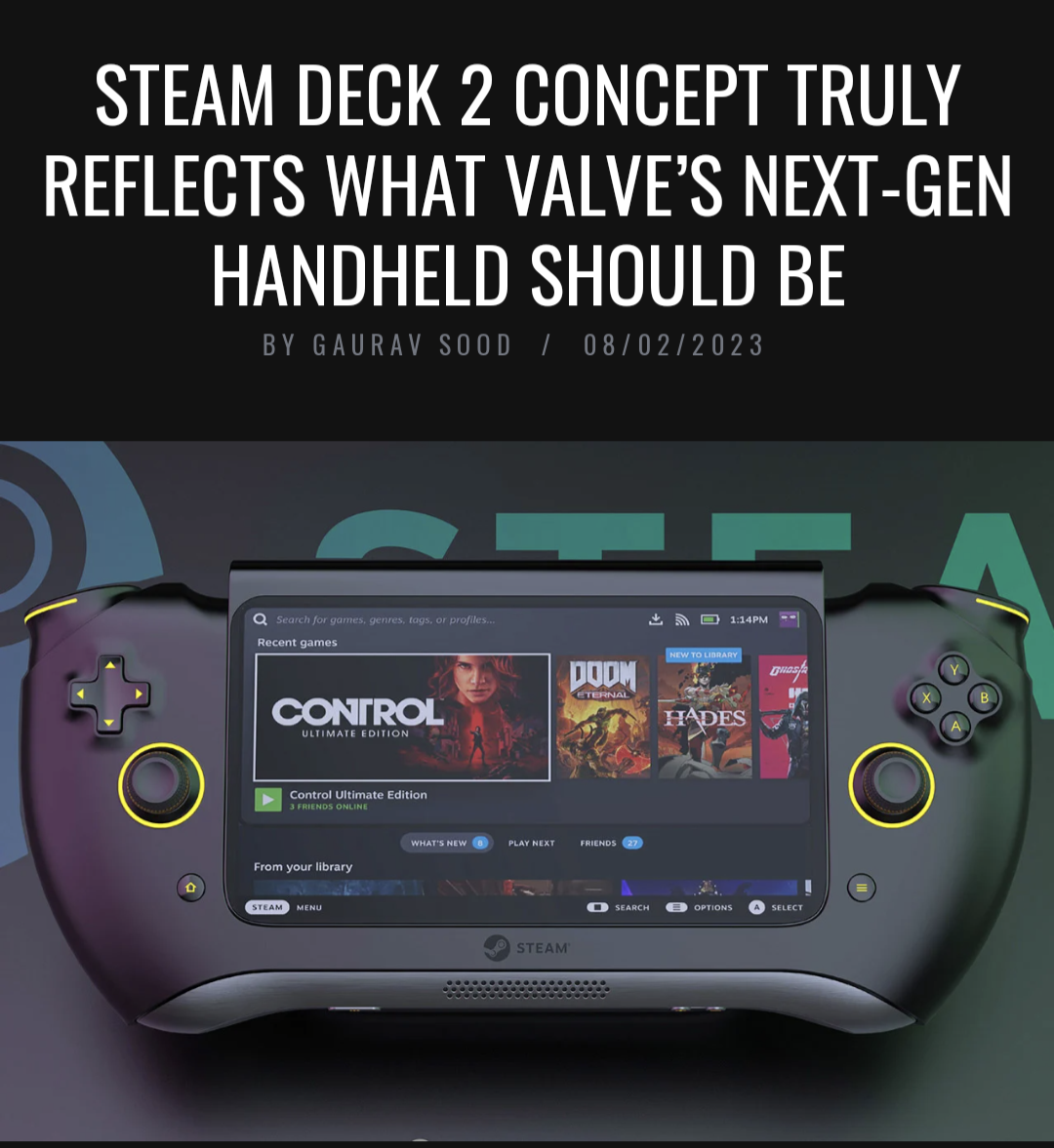
Missing the track pads, total garbage.
Steam Deck
A place to discuss and support all things Steam Deck.
Replacement for r/steamdeck_linux.
As Lemmy doesn't have flairs yet, you can use these prefixes to indicate what type of post you have made, eg:
[Flair] My post title
The following is a list of suggested flairs:
[Discussion] - General discussion.
[Help] - A request for help or support.
[News] - News about the deck.
[PSA] - Sharing important information.
[Game] - News / info about a game on the deck.
[Update] - An update to a previous post.
[Meta] - Discussion about this community.
Some more Steam Deck specific flairs:
[Boot Screen] - Custom boot screens/videos.
[Selling] - If you are selling your deck.
These are not enforced, but they are encouraged.
Rules:
- Follow the rules of Sopuli
- Posts must be related to the Steam Deck in an obvious way.
- No piracy, there are other communities for that.
- Discussion of emulators are allowed, but no discussion on how to illegally acquire ROMs.
- This is a place of civil discussion, no trolling.
- Have fun.
I agree. The article claims this mockup has better "trackpads", but I think they're just referring to the thumbsticks.
Nah, I think the article and the image are both AI generated, so the "author" of the article really has no idea what the image actually looks like.
This reminds me of the XBOX 720 memes from back in the day where the console was a sphere or some shit
IT'S SPHERICAL
Please don't feed bullshit designs like this oxygen. It's bad enough seeing all the "PS5 Pro" and "Switch 2" articles.
No trackpads = no thanks
Also why does the screen jut out like that?
How comes Valve is the only one to get inputs right? Not even fan renders get it right.
Nobody else is thinking of it as "PC gaming on a console"
They're thinking in terms of "A console which is a PC"
In other words, their heads are in console mode rather than in PC gaming mode. They aren't thinking of an effective mouse option to play paradox games and the like.
Ragebait
Why is it upside down?
That pad and buttons look painful.
This has got to be rage bait
I am almost positive the Steam Deck 2 will be the same design with upgraded hardware, maybe additional USB port or something.
Valve put a lot of RND into the Decks design and ergonomics. I think it would be a waste of money to change it. Money i would rather them use towards an OLED screen or something.
I hope they find a way to make it almost as thin as a PSP or a Switch, and powerful enough to play games at 1080p. Maybe then I'll consider one.
Concepts are always made by the people I least want to actually be in charge of design
holy shit this thing is ugly
This design is dumber than that one rounded boomerang ps3 prototype controller
At least the boomerang curved into your palms. This literally curves away. The only part of your body that will be holding onto this "prototype" when you use its joysticks are the tips of your fingers.

I forgot these existed! I always wanted one...
Sweet mercy that's ugly
Cool! It even has an unintentionally belly-operated off-button!
(Sorry, but this design looks like a UX nightmare. The Sticks feel barely reachable, the buttons on the bottom will be touched unintentionally, the shoulder pads aren't clearly separated, the ABXY buttons are way too small, the speaker seems to be mono,... The list of shortcomings could go on forever...)
Where are the touch pads? Are they secret? Are they safe?
What kind of prank is the artist trying to pull?
I love this shit. They're always so wrong but such fun designs. I wish I could find pictures of the old PS3 and Xbox 720 concepts that people were paying back in the day.
What? The Steam Deck needs trackpads and L4, L5, R4, and R5 buttons! Without them I wouldn't have been able to play modded Minecraft properly due to the amount of controls introduced by the mods I use.
Rounded corners on the screen? Yuck
That’s probably the least disgusting feature of them all, kinda looking forward for a monitor with rounded corners even though I know the problems that it will carry. The inverted shape of the handles though…
This looks really clunky. Like the steam deck is simple and familiar to me
Don't worry, its just a concept design from Carota. Zero chance this gets out the door.
Is it the 1st of April already?
Getting serious Wutang controller vibes.
Holding this is the equivalent of trying to run in your dreams. Can’t be done.
Looks like a game gear
Shit looks AI generated lmao, totally unusable shape lmao.
When's the MadCatz brand Steam deck competitor coming out?
It looks like an upsidedown Xbox controller with a screen in the middle.
Maybe unpopular but I kinda like the design and the aluminium looking bottom line.. but it's still dumb and not repairable like this. Also, we just want the old one with a better screen.
The lips around the d-pad and buttons look terrible.
They’re joking….right?
🦗
…Guys?
Almost certain somebody is trolling with this design lol.
