12
submitted 7 months ago by Ascend910@lemmy.ml to c/kde@lemmy.ml

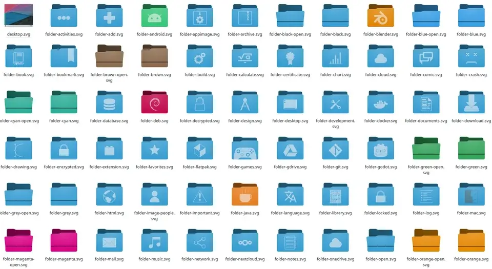
They look like a mix of Oxygen and Breeze. And look absolutely beautiful!

Much better than the current Breeze icons which look overly simple and flat.

This is the type of visual overhaul I was talking about.

These icons coupled with a great default wallpaper will make Plasma 6 look awesome!

Thanks to the great work from Ken Vermette who initially created the new icon set, and Niccolò Venerandi, who took over and improved it!

top 2 comments
sorted by: hot top controversial new old
[-] russjr08@outpost.zeuslink.net 3 points 7 months ago

I quite like the look! Though, I know that design is subjective to people, so hopefully the old version is still available to choose.

[-] beta_tester@lemmy.ml 0 points 7 months ago

You can see here all the flaws of the new icons https://lemmy.ml/post/7614728

this post was submitted on 07 Nov 2023
12 points (70.0% liked)

KDE & Plasma users

2711 readers
3 users here now

KDE is an international technology team creating user-friendly free and open source software for desktop and portable computing. KDE's software runs on GNU/Linux, BSD and other operating systems, including Windows.

founded 4 years ago
MODERATORS