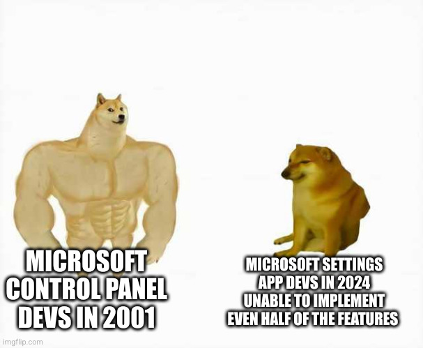
windows 7-style control panel is one of the most non intuitive uis ever created
Memes
Rules:
- Be civil and nice.
- Try not to excessively repost, as a rule of thumb, wait at least 2 months to do it if you have to.
For the past 8 years I have had to disable 'mouse acceleration' after every Windows update. The updates have become more frequent, and the setting to disable acceleration has slowly become buried deeper in the menus. Switched to Linux two days ago and I'm never looking back.
The new windows appification and UI shit screams "we think people are straight up fuckin retarded" to me. They might as well manufacture keyboards to look like speak and spell toys
Really annoying start search that doesn't go to the control panel programs but opens bing search instead, also the right control panel features are not linked from the new 2024 system app ui WTF
I wish home and pro version influenced the setting panes. I get what they're trying to do with making it look like OSX and Linux and why the "network interface and adapters" probably isn't helpful for many home users, but I just wanna manage my interfaces here.
Appwiz.cpl, ncpa.cpl, desk.cpl and mmsys.cpl. I use all the time.. ever since win 8 changed all the settings ui. That new ui, while getting better since 8 still sucks since the old control panel. I hope they never remove it since windows is still the name of the game for end users (even in some software dev environments).
Here's a list of cpl, you just use them at run or even the windows search. https://www.itechtics.com/control-panel-applets-cpl/
bro I'm so happy that the last windows i set up was 2015... i remember every time the excruciating 1h set aside to click and confirm and authenticate privileged access and pull slider etc... no sensible way to just run it in terminal, at least not that i know of. and nowadays there's this useless right-click menu that hides the real right-click menu and you can only fix this by finding a registry key 😂😂😂
As I’ve heard this explained, enterprise admins have scripts, and to a less important extent muscle memory, tied to Control Panel layout and command lines, and that’s not a group you want to irritate.
I thought this was intentional? They have control panel stuff somewhat similar to the old style, but build a settings app for the less technical people so they can find common stuff without getting overwhelmed?
No some things have been removed from the control panel
I wonder if those removed things are still in god mode though, might have to check that
It is intentional but not like that, Windows is built on backwards compatibility. That's why so many parts of current Windows versions have seemingly parts of old versions tacked onto them.
Not quite. The two menus also have different settings in them
