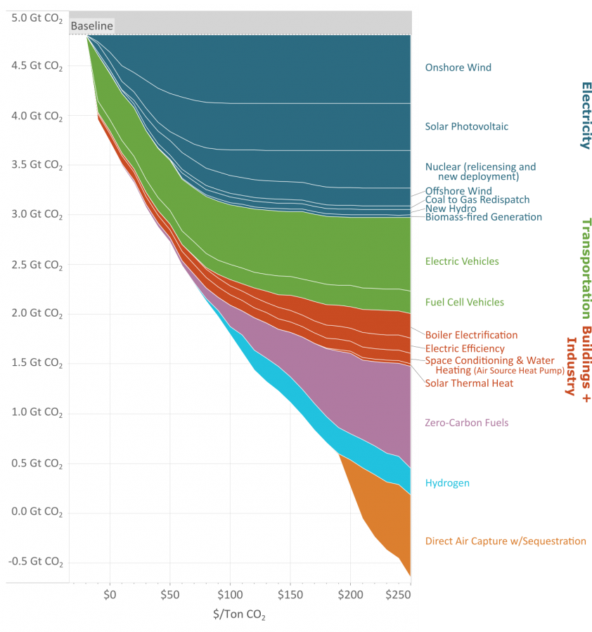
31
submitted 4 months ago* (last edited 4 months ago) by JohnDClay@sh.itjust.works to c/dataisbeautiful@lemmy.ml

As you reduce the amount of carbon emissions (the y axis) the methods to keep reducing carbon cost more (the x axis.)

This great graph came to my attention from this video from vlogbrothers. It also has some good explanations of what it means.

Note that carbon capture doesn't really make sense till you've exhausted all the other emission minimizing methods.

Source: https://www.edf.org/revamped-cost-curve-reaching-net-zero-emissions

top 33 comments
sorted by: hot top controversial new old
[-] bjorney@lemmy.ca 26 points 4 months ago

If you need a video to explain your graph, is it really that good of a visualization?

[-] JohnDClay@sh.itjust.works 4 points 4 months ago

I thought it was beautiful

[-] racoon@lemmy.ml 5 points 4 months ago* (last edited 4 months ago)

I do think it’s beautiful, indeed. There are some meaningful colours piled up forming a column

[-] TropicalDingdong@lemmy.world 19 points 4 months ago* (last edited 4 months ago)

I'm sorry but what the hell is this figure trying to say?

Its like an inverted stacked area plot, but I'm yet to figure out how I should be interpreting it.

A 'beautiful' presentation should be immediately obvious in terms of how to interpret it.

From what I can tell, this is saying that...

I can't tell what the hell this is saying..

This should not be a stacked area plot. this should be a line plot, and the data surely should not be stacked. I think its a total misrepresentation of whats going on here. These lines are not cumulative, unless you are considering some kind of optimization curve, in which case 'cost' should be flipped to 'price'. But then why is that axis in giga tonnes when it states that it is in cost per metric tonne, then how is it tonnes on the Y axis? Should be dollars?

And even then it doesn't make sense because the scale of the y axis is backwards. if it was 'price', it could be reconfigured to make sense.

Looks like something one of my students would turn in when they are just guessing on how to make a plot in excel without engaging with the material (although its clearly made in R). Remake and resubmit for half credit.

(I've read the methods. This figure should be remade by swapping x and y. Y should be labeled cost per mega gram to deploy (and should be in megagrams, not gt), x should be carbon offset capacity. If this was done, it would be easily interpreted as the points and price points (in units of $/ megagram of carbon) at which a given technology becomes cost effective.)

I know up and to the right is boring, but its intuitive and there is no need to have drawn this curve in this way.

[-] JohnDClay@sh.itjust.works 1 points 4 months ago* (last edited 4 months ago)

The video explains it pretty well. It's very information dense. But it's how much it costs to minimize carbon emissions by various methods depending on how many giga tones co2 we are currently emitting.

[-] TropicalDingdong@lemmy.world 8 points 4 months ago

Just, from a data is beautiful perspective, if I have to watch a video to understand one of your figures; that ain't beautiful.

Its actually not a super complicated figure, the point its making is just obfuscated by its presentation.

[-] JohnDClay@sh.itjust.works 0 points 4 months ago

I think why they're presenting them as cumulative is because you want all the reduction methods to add to net carbon negative.

[-] JohnDClay@sh.itjust.works 0 points 4 months ago

Giga tones co2 is pretty common from what I've seen in emissions documentation, I've never seen megagrams used for co2 before, so I thought that was reasonable.

[-] TropicalDingdong@lemmy.world 3 points 4 months ago

“carbon capture doesn’t make sense” lol

I mean, I've been in the industry for 10 years. Sure, when you are talking at a global scale, gt is what you use. The standard unit for projects is megagrams of carbon.

[-] JohnDClay@sh.itjust.works 0 points 4 months ago

Okay, since this is referring to the global co2 emissions, global scale makes sense.

[-] TropicalDingdong@lemmy.world 3 points 4 months ago

But is it? Does it?

No it doesn't, not the way this is being presented. The axis need to be relabeled and rearranged to represent that. Just accept that this is a poor presentation of these data.

[-] JohnDClay@sh.itjust.works 1 points 4 months ago

The y axis is the global co2 emissions. Where are you getting that it isn't?

[-] TropicalDingdong@lemmy.world 2 points 4 months ago

Lol.

No it isnt.

Average annual emissions are 10gt per year right now.

Y here is 'cumulative' carbon offset capacity (which is a bit of a misnomer because in their method you 'stop' doing things that are 'cheaper' at lower cost per unit carbon, which is like, not a good assumption to make, but we'll stick with it for just trudging through this disaster of a figure).

This is why data presentation matters. People who don't know what they are talking about or how to understand these things will make the wrong conclusions.

[-] JohnDClay@sh.itjust.works 2 points 4 months ago* (last edited 4 months ago)

Hmm actually looks like this is only the US. The 5gt is from 2021 when it was published. Yeah that should have been more clear.

[-] TropicalDingdong@lemmy.world 2 points 4 months ago

But its not just that. Its x axis is in Mg/$.

The figure and the thinking behind it need a complete rework. They would have been better off sticking with the original McKinsey presentation of this concept from 2007.

They've made it worse.

[-] JohnDClay@sh.itjust.works 1 points 4 months ago

Looks to be like the x axis is $/ton? If the original figure is better, could you link it so I can replace the pic?

[-] TropicalDingdong@lemmy.world 2 points 4 months ago

The originally figure is literally in the article you linked.

[-] JohnDClay@sh.itjust.works 1 points 4 months ago
[-] TropicalDingdong@lemmy.world 2 points 4 months ago

Yes. That's the original MAC curve the travesty you posted is supposed to represent an improvement to. It comes from Mckinsey 2007.

Y is cost per ton (x in the figure you presented). X is the potential reduction capacity of a given activity. Think about it like this: If Y were the price a carbon tax in Mg, the value of a tax is where a given activity becomes break even. Once carbon is 'priced' at a given level on Y, the activities below it on X become cost neutral/ cost savings. Negative numbers on this figure represent a real savings right now, with effectively a negative price on carbon. We should do these things right away. Positive values have a 'cost' associated with them (afaik, this doesn't account for the fact that fossil fuels are subsidized). If we 'taxed' or put a price on carbon, the values where that line intersects and below become cost-neutral or a savings can be realized.

[-] JohnDClay@sh.itjust.works 1 points 4 months ago

It doesn't look like you can find an optimal mix of methods for a particular reduction though.

[-] TropicalDingdong@lemmy.world 2 points 4 months ago* (last edited 4 months ago)

I mean there are two approaches we can take here. One is to go after their methods, and the second is to go after their presentation of the data. What they aren't clearly stating is that this is a supposed optimization around sequestration capacity, because its implicit to their methods. This has so many assumptions baked into it, it doesn't even make sense to begin unpacking them. The biggest are assumptions around saturation. Like if carbon was being priced at 150 a Mg, not a soul on the planet is going to be bothering with DAC when you could plop down solar panels in Finland and still make a profit.

But this isn't 'method is beautiful' this is data is beautiful.

All they needed to do to improve the MAC curve was add a cumulative sum curve on a secondary axis. Honestly, just swapping X and Y might be enough to save this.. this 'thing' they've created.

[-] rbn@feddit.ch 16 points 4 months ago

Looked at the graph for 5 minutes and I have no clue what it's trying to say. Based on the text "cost per 1 metric ton" I would expect a one dimensional chart, not a x/y-axis and definitely not a stacked area chart. Didn't watch the explanation video though.

[-] JohnDClay@sh.itjust.works 1 points 4 months ago

You can only reduce so much carbon going to solar or EVs. As you reduce the amount of carbon emissions (the y axis) the methods to keep reducing carbon cost more. (the x axis)

[-] LKPU26@lemmy.ml 2 points 4 months ago

Does the graph starting below $0 indicate some of this is negative cost?

[-] JohnDClay@sh.itjust.works 2 points 4 months ago

Yes, it's cost savings to install solar over continue with coal for example.

[-] derphurr@lemmy.world 1 points 4 months ago

"carbon capture doesn't make sense" lol

If across the world enough trees were planted to equal the size of Amazon rain forest, that would be 300 billion trees and 7.5Gtonnes CO2

So more than entire graph.

[-] JohnDClay@sh.itjust.works 4 points 4 months ago

But you need to plant that every year in perpetuity, while still burying the logs so decomposition doesn't release the co2 again.

[-] mapto@lemmy.world 1 points 4 months ago

Why would the logs be emitting CO2 (rotting?) if they are alive and growing?

[-] JohnDClay@sh.itjust.works 2 points 4 months ago

Because they're only alive and growing till they die and rot. Sometimes trees do both at the same time, rot from the inside out. You can't just plant trees for carbon capture, you also need to deal with how to permanently sequester the carbon.

[-] mapto@lemmy.world 1 points 4 months ago

Let's say that for millions of years a healthy biosphere grew around forests and the balance worked. Now you come to tell us it doesn't. Wouldn't you think it's a bit unconvincing?

[-] JohnDClay@sh.itjust.works 3 points 4 months ago

We've only been pumping out co2 for a hundred or two years. We can't keep doing that and expect the old balance to hold up.

[-] mapto@lemmy.world 1 points 4 months ago

I wonder why forestation is not present in this chart, as it is a low-cost carbon capture with side benefits. Sure, it is hard to scale, but reducing current deforestation rates would be a big step.

[-] JohnDClay@sh.itjust.works 1 points 4 months ago* (last edited 4 months ago)

It might be included in carbon capture and sequestration.

this post was submitted on 11 Feb 2024
31 points (73.8% liked)

Data Is Beautiful

5773 readers
15 users here now

A place to share and discuss data visualizations. #dataviz


(under new moderation as of 2024-01, please let me know if there are any changes you want to see!)

founded 3 years ago
MODERATORS