724
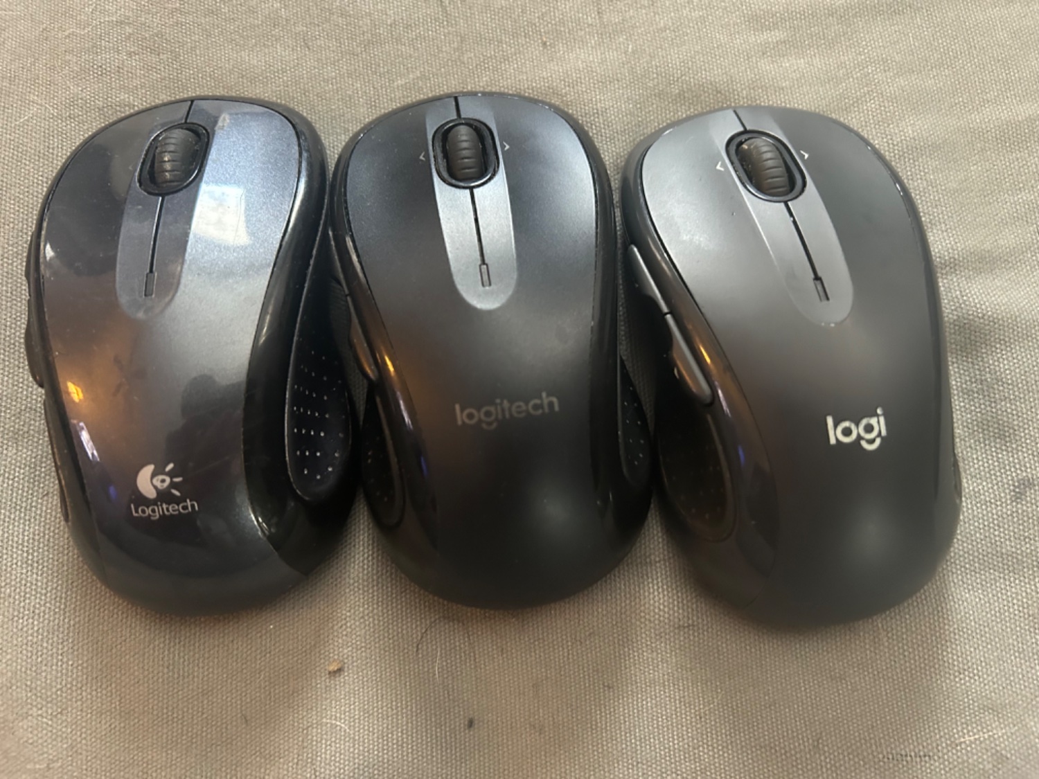
I lost my mouse a couple times and bought an exact replacement, then found the old one. You can see the evolution of the logo
(lemmy.world)
This is for strictly mildly interesting material. If it's too interesting, it doesn't belong. If it's not interesting, it doesn't belong.
This is obviously an objective criteria, so the mods are always right. Or maybe mildly right? Ahh.. what do we know?
Just post some stuff and don't spam.
It's interesting how minimalist design also influence the hardware design. Like how glossy the first gen compared the latest gen with matte color.
While I love Logitech I'll never forgive them to have killed the Harmony products, it's so great I can't believe they took that decision
ad remove
As far as I'm concerned, printing your name in a weird font doesn't even qualify as a logo.
The leftmost one is good - and the full-colour version of it was pretty cool, back in the day.
The middle one is bland, except for the "g" which is dumb.
The right one is stupid, and keeps the dumb g.
Garbage. The graphic designers need to give their heads a shake.