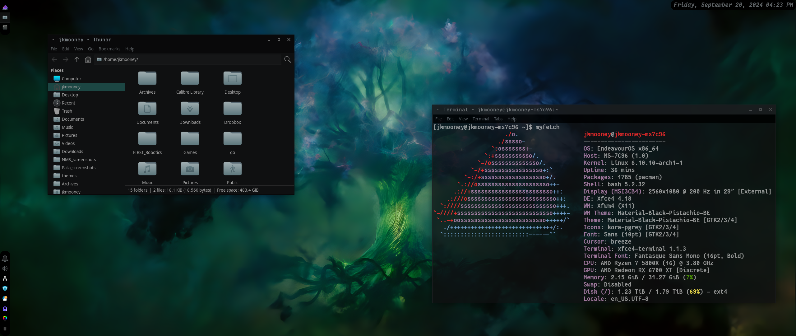
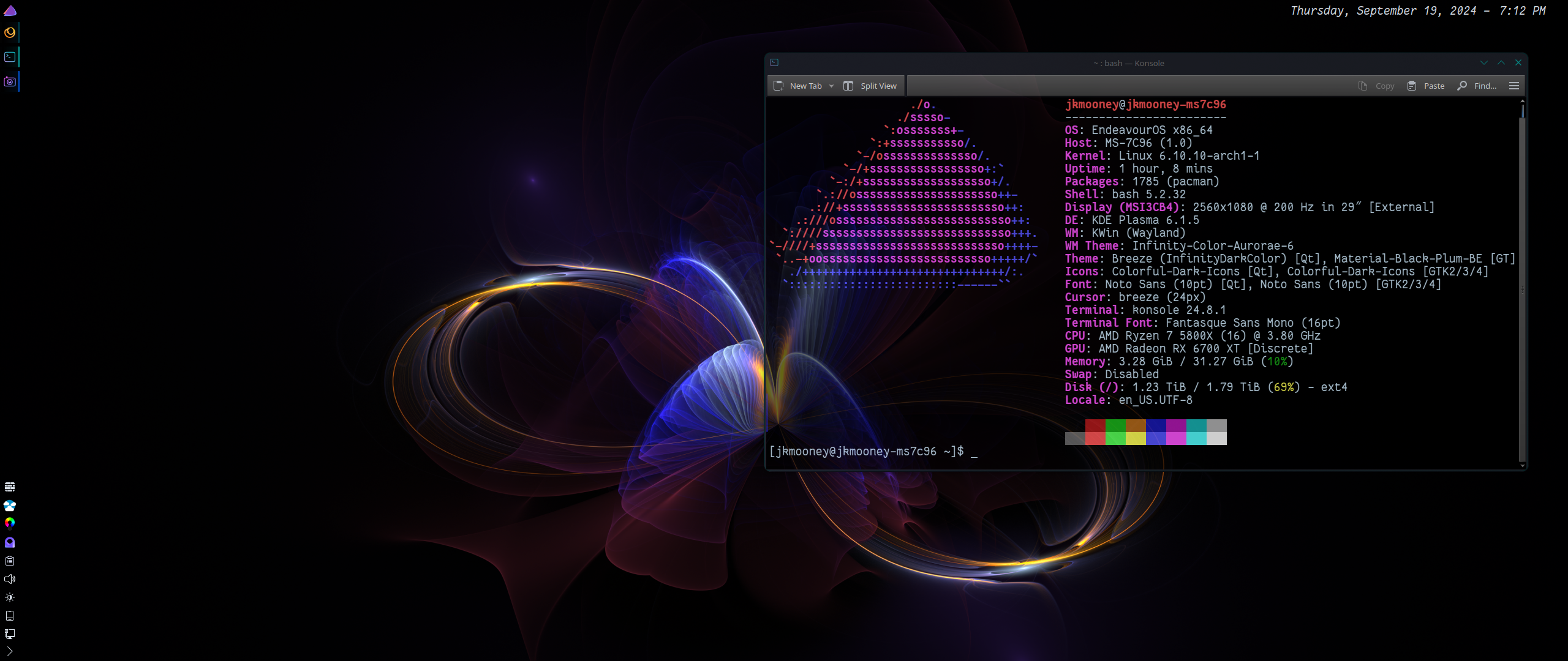
I should have mentioned, the background image is from the finale of Loki. In Norse mythology, it's the Yggdrasil tree.
jkmooney
Thanks ,
Fixed now :)
For some reason, the formatting is not being preserved here in my cut-and-pasted script. If you can't untangle it, let me know.
I added a little .css file " .config/gtk-3.0/gtk.css" copied below. (there's actually a couple approaches I took, the one I'm using here is not commented out).
/* Two different approaches given below
   both valid but with slightly different
   behaviour
*/

/* This first approach aggressively radiuses
   everything, even items within the panels
   themselves.
*/

/*.xfce4-panel {
   border-bottom-left-radius: 16px;
   border-bottom-right-radius: 16px;
   border-top-left-radius: 16px;
   border-top-right-radius: 16px;
} */

/* This approach is not as aggresive as above.
   Will need to add some transparent seperators
   on either end for the radius to show.
   (16 px for full radius at my current settings)
*/

.xfce4-panel#XfcePanelWindow {
   border-radius: 16px;
}
@import 'colors.css';
I feel XFCE is under-rated. It has the reputation for being "dated", but I find it pretty flexible.
I like this overall setup for Ultra-Wide monitors. The icon set is Kora-Grey (part of the whole Kora icon pack on gnome-look). The overall theme is Material-Black-Colors (using the Pistachio-BE option here), also on gnome-look. To do the Date - Time display they way I have, I put the clock widget on twice. Once showing only the date, the other showing only the time. Clicking the date brings up Thunderbird open to the Calendar tab. Clicking the time open Thunderbird on the Email tab. To make the panels rounded, I did add a small .css file in the gtk-3 folder. Can show you what I did if you're interested.
I probably should look at what else is out there. Hyprland is my first go at a tiling window manager/compositor. The overall graphics and presentation is what grabbed my attention in the first place. The recent "kerfuffle" on Discord was a bit off-putting though.
The upper right is set to always stay on top, which works well when you move the window buttons to the "MacOS" side of the window. Lower left is just my Status Tray. Upper left is Whisker Menu, Notifications, Audio Controls, and stacks open applications as icons. It takes up very little space. Oh and, for the upper right panel, clicking on the date opens Evolution in Calendar mode, clicking on the time opens it in Email mode.
Wallhaven.cc or deviantart is where I typically find my backgrounds


This, and other thought provoking commentary in this month's upcoming edition of "DUH!!!".