Now we're going very modern.
I'm not sure, I might decrease transparency and try it with a bunch of different themes as some colors can make blurs look like ass.
Now we're going very modern.
I'm not sure, I might decrease transparency and try it with a bunch of different themes as some colors can make blurs look like ass.
Seems that there's still some time to be spent fiddling with CSS layouts.
But anyway, this is an awesome update.
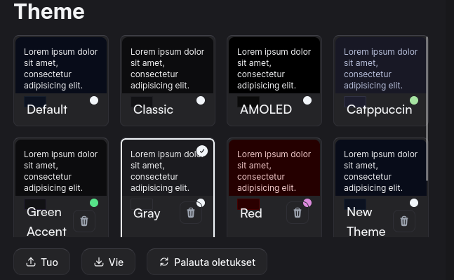
Since we're discussing rounding, how about dropdowns?
I usually dislike this kind of roundness, but I'm not sure I hate it here. It does feel a bit inconsistent with the rest of the ui, though.
Nice. I like this kind of diversity, where each instance kinda has its own look.
I think I need a little time to get used to it, but it might be good. The black theme was a bit too black on some screens.
Nice, you're really killing it with these features.
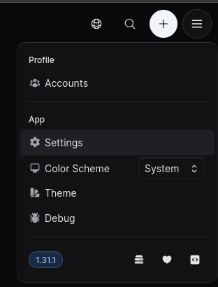
Found this feature while trying to figure out why post title is created at such an unexpected place. This is nice. Now if people start actually using it.
That's awesome.
Well you gotta start somewhere.
Let's see if we can look back at how far we've come in a year next anniversary.
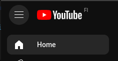
And on a 27" screen that's a whole lot of mouse movement every time.
Yeah, it's a bit annoying.
Many sites do this even if the logo/title isn't far away from other controls, I guess to have a more "obvious" home button.
Lemmy-ui does it by default. I don't know why, maybe it's for other activitypub software that won't understand lemmy syntax.
Regardless of the reason, I feel that rant. It could have been simple and straightforward, but no, f u, you'll do regex instead.