
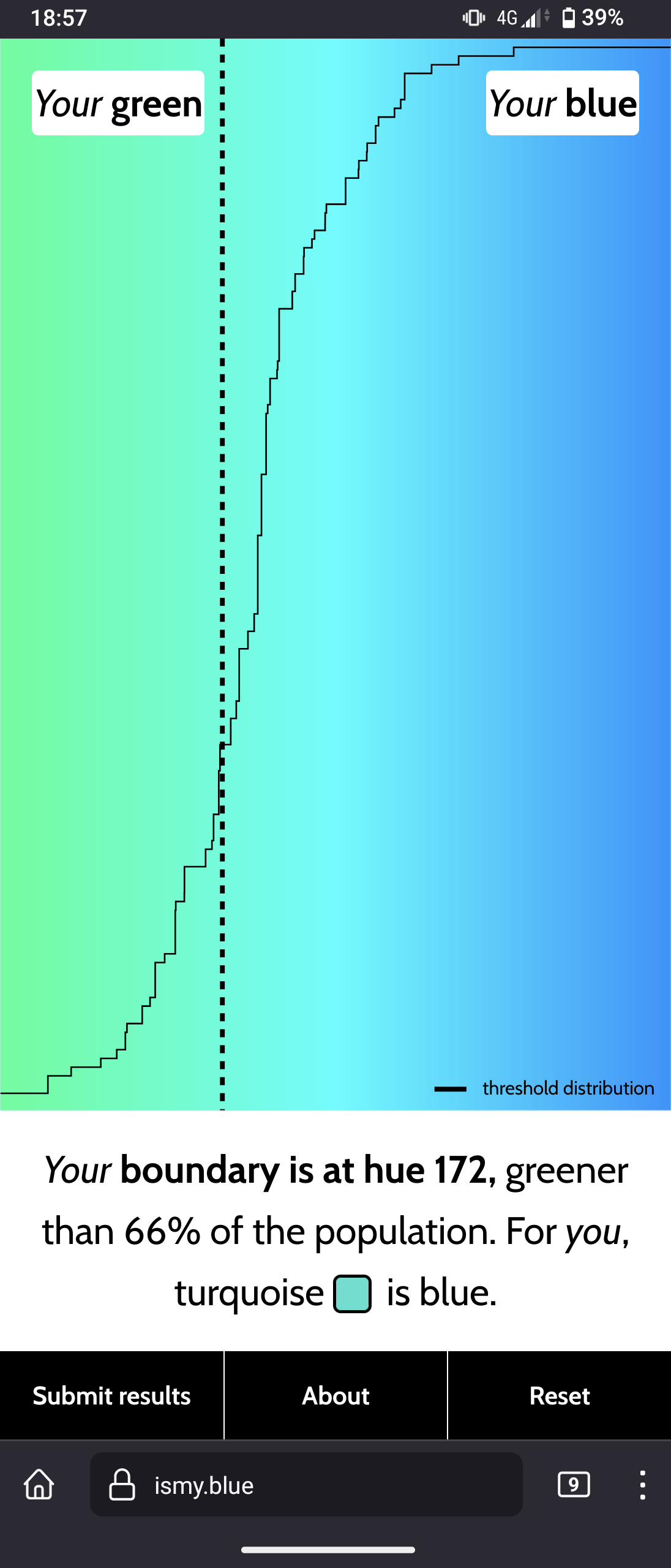
Interesting website to see what you personally perceive as "blue"
🇬🇧 This is a bilingual community on a french instance.
Total subscribers:
🇬🇧 Let's discuss art and design!
Join us and
This community is about art in all its form, as well as its influence on culture and its application at the service of society: architecture, music, literature, performances, video games, graphic design...
Check the pinned posts for basic rules and a (wip) list of art related communities 🔗
🇫🇷 Discutons d'art et de design !
Vous pouvez ici :
Le sujet de la communauté concerne toutes les formes d'art, ainsi que leur influence sur la culture et leur application au service de la société : architecture, musique, littérature, performances, jeux vidéos, design graphique...
Pour toute question, suggestion, réclamation, etc. N'hésitez pas à utiliser le sujet épinglé.
✅ Les règles de l'instance s'appliquent bien évidemment.
Interesting website to see what you personally perceive as "blue"
i feel like this needs like 5x as many data points before giving a result, also at some point to me the only correct answer would be "neither" because the middle point is just Cyan to me, which isn't blue and definitely isn't green, just like how orange isn't yellow but definitely isn't red.
That’s cause if you know name of colors with associated color, you more easily distinguish them, there was nice article in scientific american around that stuff. Anglos don’t typically separate for example light blue/cyan as a big color, and thus spend more time choosing lighter blue hue among others. This test is largely for funsies.
And 8 bit colors don’t have lots of space to do more datapoints tbh.
i more mean that it needs to show you the same colour several times, before and after different colors each time, because right now my scores are jumping wildly between runs.
ideally it should also show red between each hue, to reset your eyes and brain a bit.
I think that the difficulty in deciding which to pick when the truth feels to be "neither" is an intended effect of the test. It would be interesting to see the results of a test that allowed for "neither" though
i don't think that's the case, the point of the website seems to quite clearly be seeing what shades people consider either colour, and if a shade is "neither" then that's the answer you want to track rather than polluting your data with forced false answers.