
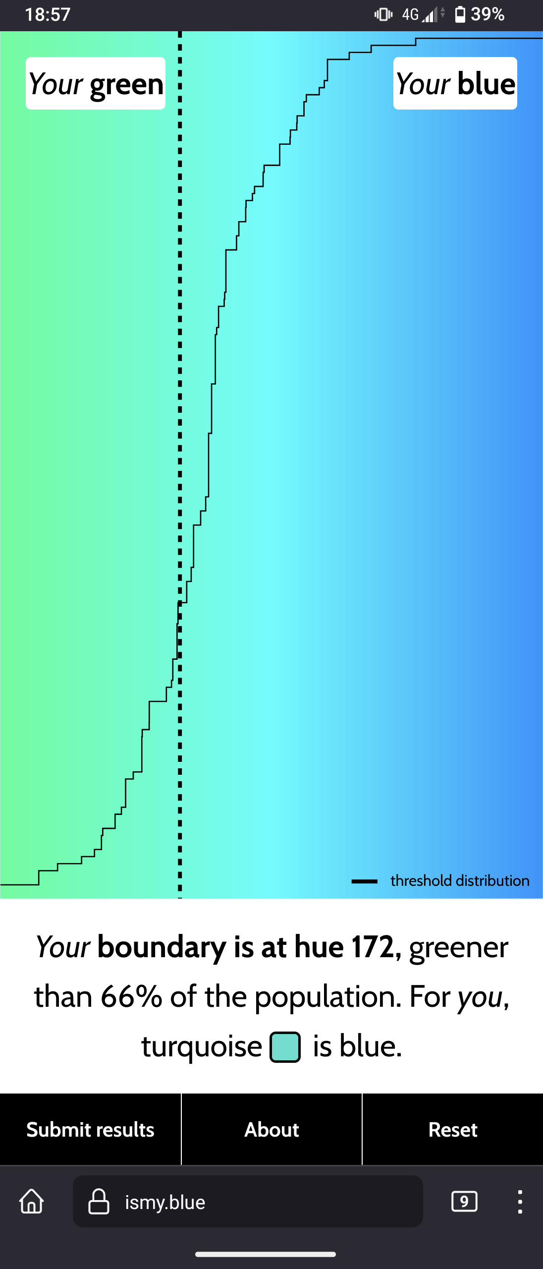
Interesting website to see what you personally perceive as "blue"
🇬🇧 This is a bilingual community on a french instance.
Total subscribers:
🇬🇧 Let's discuss art and design!
Join us and
This community is about art in all its form, as well as its influence on culture and its application at the service of society: architecture, music, literature, performances, video games, graphic design...
Check the pinned posts for basic rules and a (wip) list of art related communities 🔗
🇫🇷 Discutons d'art et de design !
Vous pouvez ici :
Le sujet de la communauté concerne toutes les formes d'art, ainsi que leur influence sur la culture et leur application au service de la société : architecture, musique, littérature, performances, jeux vidéos, design graphique...
Pour toute question, suggestion, réclamation, etc. N'hésitez pas à utiliser le sujet épinglé.
✅ Les règles de l'instance s'appliquent bien évidemment.
Interesting website to see what you personally perceive as "blue"
So I found that I pretty reliably get 185ish if I don’t think about it and just click. Now what happens is the test gives you a blue blue or green green, then throws you color just a bit over the line opposite of your first then throws you colors the opposite but closer to that line back and forth about every time. Seems like my picks tend to be A, B, A, B, A, B pretty consistently, which lead to the same outcomes. Not intentional choices for me, but it feels like the shock of seeing a color variance compared to the last color makes it feel like it’s “more green” or “more blue” than the previous. I feel like they should have a sort of pallet (unintentional pun) cleanser in between each color to give a true test.
Absolutely. A quick gob of water in between the wines would be nice. I got 185 too