this post was submitted on 06 Sep 2024
87 points (97.8% liked)
technology
23281 readers
338 users here now
On the road to fully automated luxury gay space communism.
Spreading Linux propaganda since 2020
- Ways to run Microsoft/Adobe and more on Linux
- The Ultimate FOSS Guide For Android
- Great libre software on Windows
- Hey you, the lib still using Chrome. Read this post!
Rules:
- 1. Obviously abide by the sitewide code of conduct. Bigotry will be met with an immediate ban
- 2. This community is about technology. Offtopic is permitted as long as it is kept in the comment sections
- 3. Although this is not /c/libre, FOSS related posting is tolerated, and even welcome in the case of effort posts
- 4. We believe technology should be liberating. As such, avoid promoting proprietary and/or bourgeois technology
- 5. Explanatory posts to correct the potential mistakes a comrade made in a post of their own are allowed, as long as they remain respectful
- 6. No crypto (Bitcoin, NFT, etc.) speculation, unless it is purely informative and not too cringe
- 7. Absolutely no tech bro shit. If you have a good opinion of Silicon Valley billionaires please manifest yourself so we can ban you.
founded 4 years ago
MODERATORS
you are viewing a single comment's thread
view the rest of the comments
view the rest of the comments

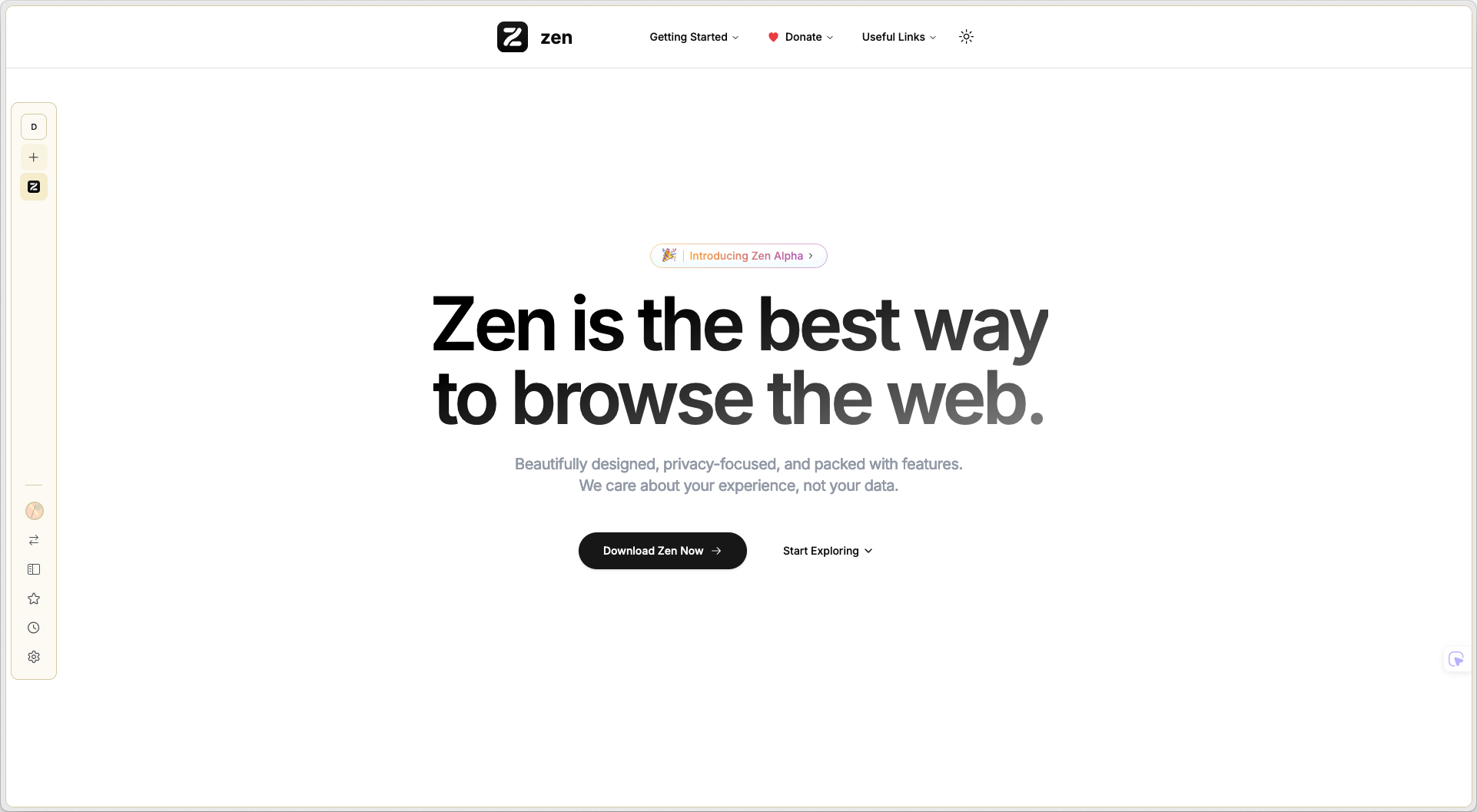
In the screenshot, it's in a sort of "mini mode" and the side bar is the tab manager/etc. You can set both that and the url bar to hide and then show on mouse hover. It looks nice but when I was messing with it it feels like it adds more time in your workflow. You have to hover right at the edge too which is annoying to hit if you have your OS bar at top of screen and/or if you have multi monitors with one on the left, since the pressure point is right on the edge. I can see it working on maybe a laptop where screen real estate is a bigger deal though.