this post was submitted on 09 Oct 2024
621 points (97.1% liked)
Funny
6886 readers
988 users here now
General rules:
- Be kind.
- All posts must make an attempt to be funny.
- Obey the general sh.itjust.works instance rules.
- No politics or political figures. There are plenty of other politics communities to choose from.
- Don't post anything grotesque or potentially illegal. Examples include pornography, gore, animal cruelty, inappropriate jokes involving kids, etc.
Exceptions may be made at the discretion of the mods.
founded 1 year ago
MODERATORS
you are viewing a single comment's thread
view the rest of the comments
view the rest of the comments

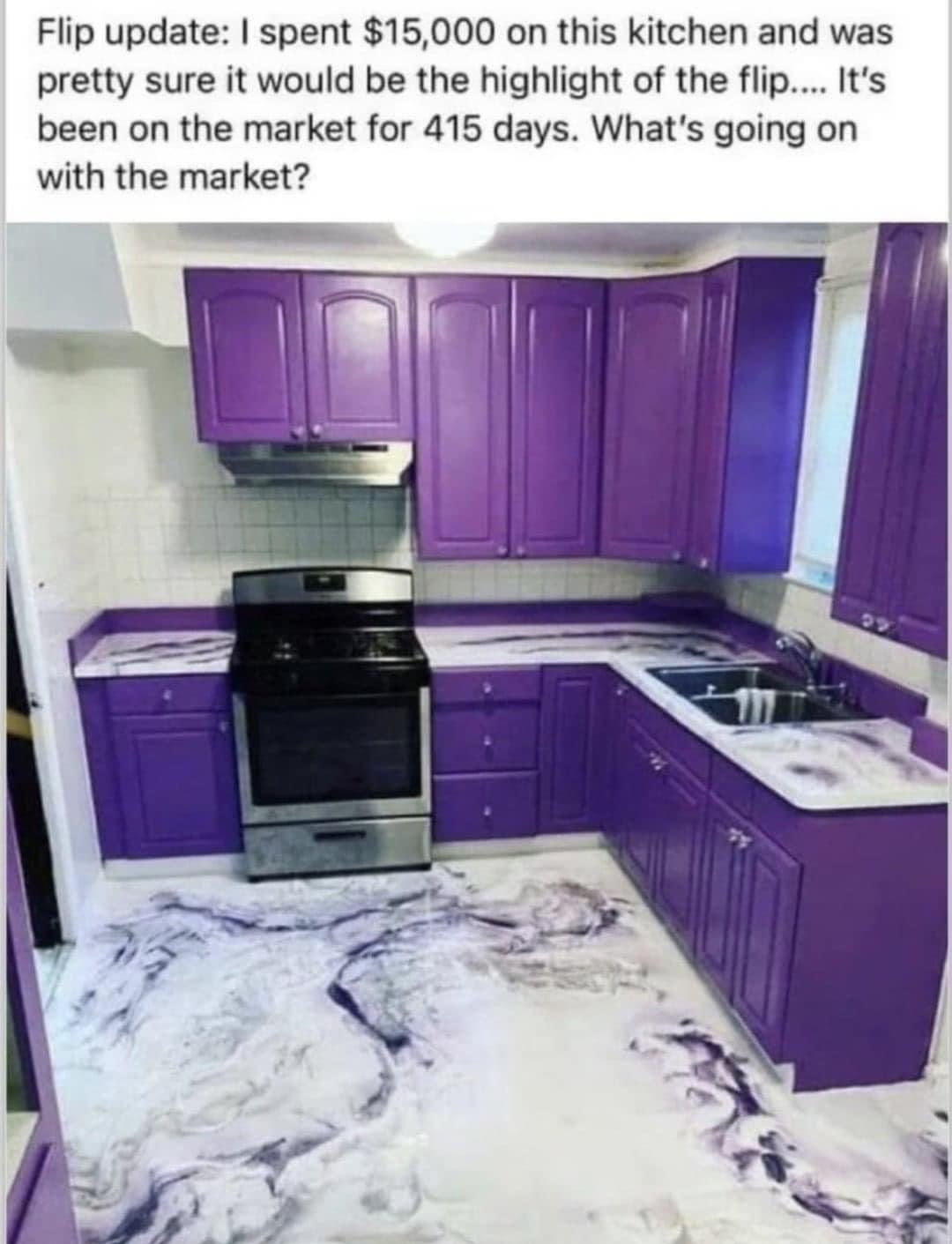
NGL the epoxy floor and countertops look sick.
But it's just way too much purple for a kitchen, or any room really
I like the countertops... in the picture. The floor looks like I'm back in a mcdonalds in the 90s.
Yeah imo that floor is more of a deal breaker than the overabundance of purple, but then again I am a purple enjoyer (although I prefer my purple to have more blue in it)
I like purple, but in a kitchen it seems like a bad choice. It makes it look like a toy kitchen set, kinda.
And there is some kind of dichotomy about the floors that is off-putting. I love the look, but its like if it can't decide if it's trying to be elegant or bold, and it kinda doesn't pull off either. Like... The fake marble McMansion isn't a great vibe, but unique natural pattern with bold colors is cool af.
Idk I could see the floor with the cabinets being black maybe with an updated design. If the rest of the house was nice, I'd do it.
Man you had some fancy McDonalds!
But I do agree there is something about this that makes it look like a toy kitchen set.