this post was submitted on 15 Oct 2024
623 points (95.5% liked)
Data is Beautiful
5068 readers
31 users here now
A place to share and discuss visual representations of data: Graphs, charts, maps, etc.
DataIsBeautiful is for visualizations that effectively convey information. Aesthetics are an important part of information visualization, but pretty pictures are not the sole aim of this subreddit.
A place to share and discuss visual representations of data: Graphs, charts, maps, etc.
  A post must be (or contain) a qualifying data visualization.

  Directly link to the original source article of the visualization
    Original source article doesn't mean the original source image. Link to the full page of the source article as a link-type submission.
    If you made the visualization yourself, tag it as [OC]

  [OC] posts must state the data source(s) and tool(s) used in the first top-level comment on their submission.

  DO NOT claim "[OC]" for diagrams that are not yours.

  All diagrams must have at least one computer generated element.

  No reposts of popular posts within 1 month.

  Post titles must describe the data plainly without using sensationalized headlines. Clickbait posts will be removed.

  Posts involving American Politics, or contentious topics in American media, are permissible only on Thursdays (ET).

  Posts involving Personal Data are permissible only on Mondays (ET).
Please read through our FAQ if you are new to posting on DataIsBeautiful. Commenting Rules
Don't be intentionally rude, ever.

Comments should be constructive and related to the visual presented. Special attention is given to root-level comments.

Short comments and low effort replies are automatically removed.

Hate Speech and dogwhistling are not tolerated and will result in an immediate ban.

Personal attacks and rabble-rousing will be removed.

Moderators reserve discretion when issuing bans for inappropriate comments. Bans are also subject to you forfeiting all of your comments in this community.
Originally r/DataisBeautiful
founded 2 years ago
MODERATORS
you are viewing a single comment's thread
view the rest of the comments
view the rest of the comments

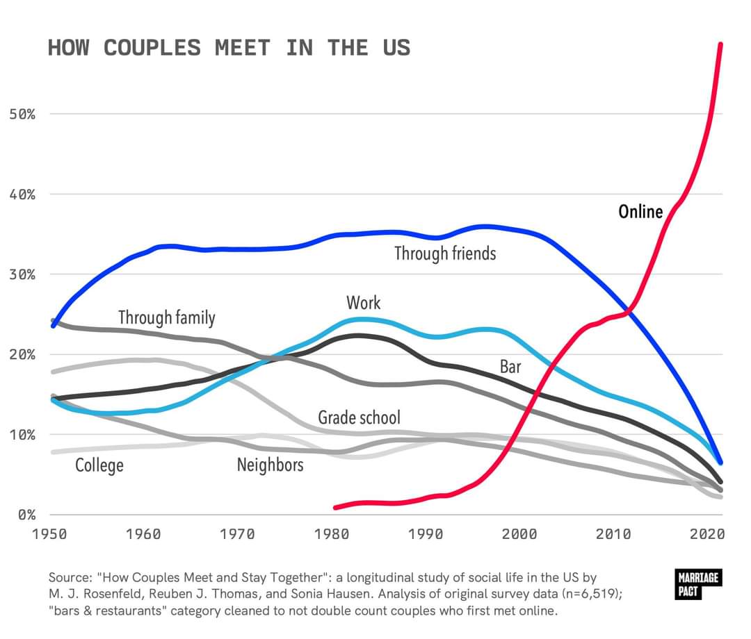
Unclear what study that is referencing, but it's notable that Michael Rosenfeld is also the first listed principle investigator in the study referenced in the OP, likely part of the same project, since they list updates for every few years (How Couples Meet and Stay Together (HCMST) 2017, 2020, 2022, United States). Also unclear who compiled the graph or where it was originally published. I want to reiterate that this study itself seems to very much not line up with the graph, unless I'm misreading it very badly.
The BBC article is about a book, Modern Romance, and the book makes a claim that 35% of Americans met their spouses online ("respondents who married between 2005 and 2012"). This checks out with the cited source study, which makes an identical claim, though there's reason to be suspicious of it since it was funded by eHarmony. The scope there is a little different than "all couples", but it's still a very different number than what is in either this article's graph, or in the OP graph, which are very different from each other as well (saying the number reached 70% by 2009 vs saying it reached 60% by 2020. I would think that if these graphs are genuinely based on research by Michael Rosenfeld that they would at least check out with each other.
Here's what I think is probably going on here: people working for the marketing departments of dating apps fabricate bogus graphs, falsely attribute their source to real studies, and push them on social media to go viral. Then people writing articles like the one you linked about the subject copy paste those images without checking them, because it's just a fluff piece for a recently published book and they don't have much time to spend on it.
Where did you originally find the OP image?
Edit: Just noticed that the second graph is specifically about same-sex couples.
Sorry for removing the comment you just replied to. I didn't realize I had grabbed the wrong graph from the article.
You could be right. I believe I found the original image circulating on reddit or tumblr (it was a few days ago).
I haven't had the opportunity to read your link directly to the study yet.