this post was submitted on 30 Oct 2024
546 points (92.8% liked)
Technology
69946 readers
3105 users here now
This is a most excellent place for technology news and articles.
Our Rules
- Follow the lemmy.world rules.
- Only tech related news or articles.
- Be excellent to each other!
- Mod approved content bots can post up to 10 articles per day.
- Threads asking for personal tech support may be deleted.
- Politics threads may be removed.
- No memes allowed as posts, OK to post as comments.
- Only approved bots from the list below, this includes using AI responses and summaries. To ask if your bot can be added please contact a mod.
- Check for duplicates before posting, duplicates may be removed
- Accounts 7 days and younger will have their posts automatically removed.
Approved Bots
founded 2 years ago
MODERATORS
you are viewing a single comment's thread
view the rest of the comments
view the rest of the comments

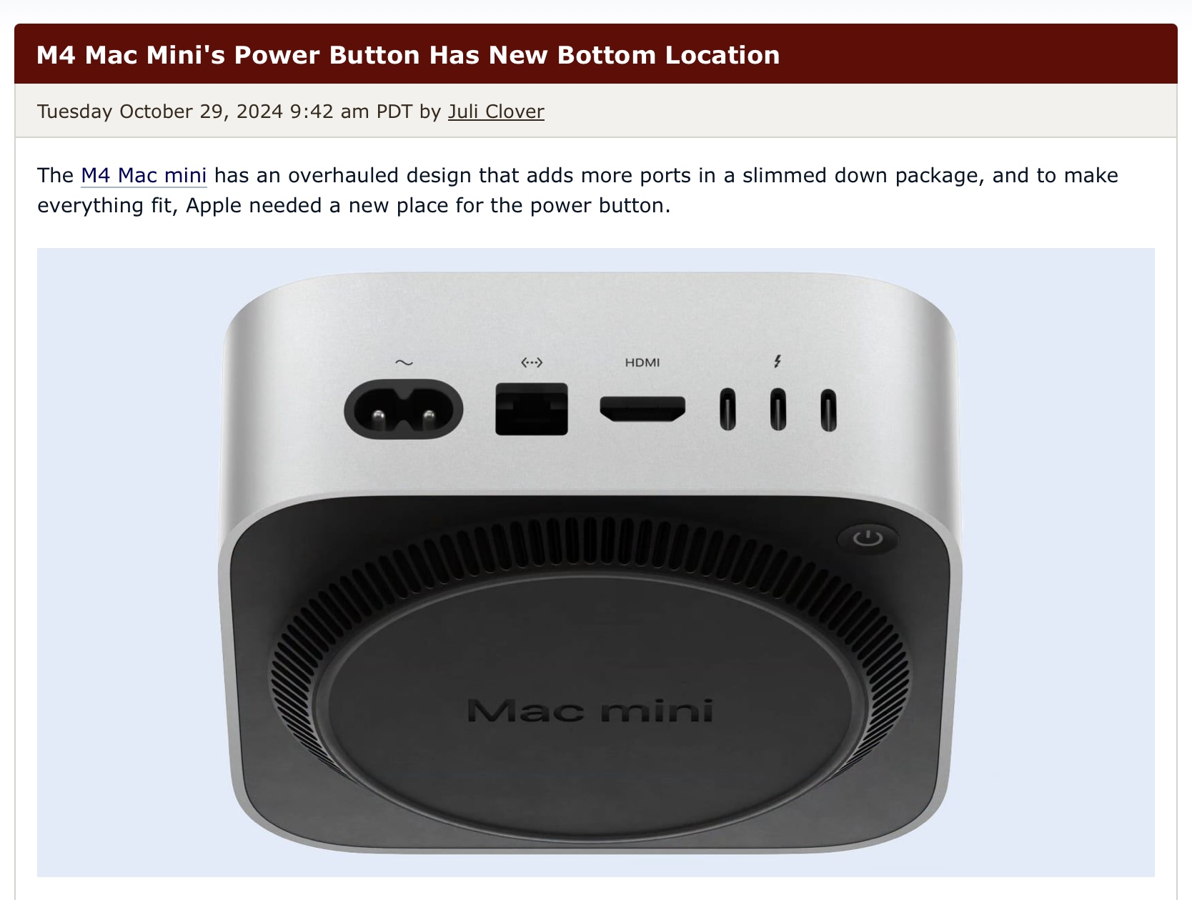
Why can't they put the power button on the front where it belongs. It's already stupid that they put it on the back, putting it on the bottom is downright idiotic. If they don't want to mess up the oh so important Apple aesthetic just make it an invisible touch button or something. Apple hates usability.
Yeah, make the logo a button or something.
For you to put your nasty fingerprints all over it?? I don't think so
Every person I have ever met that uses an iMac for the first time naturally assumes that the Apple icon is the power button. Fact that it isn't the power button is utterly idiotic
Then people would complain there's no sign of a power button.
Desktop macs (not tower macs) has had the powerbutton on the back for decades, it's fine, bottom is shit though....
Back is already bullshit. We have a few trashcan mac pros at work and usually they’re just turned so all the cables stick out towards the user because then you can easily reach the power button. Which makes it look worse than just having a power button in an accessible place aka the front or the top in the first place.
Yeah, I can see that, I was just trying to say that there Mac followed a standard
You realize how ironic your suggestion is right ?