this post was submitted on 02 Dec 2024
185 points (94.7% liked)
Fediverse
36386 readers
416 users here now
A community to talk about the Fediverse and all it's related services using ActivityPub (Mastodon, Lemmy, KBin, etc).
If you wanted to get help with moderating your own community then head over to !moderators@lemmy.world!
Rules
- Posts must be on topic.
- Be respectful of others.
- Cite the sources used for graphs and other statistics.
- Follow the general Lemmy.world rules.
Learn more at these websites: Join The Fediverse Wiki, Fediverse.info, Wikipedia Page, The Federation Info (Stats), FediDB (Stats), Sub Rehab (Reddit Migration)
founded 2 years ago
MODERATORS
you are viewing a single comment's thread
view the rest of the comments
view the rest of the comments

Yep. You essentially summed up my point.
There's a difference between data display for academia and data display for the general public.
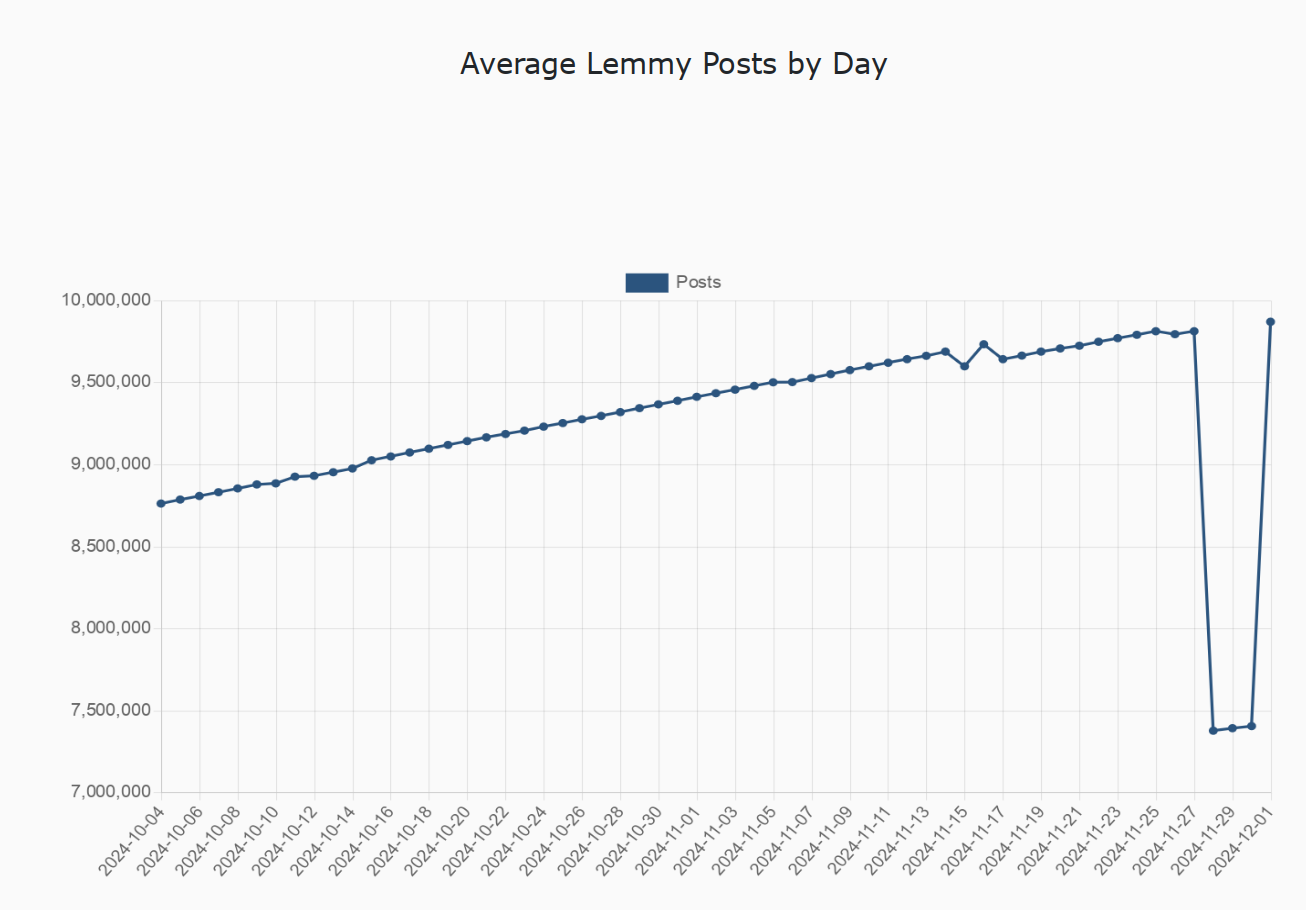
The general public is generally not well educated on understanding the data that's presented to them. Big change in line up or down regardless of scale means big change. It could be from 100 to 100.8, but if the scale is zoomed in then that could be presented as a +80% change.
And often is and sometimes with the axes removed and shown on the news specifically to be manipulative.
I really don't understand why I'm being downvoted above.... This was literally part of my grade school education on identifying and avoiding misinformation. And later on, around how the general public understands data visualizations. They are largely understood at a glance and taken at face value without reading the axes.
This is a easy way to push misinformation. Not by actually pushing real misinformation but by taking advantage of the general public's tendency to not read it carefully.
Which is manipulative. Which is why it's taught in some places as part of the standard educational curriculum...