this post was submitted on 12 Oct 2023
1064 points (91.4% liked)
Crappy Design
2998 readers
7 users here now
Noticed that theres no equivalent to r/crappydesign here yet so i made one
founded 1 year ago
MODERATORS
you are viewing a single comment's thread
view the rest of the comments
view the rest of the comments

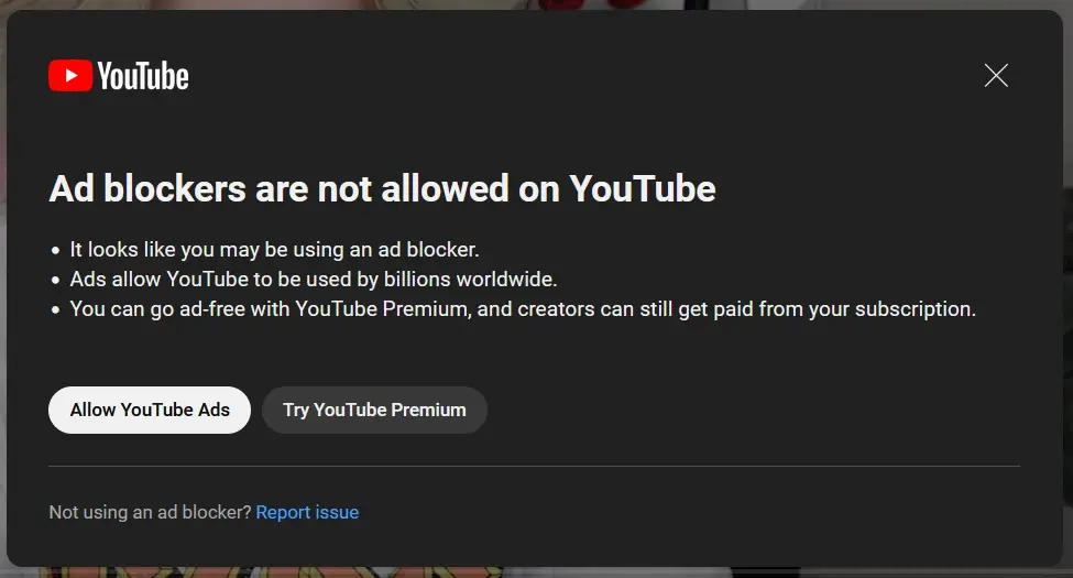
I'll be that guy and say this isn't crappy design and shouldn't be in this community. We've already got posts filling top of all we don't need more where they don't belong.
yeah, this is a policy OP doesn't like, not bad design
Ads are crappy by design. I think the spirit of the community is upheld with this post.
Even excusing the policy, the design is actually pretty shit though. We're all just used to it so it feels default and normal.
That's fair. I agree, it's mediocre at best.
While this is a policy I don't like, it's also something that is purposely destroying the usability of the Internet. Which I think constitutes a bad design.
I would argue that pop-ups like this are an intentionally crappy design meant to be frustrating and get in the way. But, I understand what your saying, this is perhaps not the best suited community for this post.
I think the difference here is I view "crappy design" as something badly made or poorly executed. What you describe I would consider to be "asshole design": perfectly well-made, but with bad intentions. I can see why you would have the different definition though, and considering the Reddit subs had a lot of these same definition issues it's not surprising they continue here.
Unsolicited ads are implicitly anti-user, especially when they impede or interrupt access to content.
I'd say it's an ok design to enforce a crappy business model