this post was submitted on 01 Nov 2023
258 points (97.1% liked)
Data Is Beautiful
8574 readers
1 users here now
A place to share and discuss data visualizations. #dataviz
founded 4 years ago
MODERATORS
you are viewing a single comment's thread
view the rest of the comments
view the rest of the comments

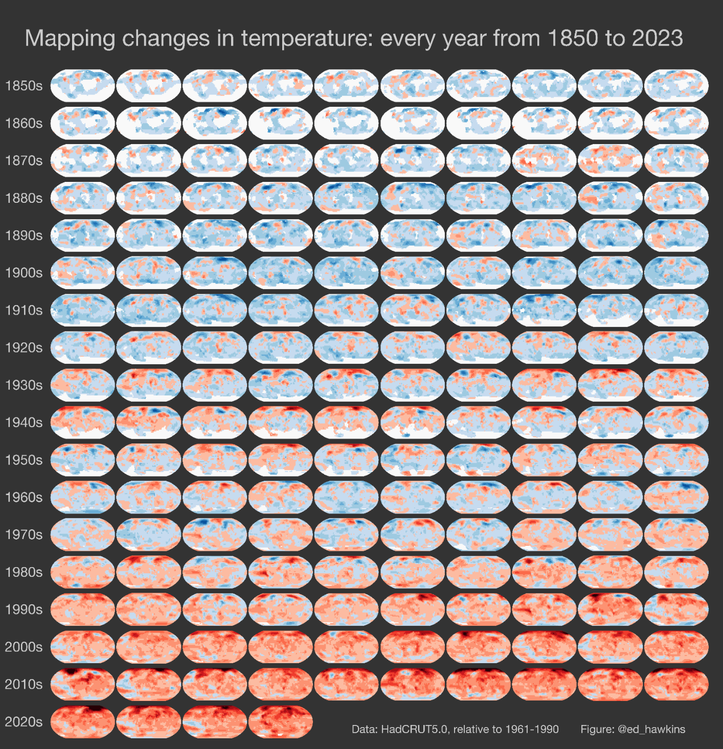
Relative scale is worse. Not only that the temperatures keep going up and aren't a fixed "red", but that there's few to no blues now, meaning it's always going up everywhere. And this is actually a more calming way to present it that the usual exponential spike chart.
We need a color that's more alarming than red to switch to next