this post was submitted on 02 Dec 2023
588 points (94.1% liked)
Microblog Memes
8695 readers
3835 users here now
A place to share screenshots of Microblog posts, whether from Mastodon, tumblr, ~~Twitter~~ X, KBin, Threads or elsewhere.
Created as an evolution of White People Twitter and other tweet-capture subreddits.
Rules:
- Please put at least one word relevant to the post in the post title.
- Be nice.
- No advertising, brand promotion or guerilla marketing.
- Posters are encouraged to link to the toot or tweet etc in the description of posts.
Related communities:
founded 2 years ago
MODERATORS
you are viewing a single comment's thread
view the rest of the comments
view the rest of the comments

I think at one point a cursive S was "draw an S without lifting your pen from one letter to another" so it comes out looking a bit like an 8. Then the top loop got smaller and smaller, until the one guy who codified the cursive alphabet just didn't put the top loop on at all.
This same guy for some reason decided capital Q should look like a 2.
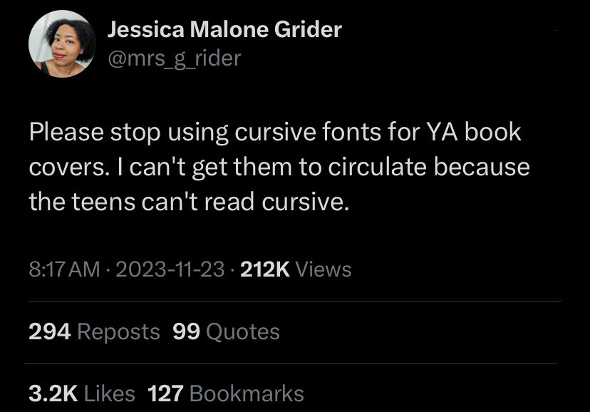
If I were in charge of the curriculum, students would get an introduction to cursive and an afternoon playing with it, basically so they can recognize it as a "font" and read it. Then let them continue to print or more likely type their work.