this post was submitted on 17 Jan 2024
31 points (100.0% liked)
Map Enthusiasts
3487 readers
10 users here now
For the map enthused!
Rules:
-
post relevant content: interesting, informative, and/or pretty maps
-
be nice
founded 2 years ago
MODERATORS
you are viewing a single comment's thread
view the rest of the comments
view the rest of the comments

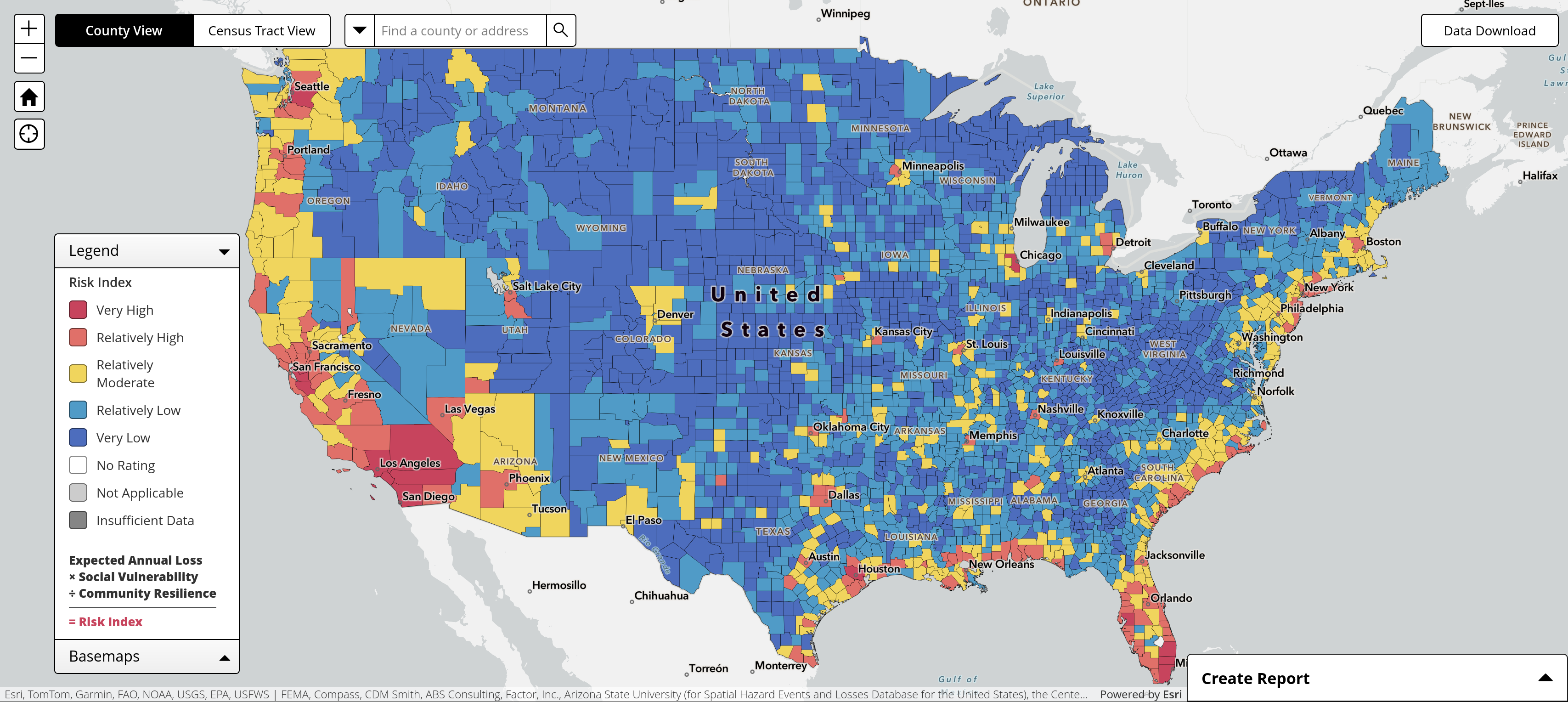
This looks suspiciously like a population density map.
Apparently the calculation includes "Social Vulnerability", which looks very much like a population map. Which is probably why my city is yellow due to winter weather even though the surrounding counties are blue.
Yeah they should really call it the Disaster Risk Index because hazards are only part of the disaster equation, the other part is vulnerability.
A tornado in the ocean isn't a disaster.
Buffalo, eh?