this post was submitted on 24 Feb 2024
14 points (100.0% liked)
Unixporn
15368 readers
1 users here now
Unixporn
Submit screenshots of all your *NIX desktops, themes, and nifty configurations, or submit anything else that will make themers happy. Maybe a server running on an Amiga, or a Thinkpad signed by Bjarne Stroustrup? Show the world how pretty your computer can be!
Rules
- Post On-Topic
- No Defaults
- Busy Screenshots
- Use High-Quality Images
- Include a Details Comment
- No NSFW
- No Racism or use of racist terms
founded 5 years ago
MODERATORS
you are viewing a single comment's thread
view the rest of the comments
view the rest of the comments


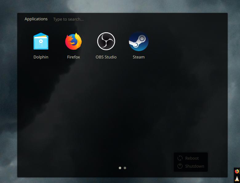
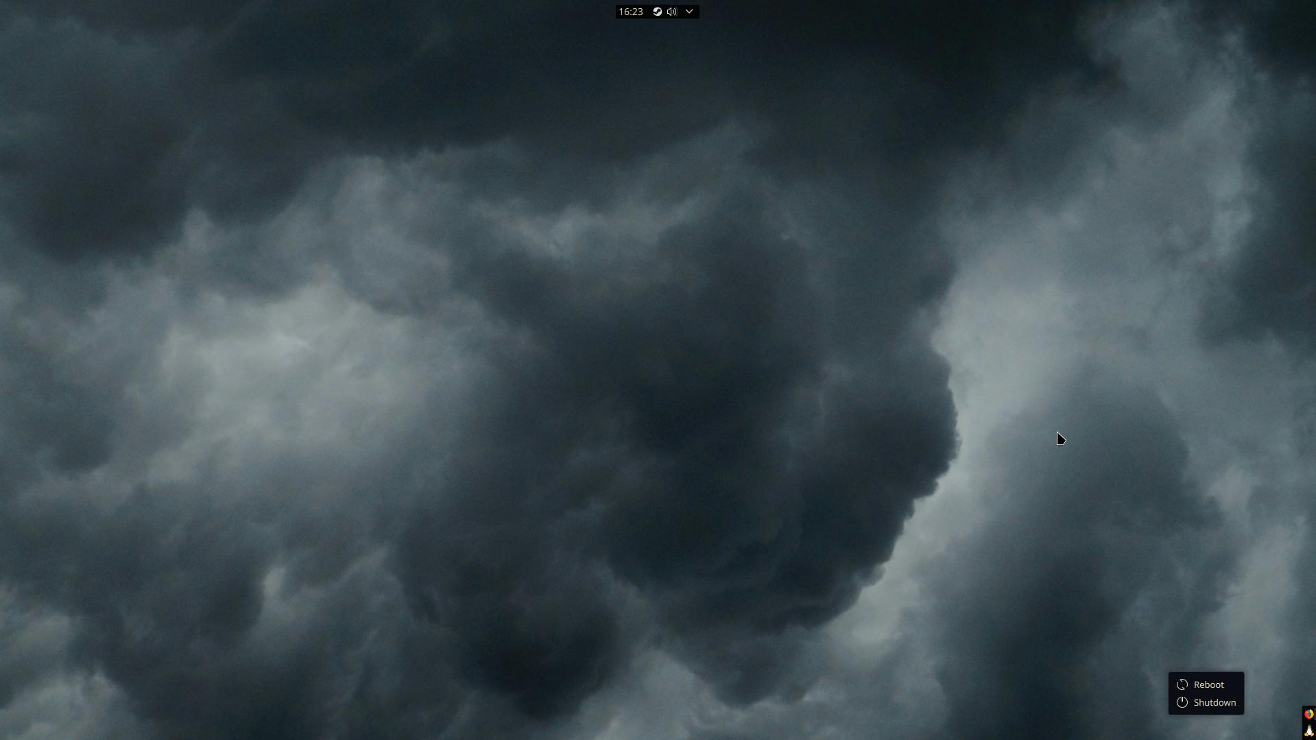
I use Plasma with a similar concept as yours, with two bars serving the same purposes.
My vertical icons-only bar goes in the lower-left, has chunkier, more glance-able icons (since pixels on the x-axis are plentiful) and this bar reserves its space from maximized windows. Think part WindowMaker/NextStep and part Unity.
Then a fully-opaque longer horizontal bar in the top-right with tray icons, a clock and a few hardware toggle widgets. Critically, like yours this toolbar stays on top of all windows (to make better use of my y-axis pixels), and my window decorations have left-aligned buttons and titles so max-height windows rarely have their titles cut off by the bar.
How did you achieve this? Custom code?
Nope, just saying I don't use any transparency for my panels. I don't mind it overlapping and hiding part of the window bar because the important stuff is all on the left side of the bar.
Sorry, I'm just a dummy and my brain sometimes swaps the meanins of opaque and transparent in my head. xd
Hah! All good, I know exactly what that one feels like!