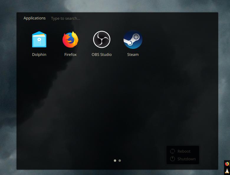
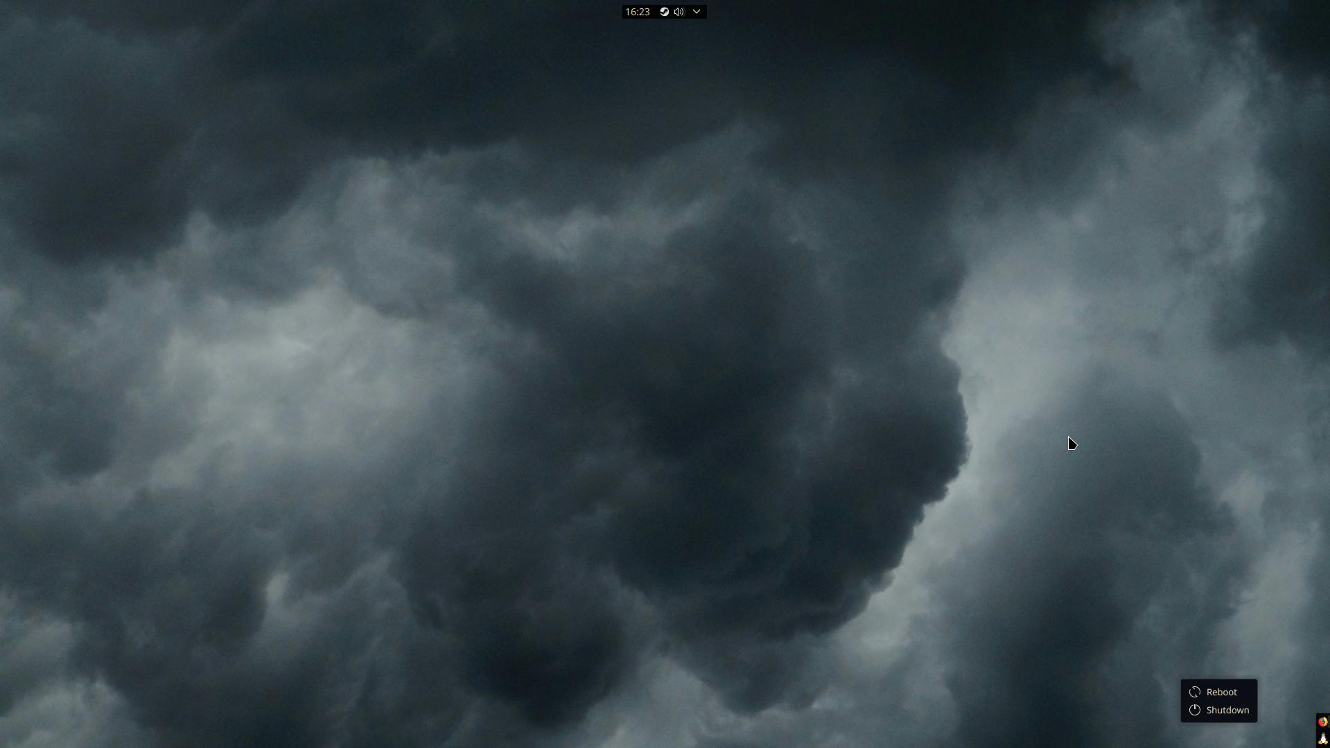
I use Plasma with a similar concept as yours, with two bars serving the same purposes.
My vertical icons-only bar goes in the lower-left, has chunkier, more glance-able icons (since pixels on the x-axis are plentiful) and this bar reserves its space from maximized windows. Think part WindowMaker/NextStep and part Unity.
Then a fully-opaque longer horizontal bar in the top-right with tray icons, a clock and a few hardware toggle widgets. Critically, like yours this toolbar stays on top of all windows (to make better use of my y-axis pixels), and my window decorations have left-aligned buttons and titles so max-height windows rarely have their titles cut off by the bar.

