Finland dataset
Edit: final update for the viz, comments started with this
A place to share and discuss visual representations of data: Graphs, charts, maps, etc.
DataIsBeautiful is for visualizations that effectively convey information. Aesthetics are an important part of information visualization, but pretty pictures are not the sole aim of this subreddit.
A place to share and discuss visual representations of data: Graphs, charts, maps, etc.
  A post must be (or contain) a qualifying data visualization.

  Directly link to the original source article of the visualization
    Original source article doesn't mean the original source image. Link to the full page of the source article as a link-type submission.
    If you made the visualization yourself, tag it as [OC]

  [OC] posts must state the data source(s) and tool(s) used in the first top-level comment on their submission.

  DO NOT claim "[OC]" for diagrams that are not yours.

  All diagrams must have at least one computer generated element.

  No reposts of popular posts within 1 month.

  Post titles must describe the data plainly without using sensationalized headlines. Clickbait posts will be removed.

  Posts involving American Politics, or contentious topics in American media, are permissible only on Thursdays (ET).

  Posts involving Personal Data are permissible only on Mondays (ET).
Please read through our FAQ if you are new to posting on DataIsBeautiful. Commenting Rules
Don't be intentionally rude, ever.

Comments should be constructive and related to the visual presented. Special attention is given to root-level comments.

Short comments and low effort replies are automatically removed.

Hate Speech and dogwhistling are not tolerated and will result in an immediate ban.

Personal attacks and rabble-rousing will be removed.

Moderators reserve discretion when issuing bans for inappropriate comments. Bans are also subject to you forfeiting all of your comments in this community.
Originally r/DataisBeautiful
Finland dataset
Edit: final update for the viz, comments started with this
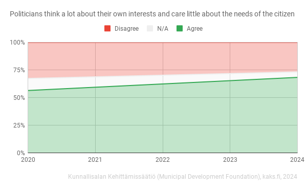
Probably because of the statement form? I couldn't decide if it should be converted to a question... Or something with the visual?
The visual, neutral looks like no graph, and coloured parts have one of their sides highlighted. It looks like there are two independent graphs stacked on top of each other
100% stacked charts are stacked for a reason, but would reordering the answers and switching to columns help?
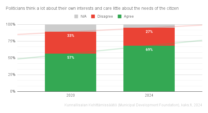
I like this format the best of the three charts you posted here. Something about stacking them in order from smallest to biggest makes more sense
Yeah I like how it got upgraded with new ideas
Trend lines and data labels?
Big yes to those data labels! The trend lines don’t tell much of a story when there’s only two points along the x-axis. Actually the red trend line is confusing since it trends up I’d expect “more” of a disagree but the data labels show there were 5% less disagree.
Certainly, columns will even be clear without reordering. Also, darker shade of grey for n/a would be good, maybe, but here it is already much easier to understand that it's not background