this post was submitted on 27 May 2024
170 points (92.1% liked)
Data Is Beautiful
6909 readers
1 users here now
A place to share and discuss data visualizations. #dataviz
(under new moderation as of 2024-01, please let me know if there are any changes you want to see!)
founded 3 years ago
MODERATORS
you are viewing a single comment's thread
view the rest of the comments
view the rest of the comments
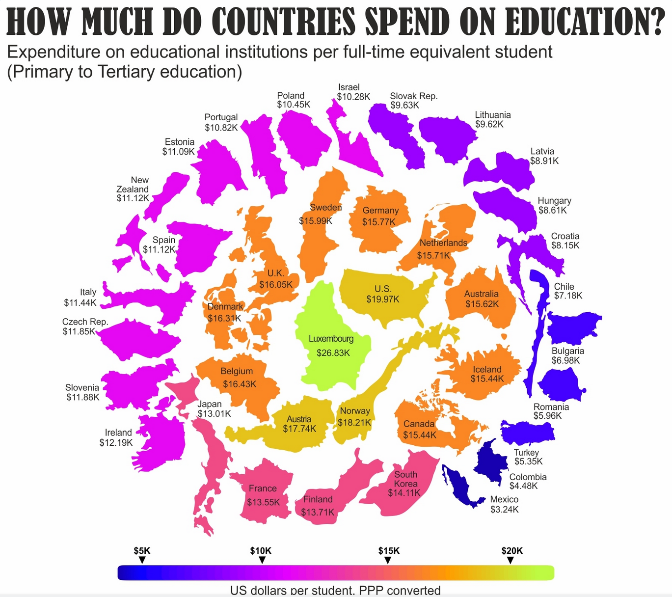
Primary to tertiary? Does that mean it includes what college students through grad school spend themselves? Because that would shift perception of this a lot.
Edit: The original data does include public funding and private funding:
They do break it out, but I can't tell if the graphic is using the total or just the public funding.
So this graphic might just be: Americans spend a stupid amount on college.