Remember, just because the money is spent, it doesn't mean it is spent well. I'm sure a lot of the US dollars are fed into sports programs and other spending, and not directly towards efforts that would benefit the most students or workers.
this post was submitted on 27 May 2024
170 points (92.1% liked)
Data Is Beautiful
6909 readers
1 users here now
A place to share and discuss data visualizations. #dataviz
(under new moderation as of 2024-01, please let me know if there are any changes you want to see!)
founded 3 years ago
MODERATORS
Yeah, also salaries are wildly different between these countries. This is a really not apples to apples
This is PPP (purchasing power parity), so that gap should be corrected at least partially
Nah, that spins average income. US teachers are paid so low it's like victimization.
You're right, teacher salaries are lower in the US than many of these countries.
Montana starting teacher salaries are on par almost with Luxembourg teens working the first day of their first job. One of these needs a 4yr degree and the trust to work with developing minds; can you spot which one?
I'd wager that most school districts in the US have significantly more money spent on transportation than in other countries as well
For example, Austria is notorious for producing desastrous results in any metric (standardized tests, teen Analphabeten...) in relation to its spending on education.
The Hungarian numbers are inflated by religious schools, secular schools only would be in the very end, also we're forcing very old and inefficient teaching methods on our teachers, so old people can jizz their pants seeing kids not having free time to play outside (which they also complain about of course), and we also have a massive corruption problem (renovations, etc., cost way more they should because we need to make the prime minister's childhood friends billionaires).
I'd much rather look a simple sorted table or a bar chart.
For me the country outlines don't add anything of value and they aren't too scale either with arbitrary rotations mixed in. Spending is on a strictly one dimensional scale yet the graphic implies some concentric (2-dimensional) pattern.
I agree. Standard bars are boring, and it's not bad to liven them up, but there are a lot of different ideas layered one over another with a little connection to data representation or increasing readability (also heatmaps with strict color gradations, false grouping, distance from center breaks at the bottom level mixing different colors). But nailing visuals without trying things out is impossible. OP got feedback they can put to use in the future.
Critically checking the graph after each step could've make it easier even for them. Had it become better in some way with X? If no, let's scrap it and try something different.
Just to make things clear, this post is not OC, I did not create the infographic
But it sorta looks like a human brain if you squint.
aren't too scale
They're very scale, but not too scale. Good point.
Gotta give it up for the UK and US proving how institutionally corrupt their public services are!
I think with the US, it comes down to that number being an average and how big the spread is between states. North East and West Pacific states spend WAY more than South Eastern, but it averages out to something seemingly reasonable.
Oh good, another thing Americans spend more than almost anyone else on and get worse results.
USA is huge and education is largely decentralized. Results are ALL over the place.
USA would probably be better if it were like 4-10 different countries....well, some of it at least.
New England Cascadia California Breadbasket States of America Gilead
I'd like to see the America stat divided up further to represent red vs blue states educational spending.
The US spends more on public education than multiple states where it's basically free for everyone. Now take a moment and appreciate how badly you are ripped off.
Just like healthcare...there are very few cases where replacing a societal motivation with a profit motivation results in better service or lower costs.
very few
Well, okay. Zero is very few.
Most private education in the US is nonprofit. The for profit institutions are generally not well thought of.
Israel's outline is sketchy to say the least...
Finland is way lower than I expected and they apparently have the best primary and secondary education systems outside of the East Asian countries
Part of that is because private education there is not a thing. So some of the funds that would go to for-profit education at the expense of public schools instead goes into taxes to more efficiently fund education.
As it should be. More accessible, cheaper through consolidation, people make more and pay more taxes, and repeat.
It also prevents use of education to enforce class divisions.
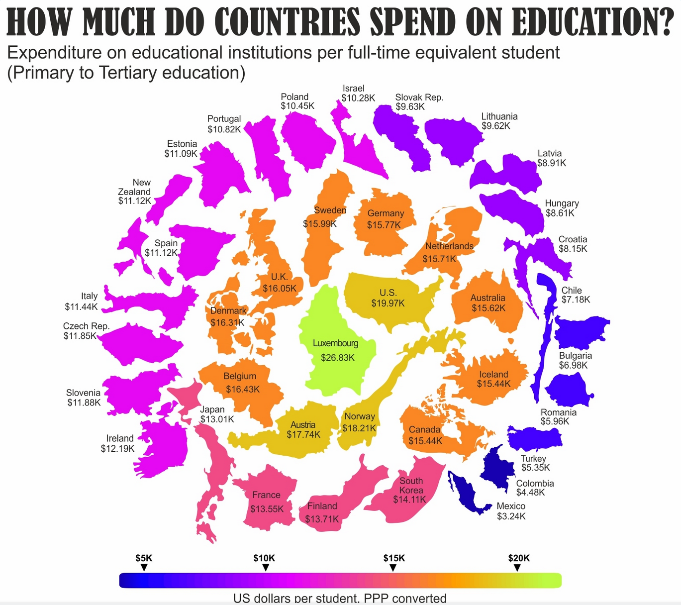
Primary to tertiary? Does that mean it includes what college students through grad school spend themselves? Because that would shift perception of this a lot.
Edit: The original data does include public funding and private funding:
Every year, governments, private companies, students and their families make decisions about the financial resources invested in education.
They do break it out, but I can't tell if the graphic is using the total or just the public funding.
So this graphic might just be: Americans spend a stupid amount on college.
LMAO Greece isn't even there
Am surprised to see Australia rates highly. 40% of students don't know it takes about a year for Earth to orbit the Sun.
I would guess that half the population doesn't understand compound interest.
I would also guess only 5% could describe the scientific method, 1% could describe the use of normal distributions.
I would guess that 20% of locally born Australians would not know how to use punctuation or grammar for clear expression.
Is this a worldwide trend? The rise of flerfers suggests it is.
Yeah, data can be beautiful - but is ugly if presented misleadingly. Only very little can be concluded from this 'graph' (without sources btw), but it is presented as if the inner west are the great core of enlightenment, spiraling out to the 'dumber' nations. The level of knowledge excellence is obviously related to the amount of dollu spent - which is nonsense. My equally valid opinion is that Western liberal/Capitalist education is exceedingly inefficient, and only optimized for wage-slavery. Notice how all the super 'edumecated' citizens from the west have been so easily propagandized to think that Russia is the bad guy. ..China is the bad guy ..socialism is bad ..communism evil ..Capitalism GREAT! We are the best!! ..and so on and so on with similar infantile propaganda from the Capitalist elite. The average intellects in these 'educated' western nations is Embarrassing, and misinformation from constant propaganda doesn't help much i'm afraid..
without sources btw
The source is the OECD report, mentioned in the article linked in the body of the post: https://www.oecd-ilibrary.org/education/education-at-a-glance-2023_e13bef63-en;jsessionid=Nwj9hwVlYhHg_5CpjLm00wyws3HlwUqKzRpJLk2T.ip-10-240-5-115
In this article, we’re going to delve into some of the data from the OECD’s report.
I'm from Hungary, can comfirm, ~~it's shit here~~ it could be better.
I guess when you consider that citizens of rich capitalist countries have to throw away so much of their income in commodified and privatised education, I guess that it is possible that countries like  can spend near the top.
Canadian average is about 1 or 2 thousand less than that from the last info I could find a few weeks ago
Was that info also with purchase power parity? Might explain the difference
Why is it in thousands of $? Should be measured in % of GDP
The % of GDP is available in the link in the post body