something more suggestive
Hey, @Jimbo@yiffit.net - if you're still in the mood to place some pixels, want to add a tube of lipstick and/or a knotted rope over there somewhere? :3
Yiffit chat! Talk about anything you want here.
Mention @chat@yiffit.net from your favorite Fediverse / Mastodon client to post here directly, or post directly via any Lemmy instance.
Community Icon (CC-BY-NC-SA) Tom Fischbach
something more suggestive
Hey, @Jimbo@yiffit.net - if you're still in the mood to place some pixels, want to add a tube of lipstick and/or a knotted rope over there somewhere? :3
Sure, there's a little space left around the icon, perhaps a small knotted rope diagonally between the yiffit.net text and the kiwi lazer?
I like it!
I'm not sure where to start with this one, if you have any design in mind let me know :3
🪢
How to pixel art knot
If we go with the knot emoji idea, there's this one: 
In fact, we can fit both emoji in that spot:
Maybe putting a black background the knot would make it pop more.
Oh yeah I see! Pops okay on white to my eye. I'll be sure to place some pixels uwu
It's subtle but that's what makes it fun. Someone who doesn't 'know' could see it and think nothing of it. Then they can make the connection and have an "Omg eww!" moment. ;)
Honestly I'm a little lost on the significance of the lipstick lol, is it just supposed to represent red as in red knot?
Lipstick, red rocket...
Yeah, the lipstick is even less subtle than the knot, really. That emoji is probably used more to refer to a dog's penis than for whatever its actual intended purpose was.
I don't spend much time on social media, but I don't think I've ever seen the lipstick emoji used. Intuition would say the fashion world using it would greatly outpace the furry world using it.
Edit: eggplant and peach on the other hand...
Oh right I vaguely recall that now, haha. Not used much around my circles I guess.
Also .nz wants their laser lol
Their laser isn't even straight, clearly they didn't care about it too much. That and, it goes behind everything else, so it'd be weird if it went over a foreground object.
If you folks are bored after this is done, I'm going to add the charmander to the Pokemon Red/Blue area:
Oh hell yeah
Luv charmander
Can't find anyone on Matrix who's working on that person right above him; hopefully they won't object to the slight overlap. They didn't have their design outlined. :|
Ahh they'll be fine, if you've ever done Reddit's r/place that was alll overlap and wars lmao, so peaceful and respectful here
Far less people here. That's what makes this more fun, in my opinion. We'd never keep that furry installation unmolested on Reddit. Heh
Pleasure working with you both, @Jimbo@yiffit.net and @l_b_i@yiffit.net!
And to you, I'm done for a while I gotta sleep real bad. Feel free to reply later if there's anything else you'd like help with :3
Thought you might find this amusing (from the Matrix server):
Love it
@Jimbo@yiffit.net, @l_b_i@yiffit.net, @user224@lemmy.sdf.org
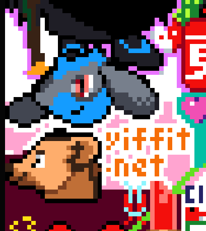
If any of you are in the mood to draw a bit more before it ends tonight, we started filling in the background of the furry corner with a maroon color, then the trans flag came in and started to fill things in, but it looks like it's mostly been abandoned, or at the very least isn't going to be finished or cleaned up before the event ends... Nobody's touched it for hours. Currently thinking we might try to finish filling this area maroon, ideally all the way up to the bottom of the character over the Riolu). Your yeen is looking a little sad at the moment and it'd be rad to give him(?) a cleaner background to live on.
Sorry, I was asleep already. I am in UTC+02:00.
No worries! Thanks for the help with all the stuff in that corner!
I was asleep as well, but looks like you got it sorted pretty good :3
All good! A bunch of furries came out of the woodwork and filled in a bunch of it. :)
How far are you planning to go with that background?
At least 1 pixel above the Pawb logo, and over to the green flag beside us (and around the small ace flag). I was originally going to just fill our entire little corner here, but the trans flag started popping up here after I started working on it, which is mildly annoying, but we can work something out, I'm sure.
I'm also repairing .nz's laser; if you're working on the trans flag, I've been trying to contact you via Matrix, you can reach me there. The laser is a few pixels off from where it should be (it's crooked); I have a template for it showing where it's going to be.
hmm, lemmy must be acting up, I don't see anything after your :
Are you on web or on an app? I've heard some apps have trouble with in-line images.
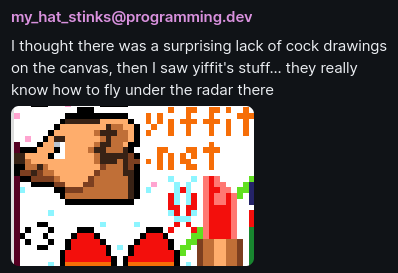
Someone posted a screenshot of the Yiffit area on the canvas (with the emojis we added yesterday), with the message "I thought there was a surprising lack of cock drawings on the canvas, then I saw yiffit's stuff... they really know how to fly under the radar there".
Default web client. The image is at http://pawb.social/pictrs/image/3628803c-c7c2-485b-ac99-a4d3b67b7c86.png, not https: The response in the browser is NS_ERROR_INTERCEPTION_FAILED. I don't know why pawb supports http: connections.
Huh, that's wild. Can you see this one, out of curiosity?

Yep, and I bet if you modify your original comment (add an s) I could see that too. And I think my_hat_stinks has outed themselves if they understand the references.
The original one was submitted from an app, whereas the latest one was submitted via web, so maybe that's the problem - the app seems to default to http://.
I blame @crashdoom@pawb.social (not really, They're doing a great job). I'm just surprised whatever app your using even supports http.
Here is the http version of your first image

Here is the https version of your first image. depending on your browser settings you will see one or two copies of the same image in this comment.

I only see one image in this comment.
And on the web client you can click the page looking button below a comment to view source. (raw markdown)
happy to help, thanks for the templates.
Its interesting the different renders for unicode. To me the unicode rope is a slanted to the right blue figure 8 with a slightly wavy line through the middle.
I mean, if there is enough people, sure. But it might just be better to help pawb out. BTW the name "Amne" won my poll for our Yeen's name. !meta@yiffit.net
ah, I knew there was a name for our yeen somewhere! Pawb.social seems to be just fine at the moment, I suspect they'll be done early based on their progress, assuming they don't have to defend their space much.
Here is the template of the icon above pawb.social:
Would it make more sense to have a uniform medium brown with a black nose and white eye?
As in brown (highlighted) rather than chocolate?

Testing out the colours and I'd probably say that's closest
At a glance I think that looks better.
I think we have a design sorted colours and all on the right:
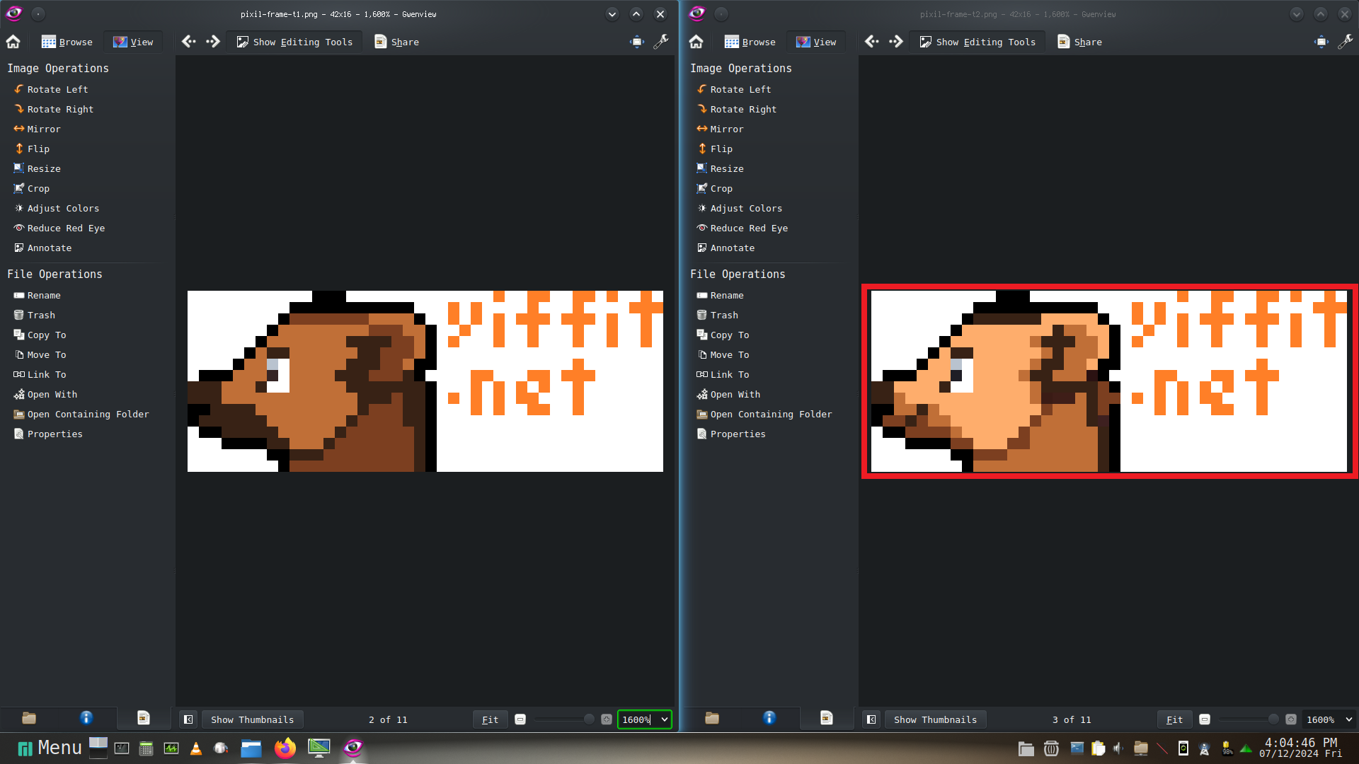
using peach as the main colour /u/user224@lemmy.sdf.org ?
You can probably keep the highlight on the ear. Use whats currently done as a baseline. The template should be updated though.
Template has been updated <3