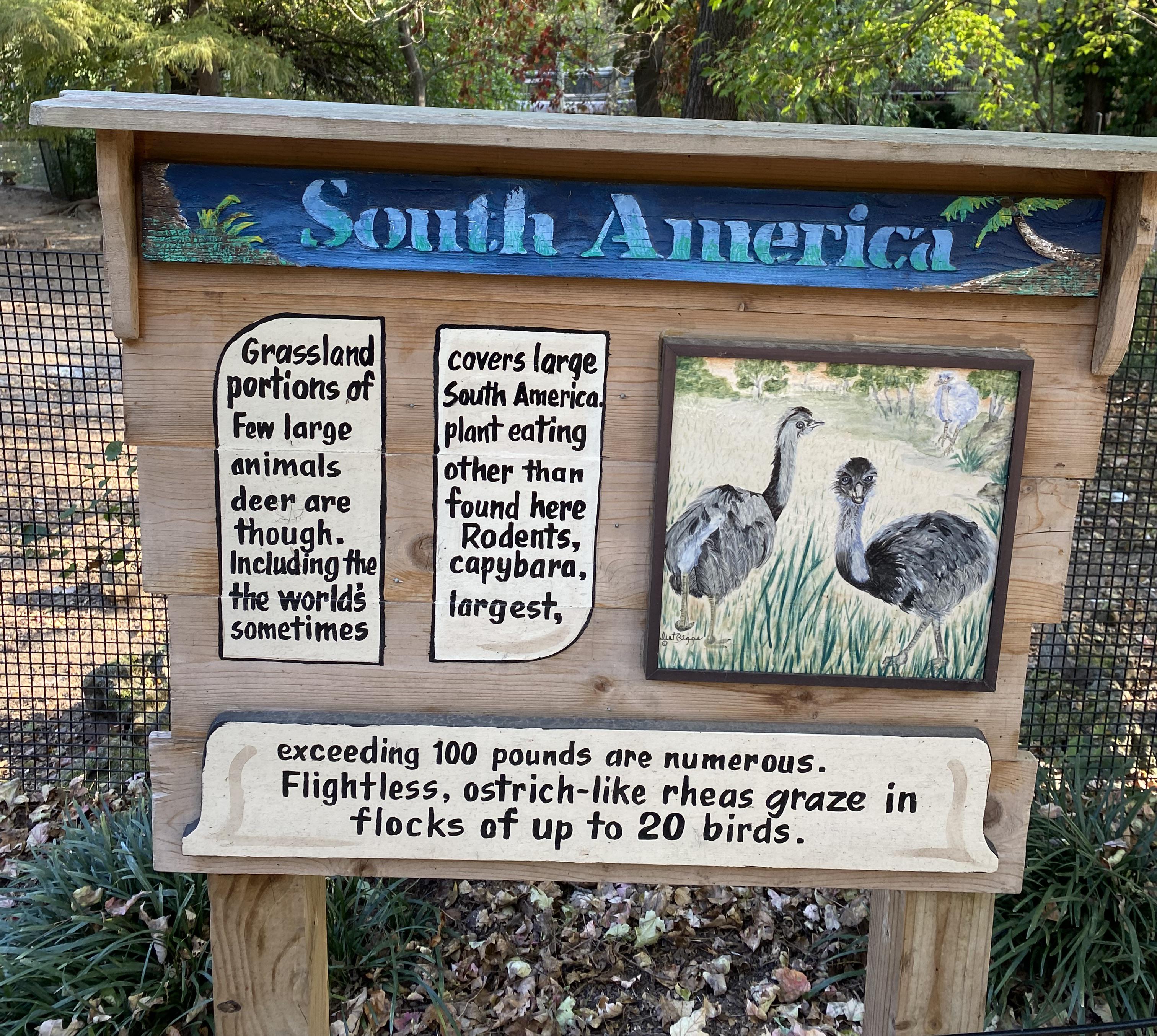
I can guess how they got here.
The original billboard had other information that fit into those three areas. At some point, they were painted over and new information squished into the space.
It's a little different than others of its ilk, I think. In all cases, these are people trying to fit words into discontinuous spaces, but usually they're spaces never meant to have text. In this case, I think the spaces were designed for text, just originally other text.
Interesting.
