So we chose to become death, the destroyer of worlds
Climate - truthful information about climate, related activism and politics.
Discussion of climate, how it is changing, activism around that, the politics, and the energy systems change we need in order to stabilize things.
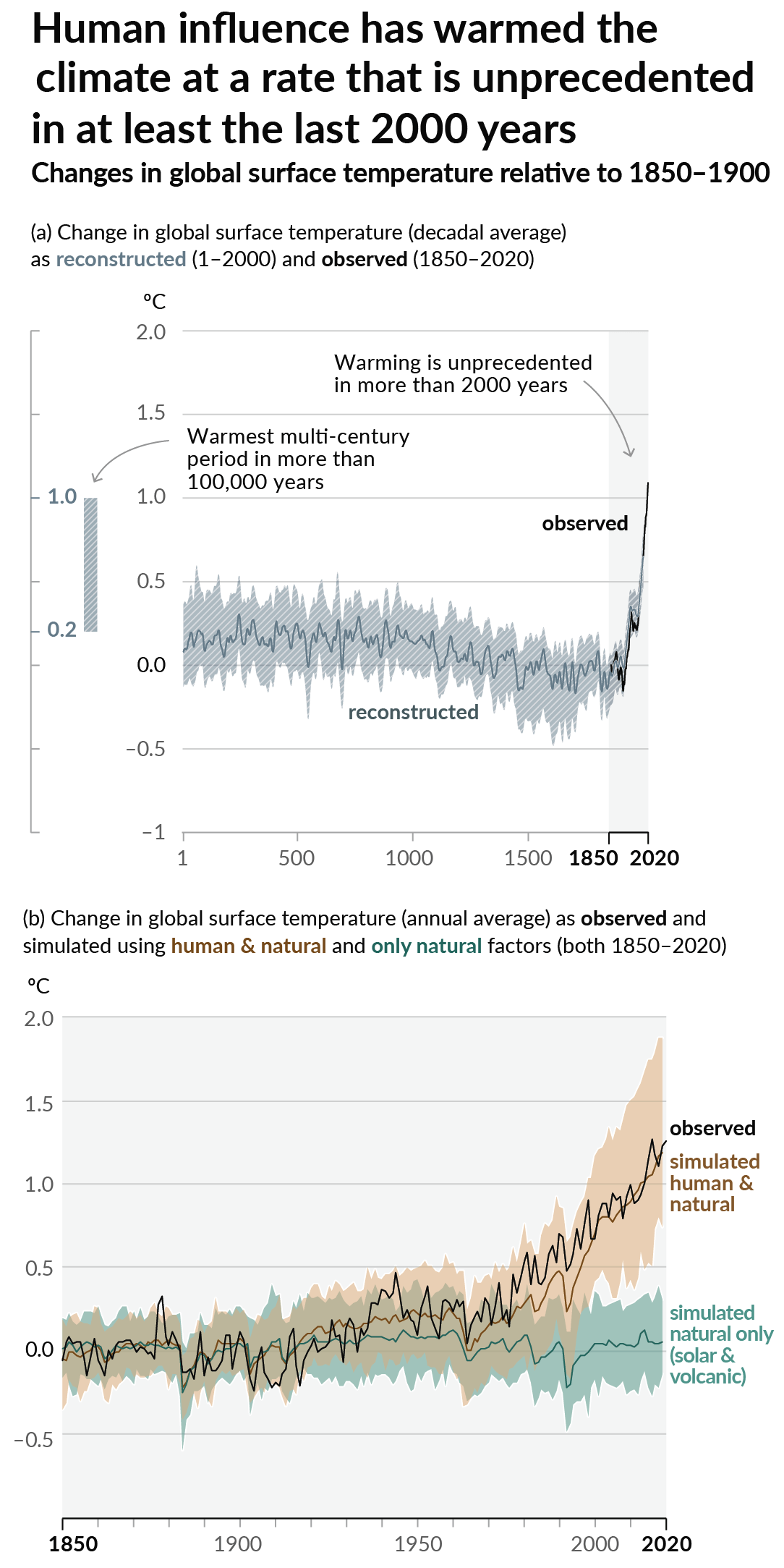
As a starting point, the burning of fossil fuels, and to a lesser extent deforestation and release of methane are responsible for the warming in recent decades:

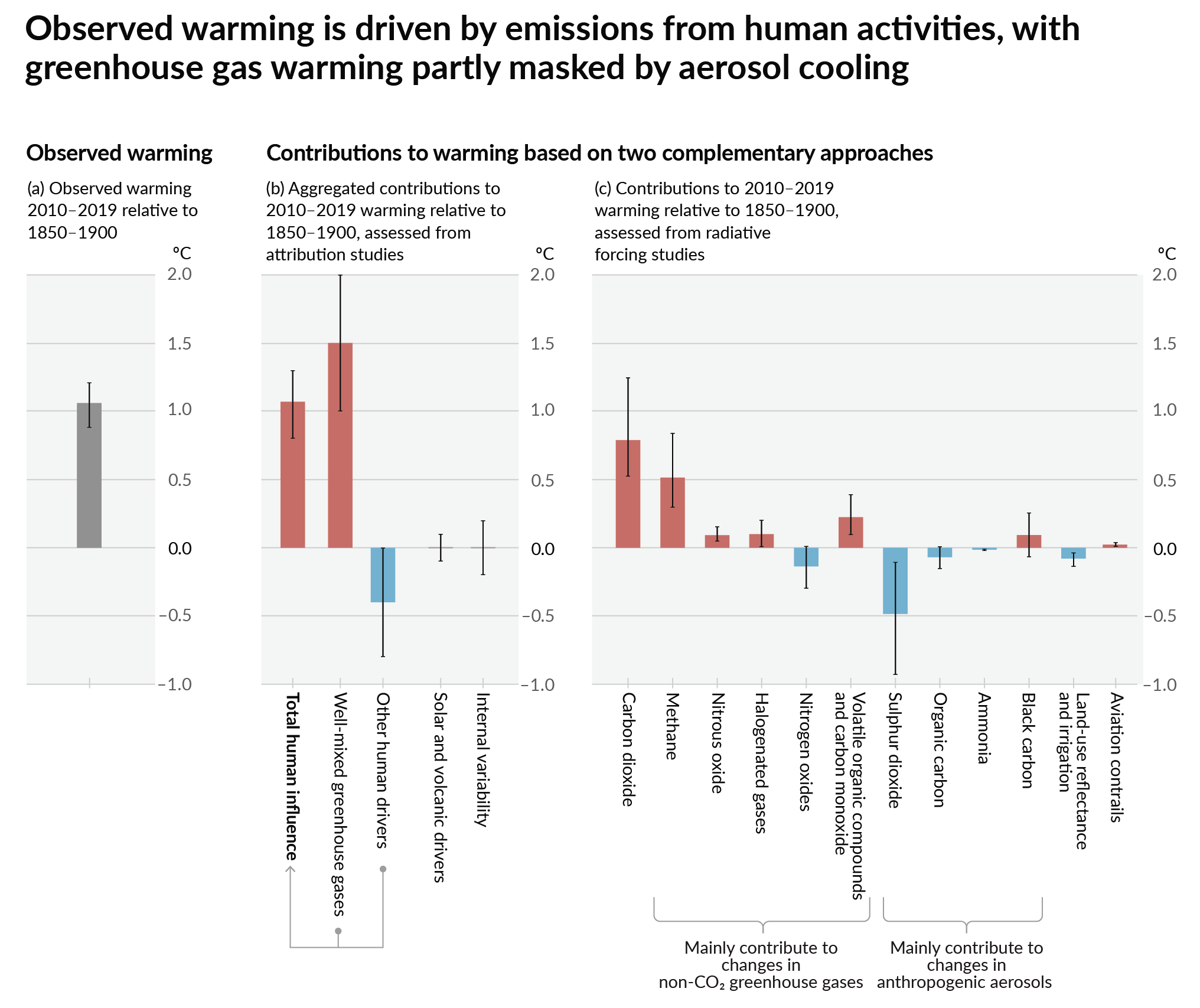
How much each change to the atmosphere has warmed the world:

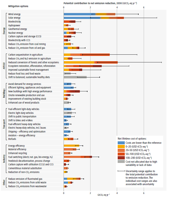
Recommended actions to cut greenhouse gas emissions in the near future:

Anti-science, inactivism, and unsupported conspiracy theories are not ok here.
Failure is a possibility, but so is success.
...so is success
Not if conservatives and their corporate backers have anything to say about it.
It's on us to stop them
Is this from one of the IPCC updates? Good visualization.
Forgive me for asking, but what about this makes it a good visualisation?
Maybe I just don't know how to read it, but this looks completely meaningless to me.
Several elements strike me.
It lays out options in a way that described the fork we are at. Asking the implicit question, are we going to turn left, go straight, or go right as I'd we are driving up a hill.
It also shows the shallow bumps in the road we have experienced and allows you to compare where we are going and how fast the hill has started climbing.
Now what is not great is the tags as it does not do great at explaining how the different scenario are derived and probability. That is pretty hard to do in a single infographic though.
