One vote action for all cross-post posts
this post was submitted on 01 Aug 2025
63 points (100.0% liked)
PieFed Meta
1574 readers
2 users here now
Discuss PieFed project direction, provide feedback, ask questions, suggest improvements, and engage in conversations related to the platform organization, policies, features, and community dynamics.
Wiki
founded 2 years ago
MODERATORS
Hmm, that is an interesting idea...
I might look into this one. Would something like voting buttons in the crosspost dropdown be an acceptable alternative? I think I would prefer to keep 1 action (click) means 1 vote, but making it easier to vote on crossposts makes sense with the way that piefed consolidates comments.
So, voting buttons here maybe? (no promises, just an idea) -
That's a fair point. I think in most cases I would want to be upvoting a post and all of its cross posts, but there are cases where I wouldn't want to upvote it in other communities.
For instance, a post that you like might get cross posted to something like c/facepalm. If you disagreed with that assessment, you wouldn't want your vote to be applied in that way.
load more comments
(5 replies)
👀
Easily upload and include images in comments. Right now you have to use a third party image hosting site, and add the URL in order to put images in comments.
Not sure about other apps, but Summit has an image upload button. They go to media.piefed.social
I would imagine hosting images would cost a fair bit. Perhaps they can have a premium option to fund it.
The website / PWA can't currently upload images.
Summit doesn't have deduplication yet.
Voyager can do it too, via PWA even. Don’t even need to press the upload button, simply copy and paste the image, it gets uploaded and included in the comment automatically.
load more comments
(4 replies)
load more comments
(4 replies)
Allow restricting posting and commenting to subscribers: https://lemmy.world/comment/18549782
My ideal default would be, users have to subscribe to vote, because drive-by downvotes are very common, and keep niche communities from getting anywhere in the All feed.
Another reason is to avoid the Reddit problem of people upvoting of off-topic posts by people who don't pay attention to what community it's posted in. I don't think Piefed/Lemmy/etc. has those kind of users (yet) but it's good future-proofing.
Currently the most popular suggestion is to have a "upvote this post and all it's cross posts” function, which would make that problem worse...
load more comments
(3 replies)
I think maybe only subscribers should be allowed to downvote, but anyone should be able to upvote
On the other hand, sometimes posts get traction because a lot of people upvote them from All
load more comments
(19 replies)
load more comments
(1 replies)
Please put the bookmark/save button on the thingy down there. There's plenty of room.
Other than that and some kickass themes, I think PieFed is ahead of the curve in the lemmyverse ATM.
Do you mean on the bar with the voting buttons instead of being behind the three dots menu?
Yup. We could make more room there by moving the collapse icon up to be near the author name?
load more comments
(1 replies)
load more comments
(1 replies)
Bring back pseudonymous voting agents. Literally the killer feature of piefed, killed by stupid forum politics.
I do not give a single goddamn fuck about brigading or vote manipulation whatever nonsense the fediverse admin cabal has convinced themselves matters on their discord stovepipe. Vites are not real. They cannot hurt you. I do not want my plaintext voting activity to be hoovered up by anyone listening to the activitypub feeds, which is already used to foster censorship and will inevitably be used to enable targeted astroturfing. Rimu, please be more brave about this.
Mark my words, this will be the "hindsight" issue a few years from now. "How the fuck did anyone think public voting was a good idea" will be the postmortem of the fediverse.
load more comments
(5 replies)
Create a clear description of Piefed on the about page or another relevant page to direct users there instead of the code repository or specific instances.
Many posts don't have a language selected so 'content language' preference should either allow selecting those, or a setting to reverse it turning it into a block list with all languages automatically selected, then allow the user to deselect his language to block the rest.
Allow voters to write their own choices in polls
If you implement the poll like this one, then they already can 😉
But it allows downvotes, which isn't supposed to be allowed in a poll.
load more comments
(1 replies)
Cross-posting text-only posts
This is planned for the 1.2 release (at least it is on the kanban board).
load more comments
(1 replies)
load more comments
(1 replies)
Allow user to view only votes from the instance they are using
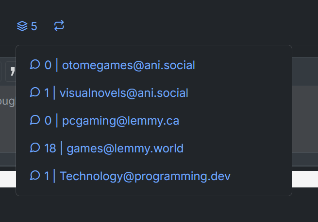
Somewhat related, it would be super interesting to get a breakdown of what the votes are like on a per instance basis. Maybe some sort of pie chart.
Oooh, vote stats. How many from community subscribers vs. not, from each instance, perhaps a timeline of when they came in, etc. Reddit had something similar.
load more comments
(1 replies)
Thanks devs for making piefed first of all I love the alternative.
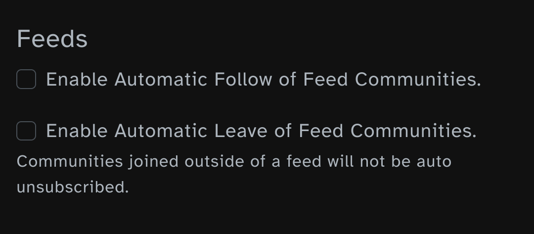
I really disliked these two options being enabled by default without informing me at the very least. I ended up subscribed to a bunch of stuff I didn't want to be subscribed to before I figured out what caused it initially when I first signed up.
Honesty I don't know why anyone would want that as default behaviour?
I'd like to sort communities by Top X amount of time, IIRC that was already in the works.
Native image upload support so I don't need an app / uploading to imgbb manually sucks on a phone.
Edit: if it's cost prohibitive to store media uploads even with file size limits I'd like more external options for image hosts than for example Summit app who only offers imgur as an alternative. Or let users enter a custom image hoster url or something.
I'd like to sort communities by Top X amount of time, IIRC that was already in the works.
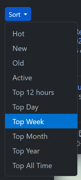
This is already live. If you are viewing a community, click Top in the bar and it should be a dropdown menu where you select the timerange:
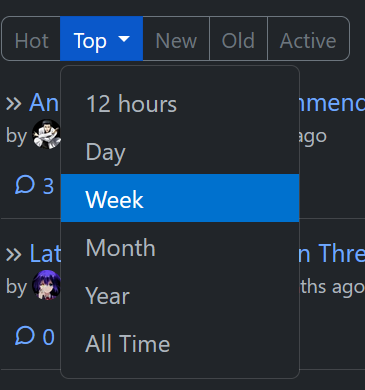
If you are on a small mobile screen (like using the PWA), the different time options are listed out with the other sort options:
load more comments
(1 replies)
Browse a list of communities sorted by their Monthly Active Users (MAU). It could make discovering popular or active communities a bit easier. Just a thought! It's not something I'm really missing.
User-created sorting methods: If the API exposes post metadata (e.g., timestamps, tags, upvotes, etc.), and the plugin system allows client-side scripting (e.g., JavaScript plugins), users could fetch post metadata and experiment implementing their own custom sorts in the browser.
Add the ability to manually add a user, community, domain or instance block in the user settings like lemmy has.
Firm up the foundationals: proper parsing of complex formatting (e.g. a bolded section within an italic section), which reminds me: enabling a Preview ability for comment replies to posts not just to existing comments. Also, the former might have already been done though I definitely recall instances in the past where it did not work.
Clean up notifications: e.g. if a post is deleted after you receive a notification about it, then either delete the notification also or at least let us see the post - it's super annoying to have a notification that goes nowhere.
Also, notification links should always actually go to the things they point at. On some posts the comments are now loading separately for some reason (perhaps if there's a lot of them? but even then why not load them at page start rather than delay?), which breaks the Notification links. Many things break those notification links actually. Another one is people from instances that you have blocked - you can't see the comment that the link tries to take you to anyway, so what use is the notification at that point? Either remove the latter or... something, maybe show the comment after all in that special case (except wait no, if you blocked everyone from an instance then likely you did so for a reason, and do not want notifications from them?).
Edit: here is an example link, where it looks like the Continue thread breaks the link to go where it needs to on the page.
These kinds of "polish" features that are still lacking are annoying and I for one would love to see them worked on, before adding all kinds of other features that I'll likely never use - whereas typing out comments and viewing notifications are the top 1/2 of all things that I do on PieFed (besides look at posts and vote on them:-P) so these would highly benefit from being polished! 😄
Though I still love PieFed even while having to wait for them too. 😊
I've done a lot of work on the markdown to html edge cases. So, I think things like bold and italics intermingling and garbling each other shouldn't happen any more. If it does, feel free to let me know!
Oh that's wonderful! I tried to test out bold within italics and italics within bold and both worked... this time. Thank you for your efforts, they are super appreciated!
More generally, I love being proven wrong about PieFed. On Lemmy if you say "this feature does not exist", then five years later it's still an accurate statement, whereas on PieFed... it's so hard to keep up with because it's so readily changed, by such dedicated fans like... well, YOU! 😊🎉💪🤩
Watch tags from mastodon, even if no community was pinged. "Tag as community" so to speak
that would require PieFed users to follow many many Mastodon users, that's the only way for Mastodon to alert PieFed about the posts
When I view a tag on my mastodon account, I see posts from people I don't follow because someone from my instance is following that person?
yes, or following someone that boosted it
load more comments
(1 replies)
view more: next ›