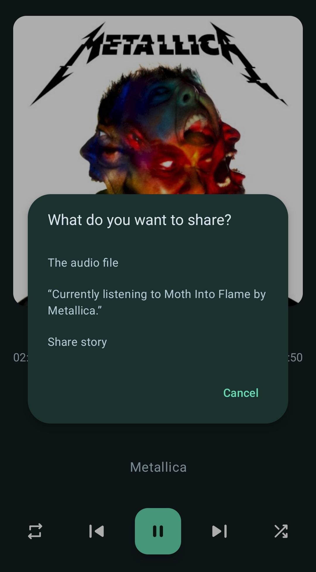
The right way is to share a music file.

Anything that is at least tangentially connected to the technology, social media platforms, informational technologies and tech policy.
[Opinion] prefix
Opinion (op-ed) articles must use [Opinion] prefix before the title.
1. English only
Title and associated content has to be in English.
2. Use original link
Post URL should be the original link to the article (even if paywalled) and archived copies left in the body. It allows avoiding duplicate posts when cross-posting.
3. Respectful communication
All communication has to be respectful of differing opinions, viewpoints, and experiences.
4. Inclusivity
Everyone is welcome here regardless of age, body size, visible or invisible disability, ethnicity, sex characteristics, gender identity and expression, education, socio-economic status, nationality, personal appearance, race, caste, color, religion, or sexual identity and orientation.
5. Ad hominem attacks
Any kind of personal attacks are expressly forbidden. If you can't argue your position without attacking a person's character, you already lost the argument.
6. Off-topic tangents
Stay on topic. Keep it relevant.
7. Instance rules may apply
If something is not covered by community rules, but are against lemmy.zip instance rules, they will be enforced.
!globalnews@lemmy.zip
!interestingshare@lemmy.zip
Icon attribution | Banner attribution
If someone is interested in moderating this community, message @brikox@lemmy.zip.
The right way is to share a music file.

Is this a self hosted thing or what? This is how I want to share music. I am typically generating public links or dumping copies of songs in a folder that's preshared with a friend. It works, but I like what's going on in this screenshot
My music folder is like ~10GB, so I just have it being synced automatically by Syncthing on all devices.
But if you clicked share audio file, does that give you a download link to share with friends
It shares the file itself directly.
Name of the app?
Just a regular music player, Retro, from F-Droid.
No, the right way is sharing an mp3 file.
There's also song.link in case you don't use Tidal.
And Songwhip for a similar mobile friendly look.


I feel like odesli/song.link uses screen space more efficiently, but it kinda comes down to preference.
Edit: Replaced the Screenshots with light mode ones, the dark mode ones had screwed up colours.
True, I like them both. I don’t remember the mobile screen looking so clean on odesli when I was using it initially. I used to solely use it. Thanks for the heads up.
Just learned about this in a chatroom today and it’s perfect. Now I don’t have to choose between excluding people with a Spotify link or subjecting them to YouTube ads.
Nice, now I just need to find a way to get people to actually like my music recommendations 🤔
That's easy, get better taste
My taste is impeccable. Everyone else is wrong.
In people, not music
ITGOESITGOESITGOESITGOES
ITGOESITGOESITGOESITGOES
GUILLOTINE
Not even joking, Death Grips was exactly who I was thinking of…
I’ve been told to stop playing it in the office at work.
I’ve been using Songwhip.com for this purpose. It’s an extra step but worth it if you want to make it easy for a group to listen.
Between this, Tidal's elimination of MQA, their recent pricing decisions, and Spotify littering their app with podcasts and now learning videos, I've never been happier with my music service. Thanks, Tidal