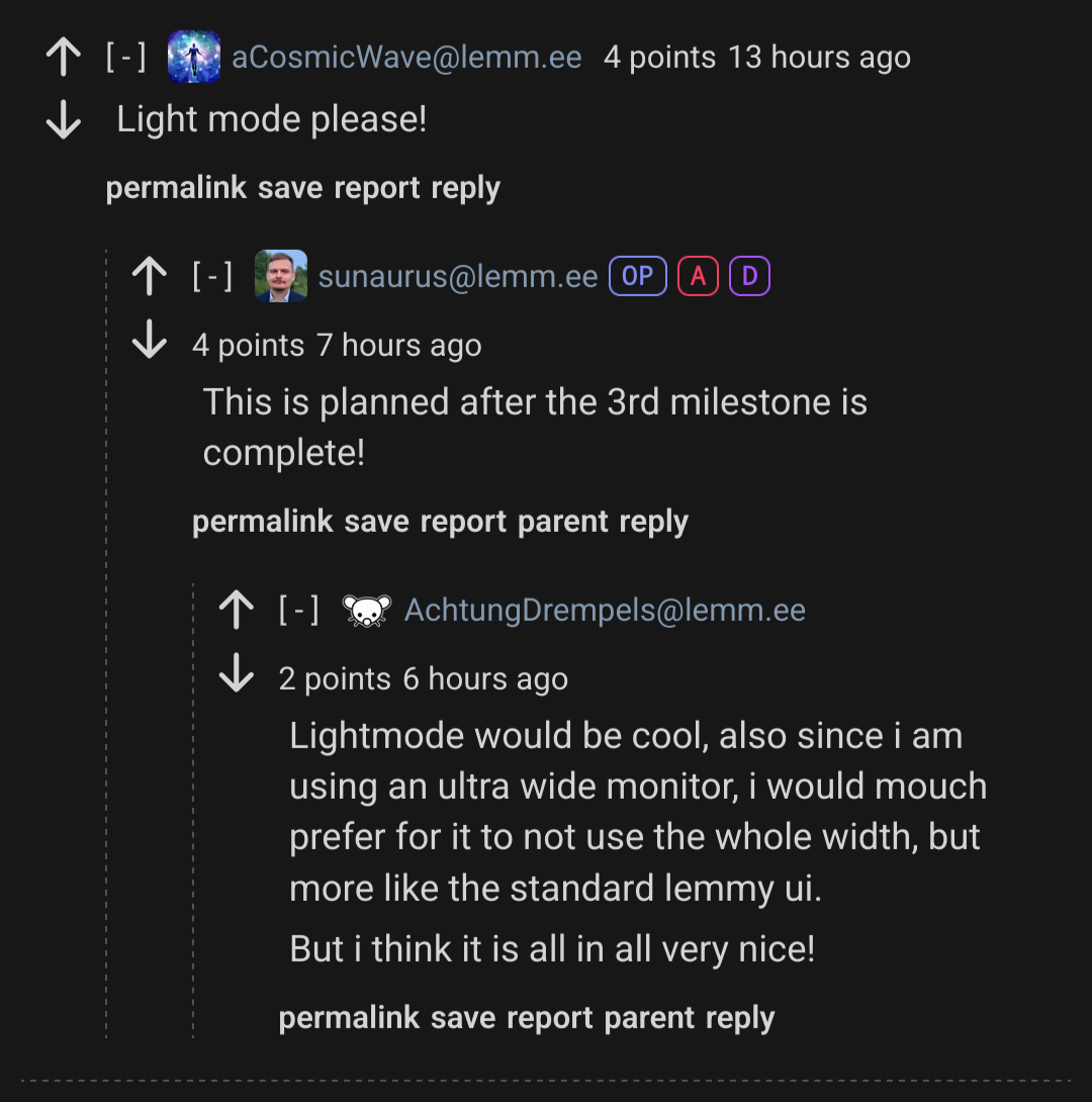
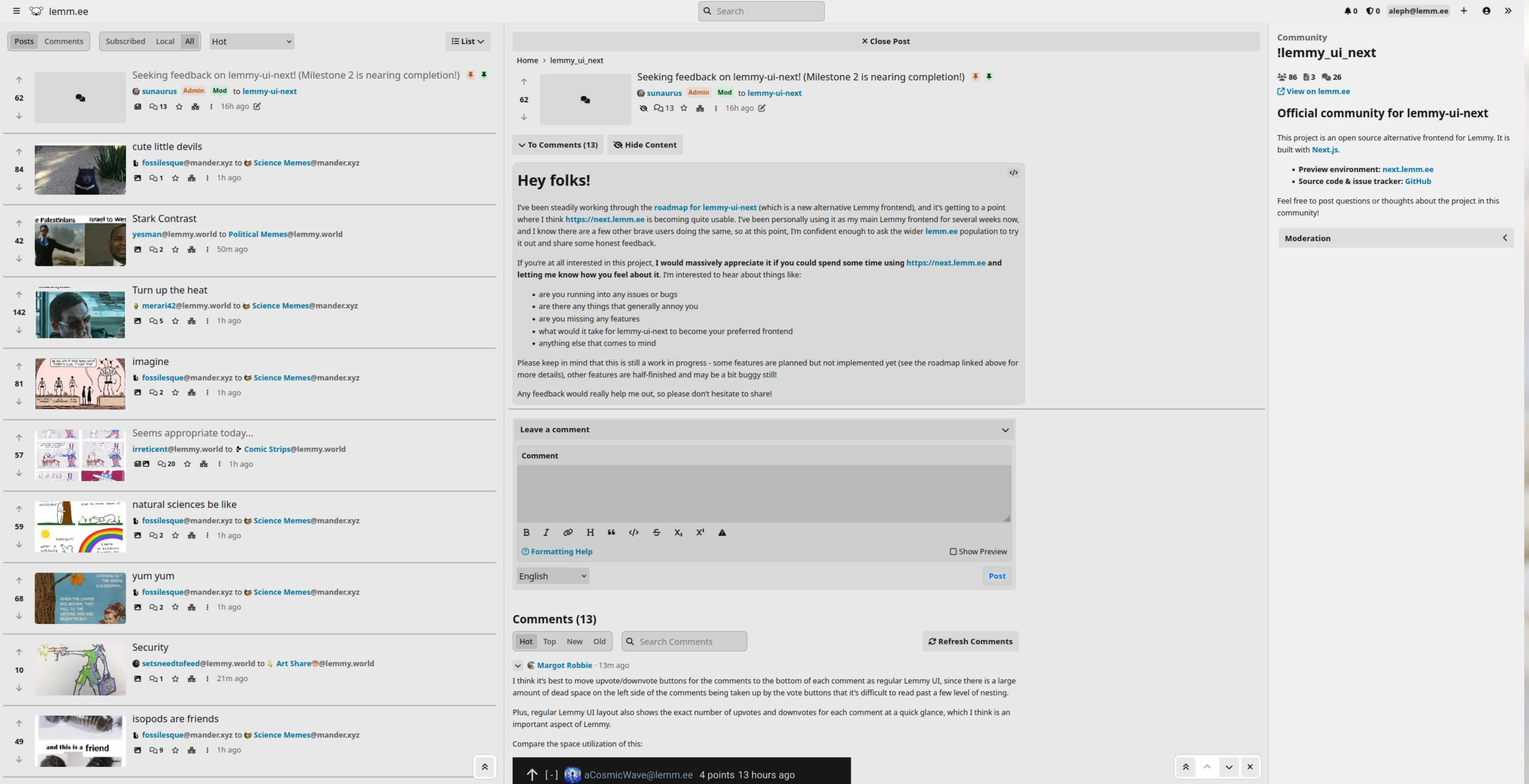
162
submitted 2 months ago* (last edited 2 months ago) by sunaurus@lemm.ee to c/lemmy_ui_next@lemm.ee

Hey folks!

I've been steadily working through the roadmap for lemmy-ui-next (which is a new alternative Lemmy frontend), and it's getting to a point where I think https://next.lemm.ee is becoming quite usable. I've been personally using it as my main Lemmy frontend for several weeks now, and I know there are a few other brave users doing the same, so at this point, I'm confident enough to ask the wider lemm.ee population to try it out and share some honest feedback.

If you're at all interested in this project, I would massively appreciate it if you could spend some time using https://next.lemm.ee and letting me know how you feel about it. I'm interested to hear about things like:

  • are you running into any issues or bugs
  • are there any things that generally annoy you
  • are you missing any features
  • what would it take for lemmy-ui-next to become your preferred frontend
  • anything else that comes to mind

Please keep in mind that this is still a work in progress - some features are planned but not implemented yet (see the roadmap linked above for more details), other features are half-finished and may be a bit buggy still!

Any feedback would really help me out, so please don't hesitate to share!

top 42 comments
sorted by: hot top controversial new old
[-] MargotRobbie@lemm.ee 16 points 2 months ago

I think it's best to move upvote/downvote buttons for the comments to the bottom of each comment as regular Lemmy UI, since there is a large amount of dead space on the left side of the comments being taken up by the vote buttons that it's difficult to read past a few level of nesting.

Plus, regular Lemmy UI layout also shows the exact number of upvotes and downvotes for each comment at a quick glance, which I think is an important aspect of Lemmy.

Compare the space utilization of this:

To this:

[-] RobotDaniel@lemm.ee 5 points 2 months ago

This sounds good as the bottom makes more sense as if you are reading a longer comment you want to upvote at the end, not have to scroll back to the top to upvote

[-] shasta@lemm.ee 3 points 2 months ago

On some apps like Connect, you can customize swipe actions. I like being able to swipe a comment to upvote, downvote, and hide.

[-] waldyrious@lemm.ee 1 points 2 months ago

I actually disagree. Your comment is a good example. You state your case up front, add a bit of context, but then there are some screenshots that take up quite a bit of space. I do appreciate the possibility of voting on the comment without having to scroll all the way down to find the arrows, without gaining much in terms of understanding your message further.

[-] neme@lemm.ee 13 points 2 months ago* (last edited 2 months ago)

A setting option to have media auto expand only after opening the post would be nice, the currently available option in the settings does it everywhere.

[-] sunaurus@lemm.ee 8 points 2 months ago

Interesting idea, I think that will also require a small change in the Lemmy backend, but I think it's doable. Thanks!

[-] Spendrill@lemm.ee 11 points 2 months ago

This is purely a matter of taste but I find that the typefaces being used and the way you're using them, particularly the use of the bold weight for the title results in dense slugs of text that are not as easy to separate out the individual bits of information (Poster, community, instance) at a glance the same way I can with the default theme. This is a minor issue and I dare say that if it's a problem for other instance owners they can bodge together some css.

Congratulations on your hard work, it is a usable interface. Well done.

[-] darakan@lemm.ee 10 points 2 months ago

I like this a lot in general. It is reminiscent of old reddit which is a style I like. Unfortunately it suffers from the same major issue I have with old reddit. Namely that the content is left aligned and there is just a crazy amount of white space. It's probably not an issue for many, but as someone who has a large 4k monitor, it means my neck is constantly turned to the left if I have my browser in full-screen mode. Centering the content some would be greatly beneficial. Hacker News and Lobsters do this, although imo HN could be better about it.

Screenshot with large white space amount on 4k resolution of lemmy-ui-next

[-] aleph@lemm.ee 5 points 2 months ago* (last edited 2 months ago)

Agreed. Use of space could be better. Or, if you are going to have all that space in the middle, do what Alexandrite does and display post content in a new middle column so that the entire width of the screen is utilized.

Alexandrite screenshot

[-] Abnorc@lemm.ee 2 points 2 months ago

I think I agree. The previous UI is just so much easier for me to read and look at.

[-] evlogii@lemm.ee 10 points 2 months ago* (last edited 2 months ago)

Cons:

  1. I'm already accustomed to the light theme of Lemmy and can't find how to switch from dark to light in "Next."
  2. When I scroll down to the end, there's 2/3 of the screen that is not being utilized. 2a. The red, green, and blue buttons in the footer seem to do nothing.
  3. The notion on every post that "Your IP is hidden from another Lemmy instance" is kind of annoying and useless. Why is it there?
  4. I dislike a little that it tries to copy the old Reddit interface. Although that interface wasn't bad, and I'm the one who would first say "don't fix what isn't broken," I'm more prone to seeing something new, some experimentation. Right now it feels more like "next to the old Reddit," which isn't exactly bad, but still...

Pros:

  1. I kind of like how images work on "Next." It feels faster and more "in place." It's simpler for me to distinguish between different types of posts (image, link, video).

P.S. I'm on the latest stable Firefox (124.0.2).

[-] sunaurus@lemm.ee 9 points 2 months ago

I’m already accustomed to the light theme of Lemmy and can’t find how to switch from dark to light in “Next.”

This is planned after the 3rd milestone is complete!

The red, green, and blue buttons in the footer seem to do nothing.

They should change the primary color in the UI - are you sure it's not doing this for you? Maybe it's just enough of a subtle change that it's not immediately noticable?

The notion on every post that “Your IP is hidden from another Lemmy instance” is kind of annoying and useless. Why is it there?

Most (all) other Lemmy frontends will always leak your IP to external media hosts, I wanted to handle this a bit differently in lemmy-ui-next by proxying by default (to improve user privacy). The message is there to let you know if a specific piece of media is being proxied or not - and the only way for something to not be proxied is for the user to manually approve it first.

I guess not all users will care about this, so maybe I can add a setting to hide the proxy indicator completely... I will think about it!

I dislike a little that it tries to copy the old Reddit interface. Although that interface wasn’t bad, and I’m the one who would first say “don’t fix what isn’t broken,” I’m more prone to seeing something new, some experimentation. Right now it feels more like “next to the old Reddit,” which isn’t exactly bad, but still…

It was an initial goal and guiding principle to heavily take inspiration from the great UIs of existing link aggregators like old reddit and hackernews. At the same time, I realize that this approach is not for everyone, so I am not against adding some different layouts (especially for the post list view) in the future.

Thank you for all the feedback!

[-] evlogii@lemm.ee 3 points 2 months ago

The red, green, and blue buttons in the footer seem to do nothing.

They should change the primary color in the UI - are you sure it's not doing this for you? Maybe it's just enough of a subtle change that it's not immediately noticable?

Yeah, I totally missed that. It's actually pretty subtle. Got it now though. 👀

Oh, and hey, just wanted to drop a quick thanks for putting in the work on this Lemmy instance. 😘❤️

[-] aCosmicWave@lemm.ee 7 points 2 months ago
[-] sunaurus@lemm.ee 6 points 2 months ago

This is planned after the 3rd milestone is complete!

[-] AchtungDrempels@lemm.ee 2 points 2 months ago

Lightmode would be cool, also since i am using an ultra wide monitor, i would mouch prefer for it to not use the whole width, but more like the standard lemmy ui.

But i think it is all in all very nice!

[-] Signfeld@lemm.ee 6 points 2 months ago

Not sure if it has been mentioned already, but, it would be great if this could be set to a PWA so various mobile web browsers could "install" it properly to the device's home screen (like Mastodon does).

Otherwise, I am loving it!

[-] RobotDaniel@lemm.ee 3 points 2 months ago* (last edited 2 months ago)

I agree, this would be great

[-] Azzu@lemm.ee 6 points 2 months ago

Can't select top 12/6/1 hour sorts, just not there

[-] RobotDaniel@lemm.ee 5 points 2 months ago

I think that it would be great to have an option to expand all images by default, possibly at 50% size for easier scrolling, the UI does look great rn

[-] MenacingPerson@lemm.ee 3 points 2 months ago

it does have that i believe

[-] gregorum@lemm.ee 5 points 2 months ago* (last edited 2 months ago)

keeps logging me out

Edit: also, it’s a bit crowded and could use some more color in different text ui elements to differentiate them (votes, etc), but maybe that’s coming.

[-] Zatore@lemm.ee 5 points 2 months ago

Thank you for adding the expand image option that I asked for. You are awesome!

[-] Lemmeenym@lemm.ee 4 points 2 months ago* (last edited 2 months ago)

I've been using the new UI for a couple of hours and will continue to use it for at least the next few days. I have a mild preference for the look of the older UI but no specific reason. So far I had three things I'd like to ask about.

I can find the instance modlog but not community modlogs. Am I just overlooking the link or are those not currently available?

I would like a direct link to my history on the top bar, I can get there by going to settings and using a link there to get to my public profile to see my history but I would rather have a direct link because I go into my history frequently to check for updates or new comments on posts or to find communities that I've previously visited.

I would prefer individual up and down vote totals either instead of or in addition to the total points. I would actually like a full interaction log that shows who has up voted or down voted like kbin has.

Eta: when I post a comment it changes to a view to only show my comment instead of continuing to show all comments on the post.

edit2: How do I block communities with the new UI?

[-] Pengilly@lemm.ee 4 points 2 months ago

I just signed on, and the main thing I notice that's on here but is lacking there is the exact count of upvotes and downvotes. I much prefer being able to see exactly how many upvotes and downvotes something has, so I don't think I will use it as my main means of accessing this Lemmy, but I'll keep on testing it to see where else it can be improved.

[-] TWeaK@lemm.ee 4 points 2 months ago* (last edited 2 months ago)

I think it would be nice to have a number count on the unread messages icon.

Edit: Also NSFW images are auto-expanding for me (per the settings I had before) but not showing blurred. In normal lemmy the images would expand but be blurred until clicked. The thumbnail remains blurred, but if all images are expanded I'd like to keep the NSFW blurred until/if I want to show it.

[-] nmtake@lemm.ee 4 points 2 months ago* (last edited 2 months ago)

Thanks for the hard work. It's already quite usable for me. Here are the issues I noticed on Firefox/Linux:

  • Each comment area seems to have overflow (caused by the text buttons?), so hovering a mouse cursor on the comment reveals hidden scroll bar on the right.
  • Titles are too bold and look somewhat intimidating.
  • Rendered inline code (`...`) leaves the backquotes like this.
[-] doc_dish@lemm.ee 4 points 2 months ago* (last edited 2 months ago)

In the new interface, clicking the post title opens the subject of the post (e.g. the linked site or image), whereas the old interface takes you to the post. The only way of accessing the post itself is via the comments link, which is quite small on mobile.

[-] TWeaK@lemm.ee 4 points 2 months ago

Clicking your Username takes you to the user Settings page, then the link for your Profile is all the way on the other (left) side of the screen.

Other UI's (both the default lemmy and old reddit) have a direct link to the user's Profile up on the top right bar. The standard lemmy UI has the username as a dropdown box with Profile, Settings and Sign Out options.

I think the username link should go to the profile, then either the lemmy icon could go to settings or a standard cog icon could be added to directly link to settings. The sign out option could still be omitted for tidiness, as when you go to settings the Log Out button is right underneath the top right bar, however I definitely miss having a direct link to my profile.

[-] ticoombs@reddthat.com 4 points 2 months ago

"Bug":

Your IP is visibleto

Suggestions:

  • Padding on left side / center mode option
    • Maybe its better on smaller screens, but on a 27" there is a tremendous amount of dead space.
  • Comment threads are "clickable" like images?
    • Instead of having to click the title, allow clicking the Comment Icon comment icon

Sent from next.reddthat.com :)

[-] ticoombs@reddthat.com 2 points 2 months ago* (last edited 2 months ago)

Bug: subscribe & unsubscribe links

subscribe & unsubscribe links are the wrong sizes on communities?listingType=Local

[-] ticoombs@reddthat.com 2 points 2 months ago

Bug:

https://next.reddthat.com/post/17139768

New ThumbnailUrl isn't used for videos

[-] MenacingPerson@lemm.ee 3 points 2 months ago

Hi, I've posted a github issue about blurring NSFW images.

[-] Azzu@lemm.ee 3 points 2 months ago

I block large (in filesize) images with ublock origin to save data sometimes. Usually, the images are empty and get a red border and when I touch that, the image loads anyway.

With this ui, it just says "image can not be loaded" instead and I don't get the red border and I can't load the image.

This still working, or a native data saver mode like that, would get me to use this. I know that's quite a special usecase :D

[-] nmtake@lemm.ee 3 points 2 months ago

I encountered a bug while posting another comment. If a user "Submit" text from the "Preview" view, empty text will be sent.

[-] TWeaK@lemm.ee 3 points 2 months ago* (last edited 2 months ago)

Can we get some keyboard shortcuts in there from the existing lemmy ui as well? Ctrl+Enter doesn't submit posts in next-ui.

[-] mtchristo@lemm.ee 2 points 2 months ago

upvotes and downvotes count instead of the sum count

[-] TWeaK@lemm.ee 2 points 2 months ago

The locally hosted image url format breaks extensions that convert webp to other image formats. Some other services (eg messaging apps) don't support webp, so these extensions are really useful as it avoids having to save, open in an image processor and manually convert.

Example url: https://next.lemm.ee/_next/image?url=https%3A%2F%2Fslrpnk.net%2Fpictrs%2Fimage%2F70dad073-5920-4864-9d04-655788f0c6af.webp&w=1080&q=75

Extension in use: https://addons.mozilla.org/en-US/firefox/addon/save-webp-as-png-or-jpeg/

Basically, the &w and &q parts of the url trips the extension up, so it doesn't recognise the image as something it should run on, however these tags are required and the image won't load without them.

[-] TWeaK@lemm.ee 2 points 2 months ago

I added an issue to the extension's github, the plot thickens: https://github.com/jscher2000/Save-webP-as-extension/issues/30

Hmm, the extension tries to inject the script that generates the button bar, but it fails with this error (in the add-on debugging inspector console):

Uncaught (in promise) Error: Missing host permission for the tab

I have not seen this on other images displayed in Firefox's stand-alone image viewer.

On the regular dev tools network tab for the image, I see this that the image is served with this header:

content-security-policy: script-src 'none'; frame-src 'none'; sandbox;

That seems to block even the built-in Firefox Screenshot feature (which uses extension APIs).

I wonder whether applying the site's CSP restrictions to the stand-alone image viewer was intentional or is a new bug. Have you used the extension on this site in earlier versions of Firefox?

Anyway, I'll have to think about whether there is a workaround for this. (Many extensions manipulate CSP for content blocking, and I don't want to interfere with or break those.) And if there isn't, how to at least alert the user to the nature of the failure.

[-] s08nlql9@lemm.ee 1 points 1 month ago* (last edited 1 month ago)

I've been seeing this a lot lately @sunaurus@lemm.ee

EDIT: issue with phone not uploading thr pic. But the error says Error: Error in input stream Unfortunately, we ran into an issue when trying to display this page.

[-] waldyrious@lemm.ee 1 points 2 months ago

Issue: clicking "reply" in a comment currently does not auto-focus the text box that appears. I did that and started typing and the page scrolled down when I pressed the space bar, which was rather confusing.

[-] waldyrious@lemm.ee 1 points 2 months ago

Issue: Submitting a top-level comment seems to take me to the "single thread" view, rather than remain in the main view with all the other comments, plus mine. It doesn't feel very intuitive or ergonomic.

this post was submitted on 15 Apr 2024
162 points (95.0% liked)

lemmy-ui-next

99 readers
1 users here now

Official community for lemmy-ui-next

This project is an open source alternative frontend for Lemmy. It is built with Next.js.

Feel free to post questions or thoughts about the project in this community!

founded 3 months ago
MODERATORS