papalonian

joined 1 year ago
[–] papalonian@lemmy.world -1 points 12 hours ago

That.. I... but you..

You told me me not to engage in something. I quoted you to show you that you were discouraging discourse. How is this lost on you?

[–] papalonian@lemmy.world -4 points 13 hours ago (1 children)

The same reason mine can't; because I didn't care to phrase it as such. If I were actually interested in starting a dialogue, I wouldn't have phrased the last line of my parent comment the way I did. I would have asked the question in a neutral or positive tone to show the reader that I'm not attacking their position, explicitly or implicitly.

"People that XYZ, why?"

This phrasing is automatically othering anyone that would be able to respond. Without any other context, it can easily be interpreted with more hostility, especially online.

"What are the benefits of using motion blur?"

This phrasing puts no implicit judgment on the person, and instead seeks to find positive attributes of the subject in question. Any bias that can be inferred is positive.

While I concede that op certainly could have asked the question in genuine earnest, my time on the Internet has taught me that the likelihood of that is far less likely than that of op asking a sarcastic question.
[–] papalonian@lemmy.world -4 points 13 hours ago (2 children)

So... Let's stop talking to each other altogether...?

[–] papalonian@lemmy.world 5 points 16 hours ago (16 children)

Because I like it. There shouldn't need to be much more "reason" than that.

People that can't leave others alone for having different preferences than you, why?

[–] papalonian@lemmy.world 4 points 21 hours ago

Case closed, boys

[–] papalonian@lemmy.world 19 points 1 day ago (2 children)

I've never seen the movie. Is the Chihuahua, by chance, from Beverly Hills?

[–] papalonian@lemmy.world 1 points 2 days ago

That's rough buddy. Time to get a fake identity and open an account in a different state with stricter banking laws

[–] papalonian@lemmy.world 3 points 2 days ago (2 children)

Your current one as in, your credit union is the one charging you these "insufficient fund" fees?

I'm admittedly not educated in the law of banks and credit unions, but I have a feeling they aren't meant to be doing that.. not that the little man like you or I could do much about it 🤷🏾‍♂️

[–] papalonian@lemmy.world 48 points 2 days ago

That poor kid. I already was upset thinking about them having to see Mom get arrested. I didn't even consider the fact that the youngest is probably blaming himself.

[–] papalonian@lemmy.world 2 points 2 days ago (4 children)

Just curious. Why not just get a different bank or credit union?


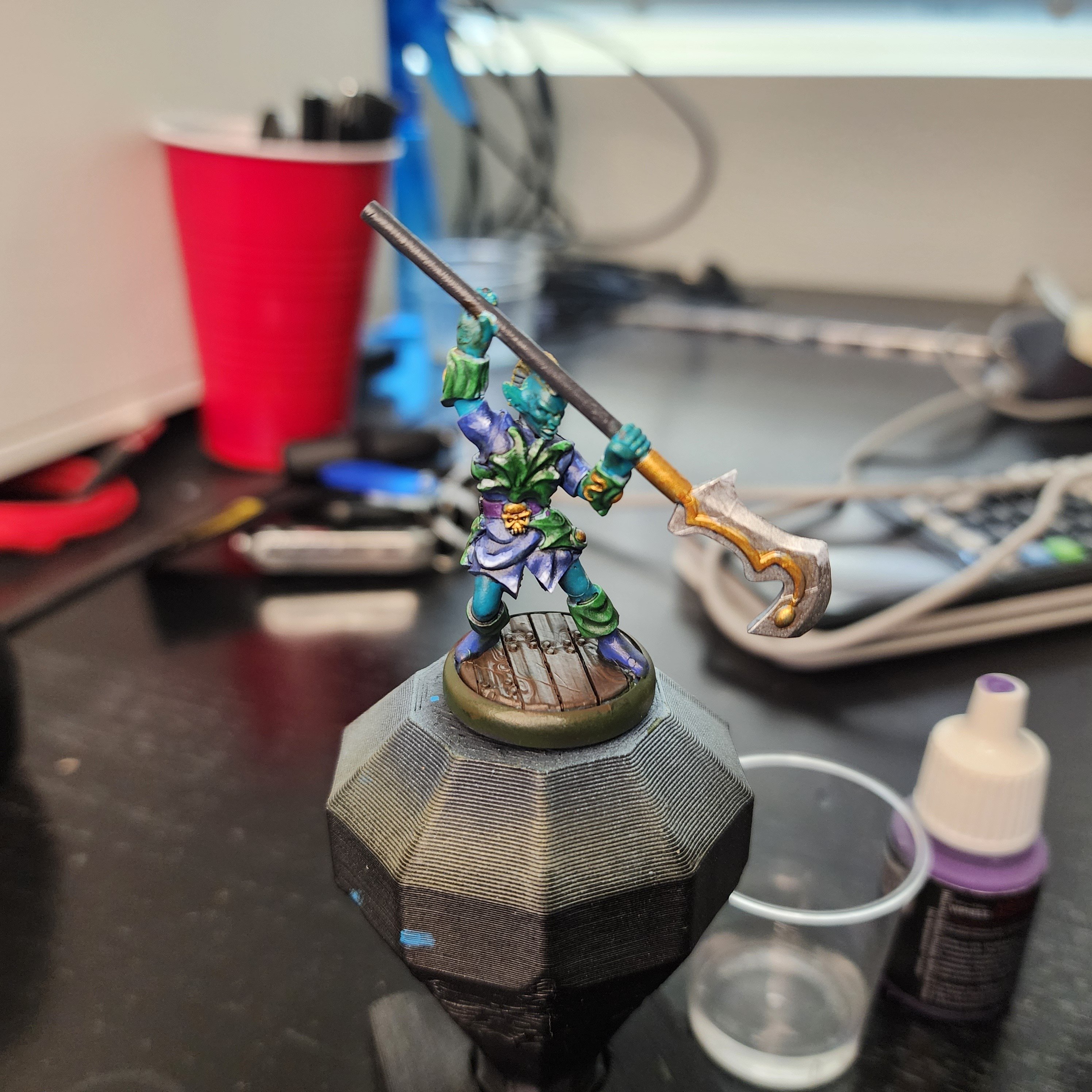
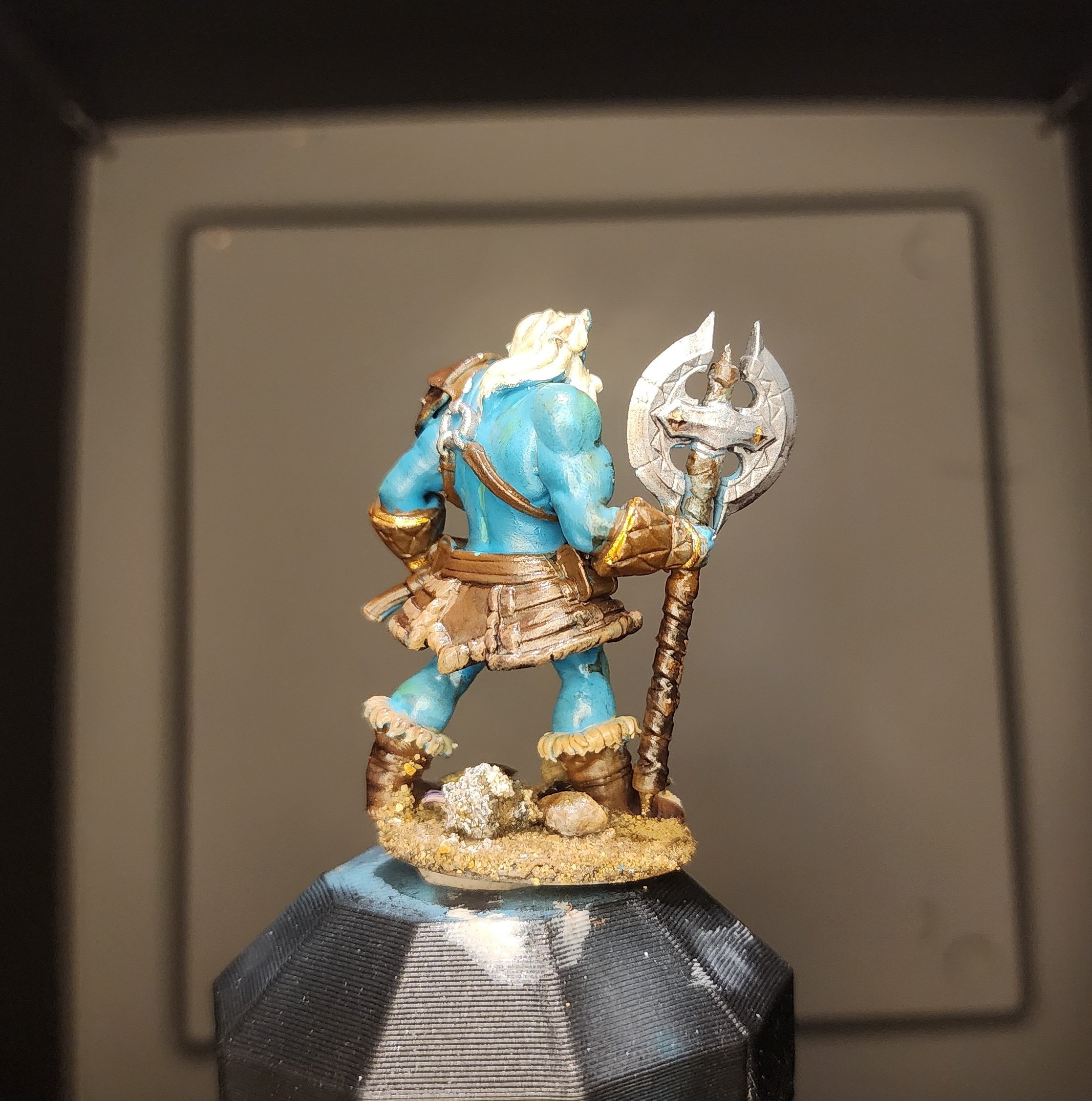
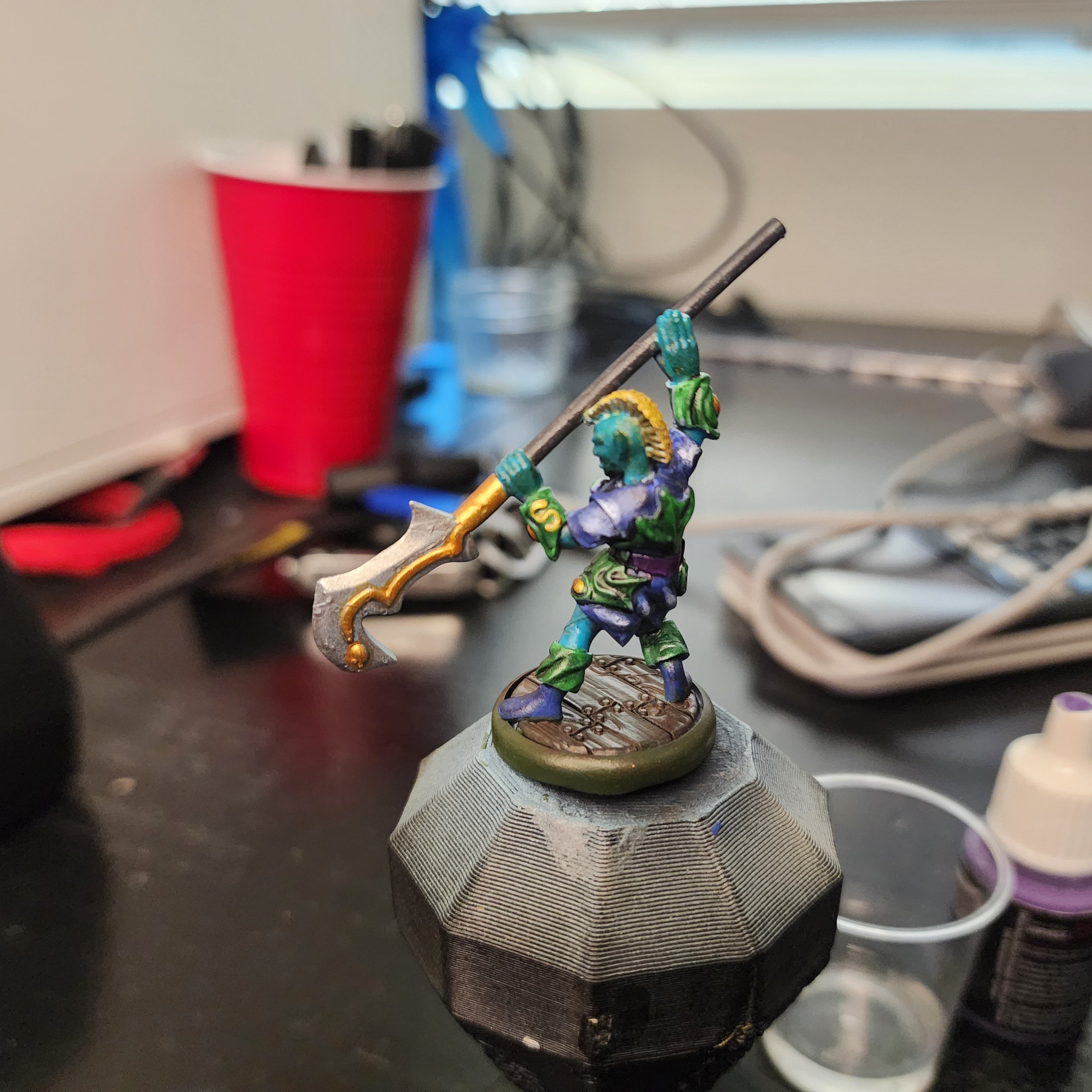
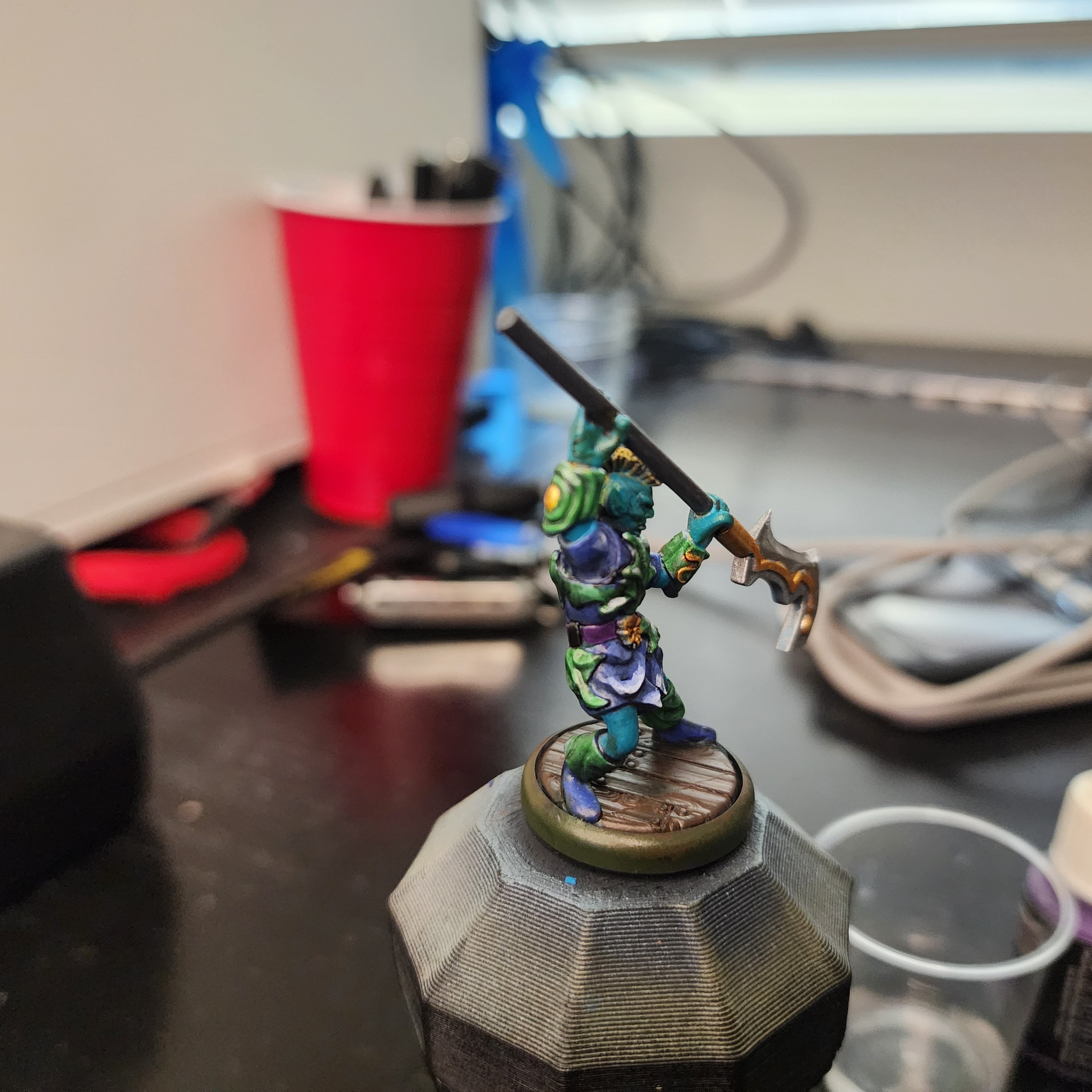
This is one of the characters from Valandar's second Player Character pack. His weapon made me think of mer-people, so I wanted to paint this guy with an aquatic theme. About halfway through I realized the color scheme wasn't going in the direction I wanted, so I abandoned the aquatic theme and just picked colors that I thought would look good together.

After applying the final wash, I felt the model looked too dark and monotone, so I decided now was a good time to give edge highlighting a try, something I've always been too lazy or impatient to try. Holy crap, does a tiny bit of white make a difference! You can see that my blending and edge selection leaves plenty to be desired, but for a first time, I think some parts of his robe look really cool.

As always, here are a few more angles:

Aqua-druid rear

Aqua-druid side

If anyone has any advice or pointers for color selection, I'm all ears. For this guy, I started with the color I knew I wanted to make a bulk of the model (blue/ aquamarine), picked a few nearby colors (green and purple) for the secondary bits, then jumped across the color wheel (yellow and gold) for the highlights. I think the model has good contrast, and the colors look ok together, it just doesn't have the look I was going for. I'm sure I'll get a better eye for color selection as I continue to paint, but if there are any places to start looking I'm open to pointers.


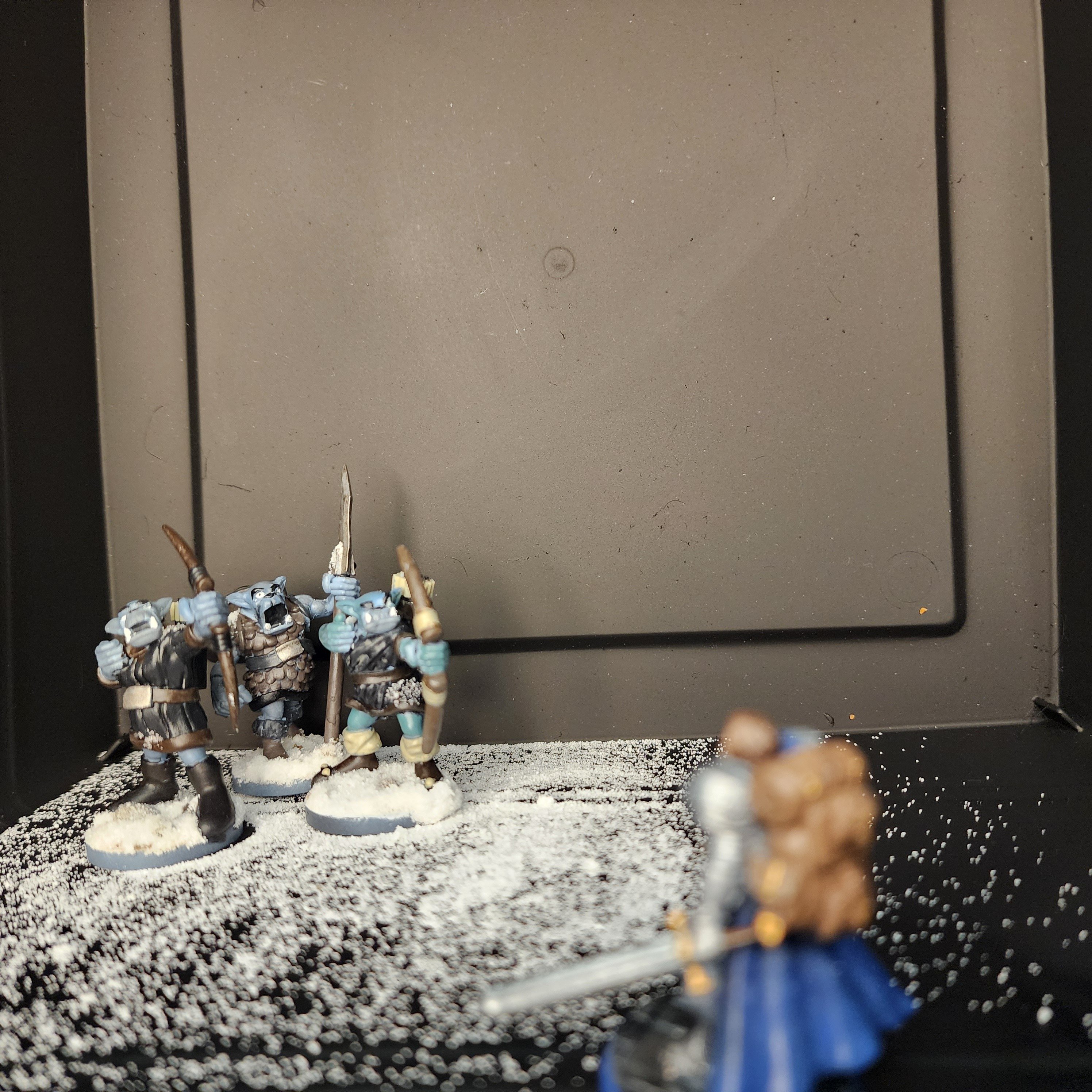
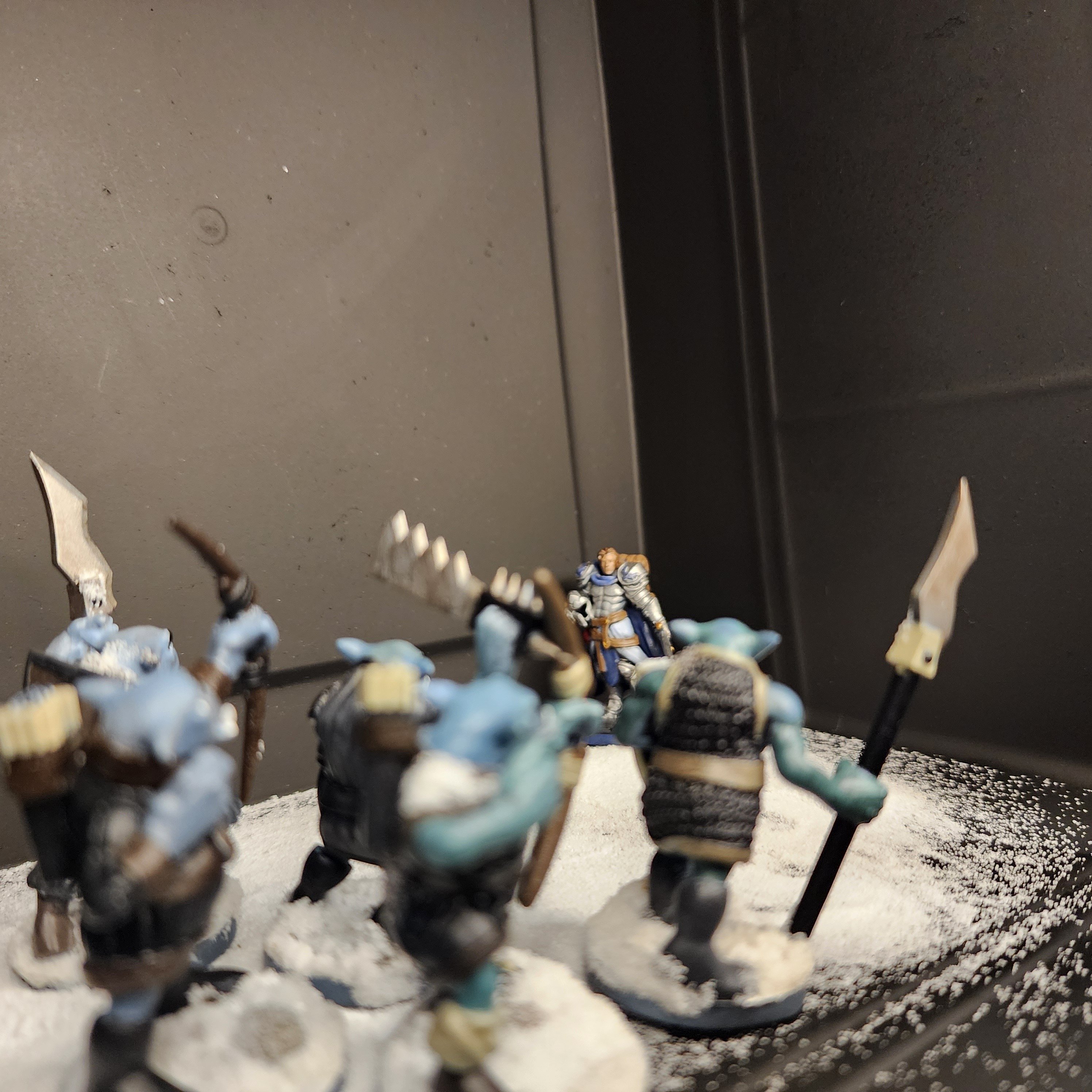
I realized that I never posted my complete army of Ice Orcs that I'd posted a WIP a little bit ago.

Here they are! Some of them definitely turned out better than others, but I had a lot of fun painting them up and I'm happy with how they look as a whole. I've only ever painted one other "army" of minis, and I used the same color scheme for all of them, thinking I needed to in order to make them look like a cohesive unit. It worked, but just as they were cohesive, they were boring.

I tried a different approach here, picking out a general list of colors (black, brown, tan, and gray) that fit the theme I was going for. For each orc's armor, I mainly stuck to the selected colors, but threw them on wherever I thought it would look good, not caring if the previous model was brown with black accents, black with tan accents, etc. I figured as long as they all used them same colors overall, the colors would tie themselves together.

The skin came out a little wonky, but if you've seen my other posts or comments, you'll know that was kind of expected. I'm pretty ass at painting skin tones, and used the orcs as a playground to hone the skill a bit. They still don't look great, but I'm getting better at things like highlighting muscles and shading skin folds and the like.

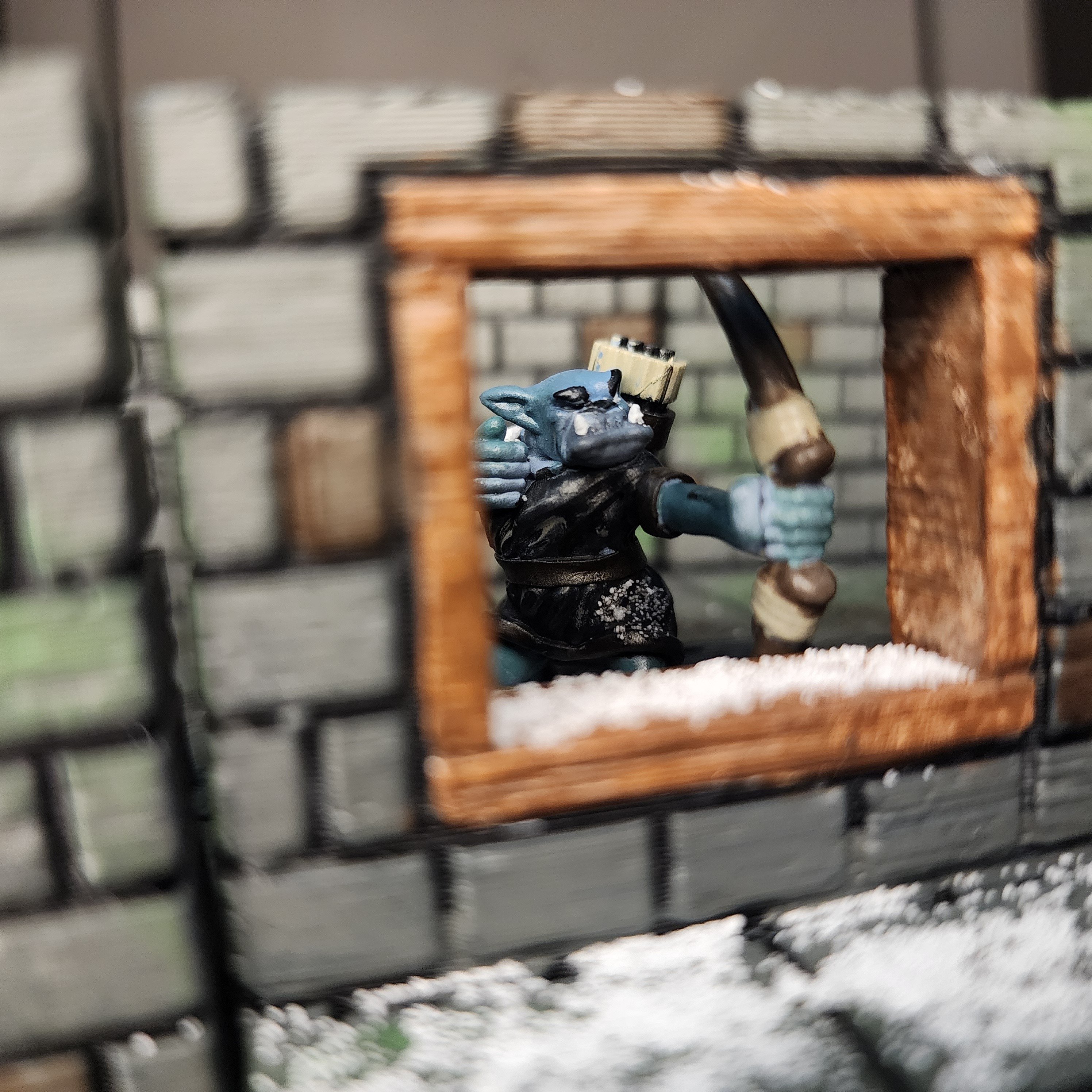
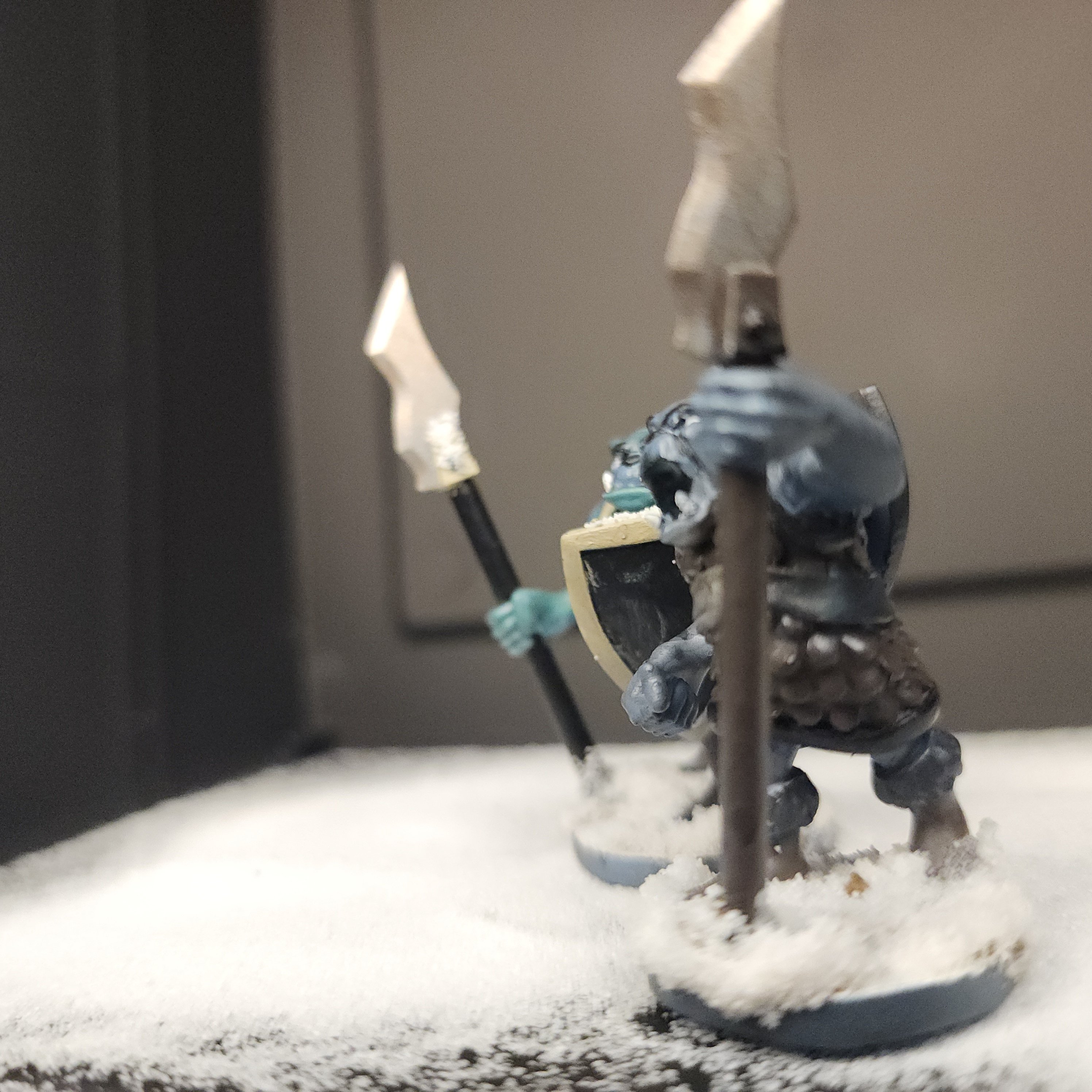
Anyways, sorry for the giant wall of text. Here's a few glamor shots, featuring my paladin from a few weeks ago.

3 orcs 1 paladin

Orc lookout

Spearmen

1 man army


You looked, didn't you.

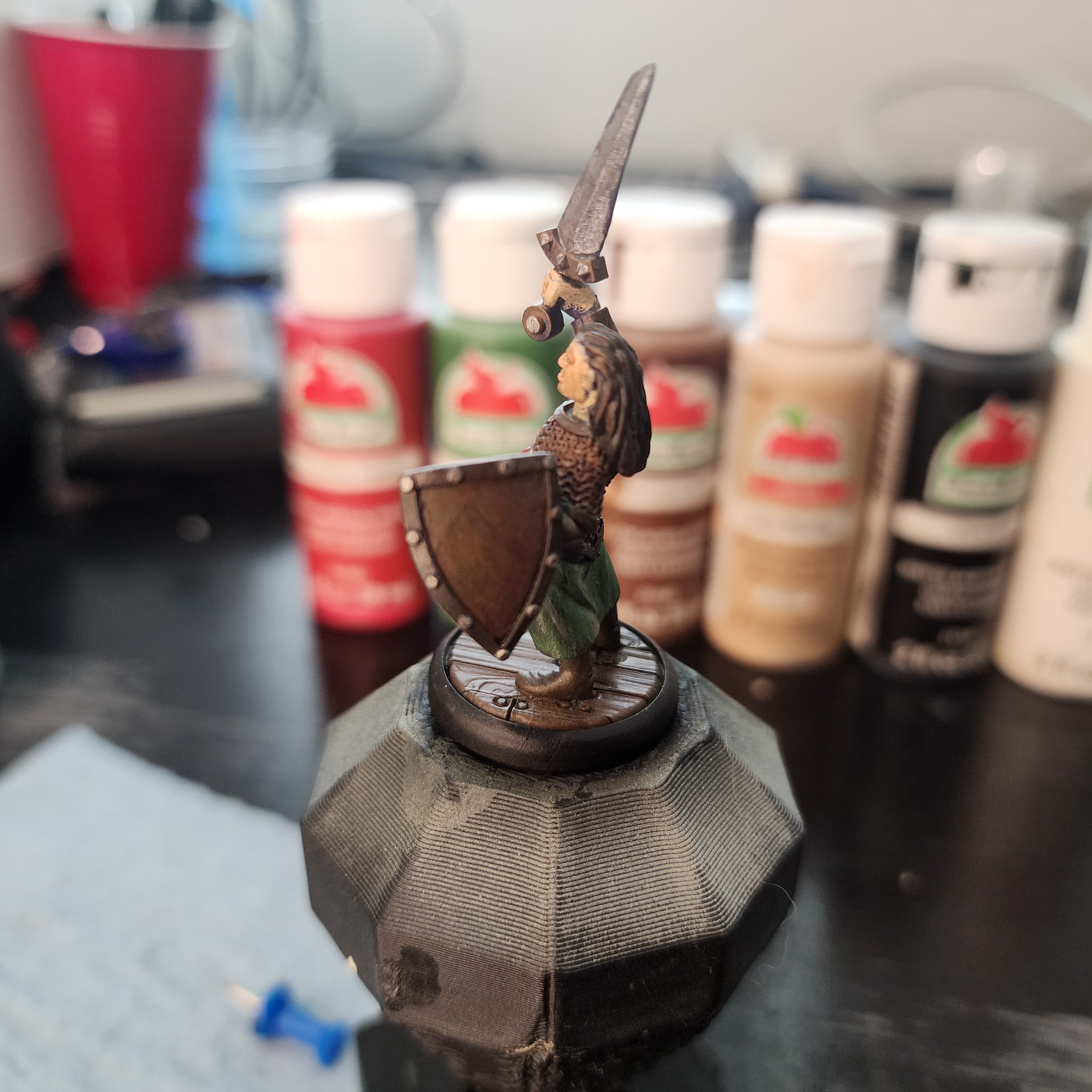
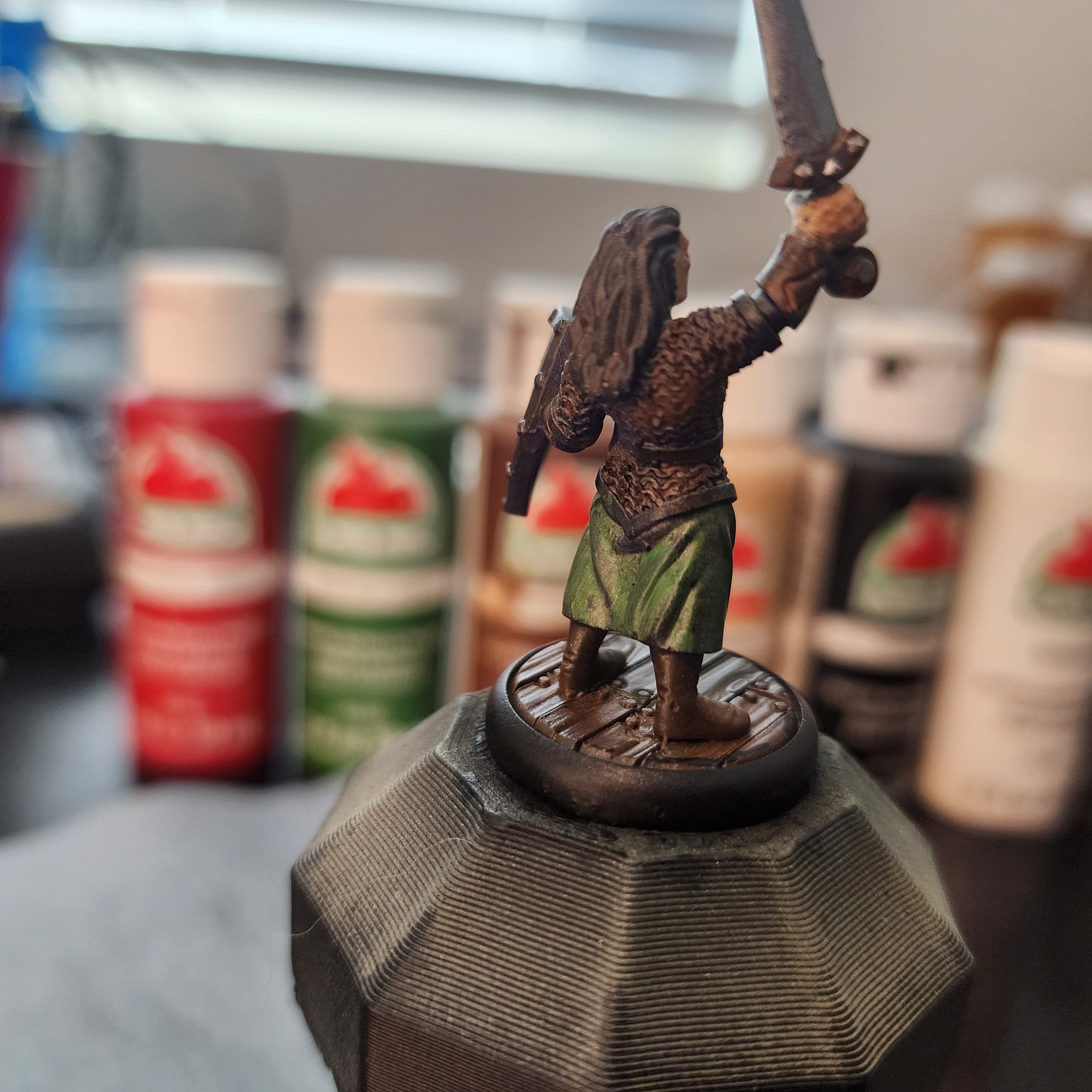
This is slightly different than my normal paint jobs. As evidenced by the background of the picture, he was painted using only cheap craft paints (save for the sword and other metallic highlights). The reason for this is that I plan on hosting a Mini Painting Party, where I'll be providing all the supplies needed to paint up some little dudes. I want to do this without breaking the bank, but I also wanted to make sure that the cheap paints weren't going to make the experience unenjoyable. So, I put together the same kit I plan on giving everyone (#0, #1, #2 brushes, a DIY wet palette and some toothpicks) and got to work.

I've got about a dozen of this same mini. I might tweak the color scheme a bit, but the plan is to teach everyone step-by-step how to replicate the above, then bust out the assorted minis once everyone has an idea of what they're doing. Originally, I was going to pull the nice paint out after the first mini, but after seeing how well the cheap stuff held up, I think I'll save the pricey stuff for myself...

That being said, the craft paint worked much better than I was expecting. Part of it is likely due to the experience I've gained since I last used the stuff, but the only time I felt frustrated with the paint was when applying the final wash a good amount of green washed off. This happens to me a lot when applying washes so I think it's more something I'm doing than the paints fault, but it was much worse with this craft paint than the nicer stuff.

Anyways, here's a couple other angles.

Adventurer side

Adventurer rear


This is a work in progress pic of what will eventually be an army of icy blue-gray skinned orcs. I plan on making a range of colors between pure light gray and pure baby blue, and grabbing colors from different parts for each orc so they'll all have different but similar skin tones.

The models are from Valandar's awesome Orc Horde collection on Thingiverse. These models are a ton of fun and a great balance between high-detail and printability/ paintability. I wish the bases were a little more interesting, or printed separately so I could attach my own, but a flat base allows me to add my own terrain later on.

I plan on doing a typical green-skinned orc army, as well as a fire-red army. Orcs are a fun way to play around with different armor color schemes because if something ends up looking like crap you can just say, "they're orcs! They just grabbed what's available!"


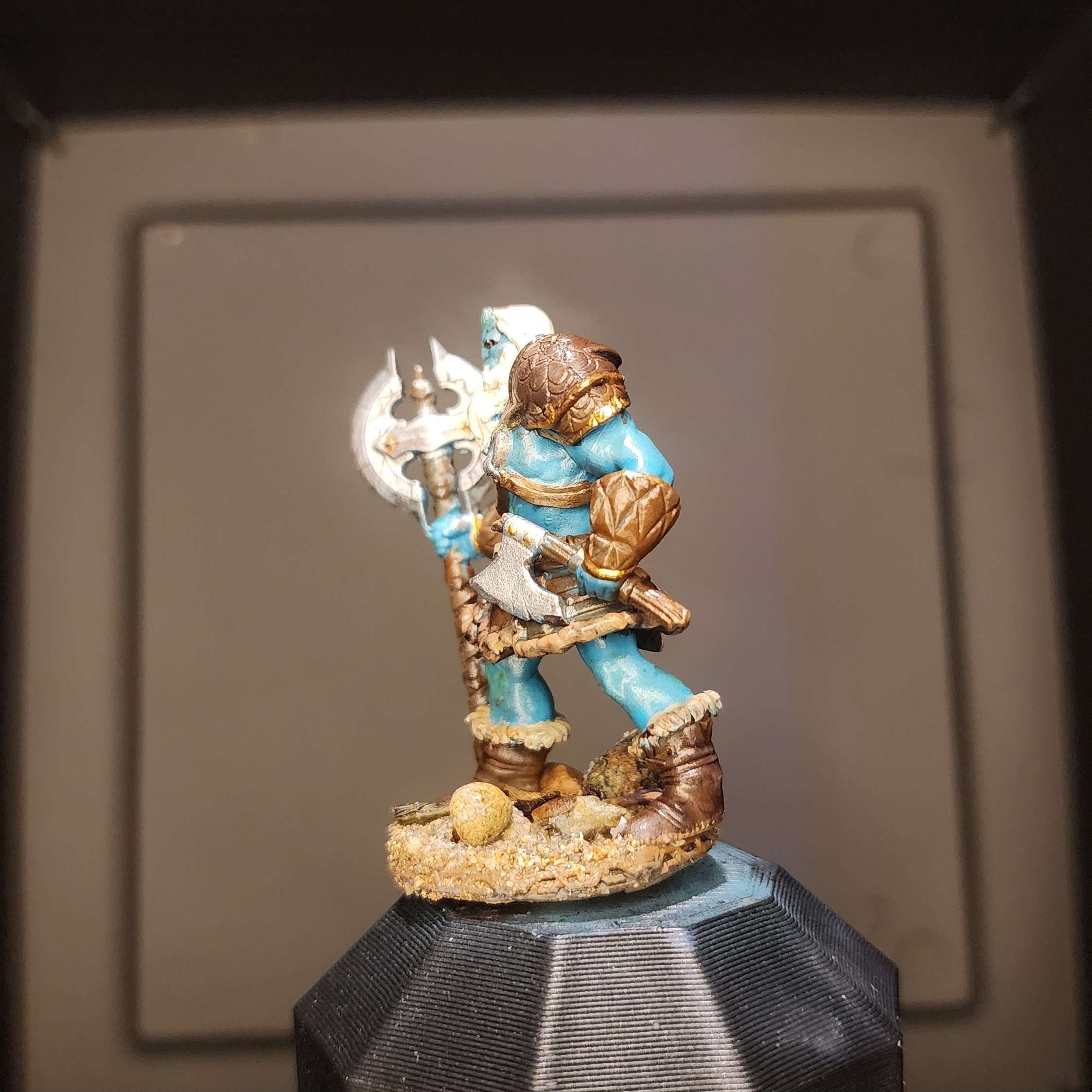
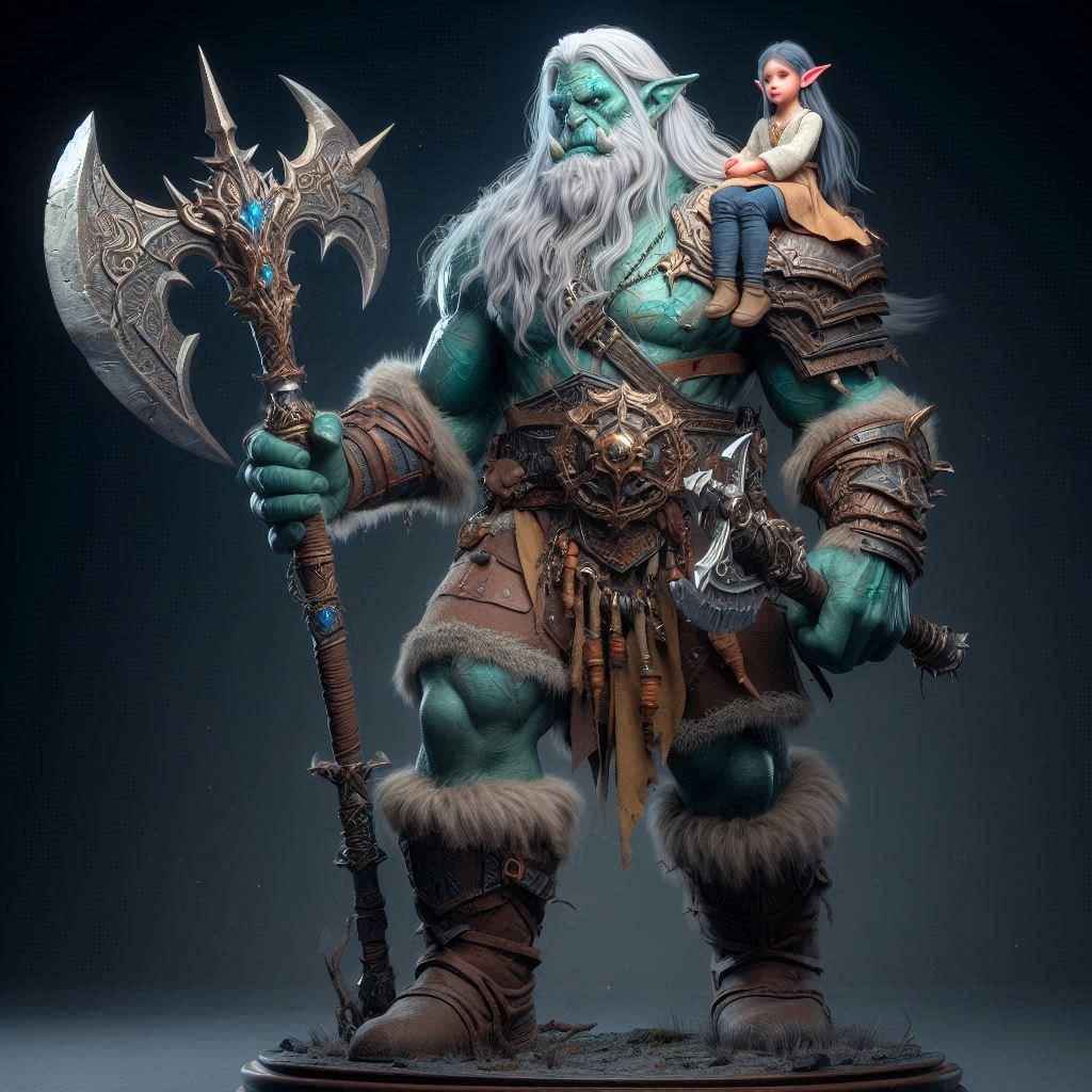
This is my friend's character for a campaign that we are in. He used AI to create the general look of his character, then designed a mini based on the outcome. I printed it out for him and used the AI image as a color reference.

Here are a few other angles:

Smitty rear

Smitty side

And here is the AI generated image that the mini is based off of:

Smitty AI

(The small girl is the character's sister.)


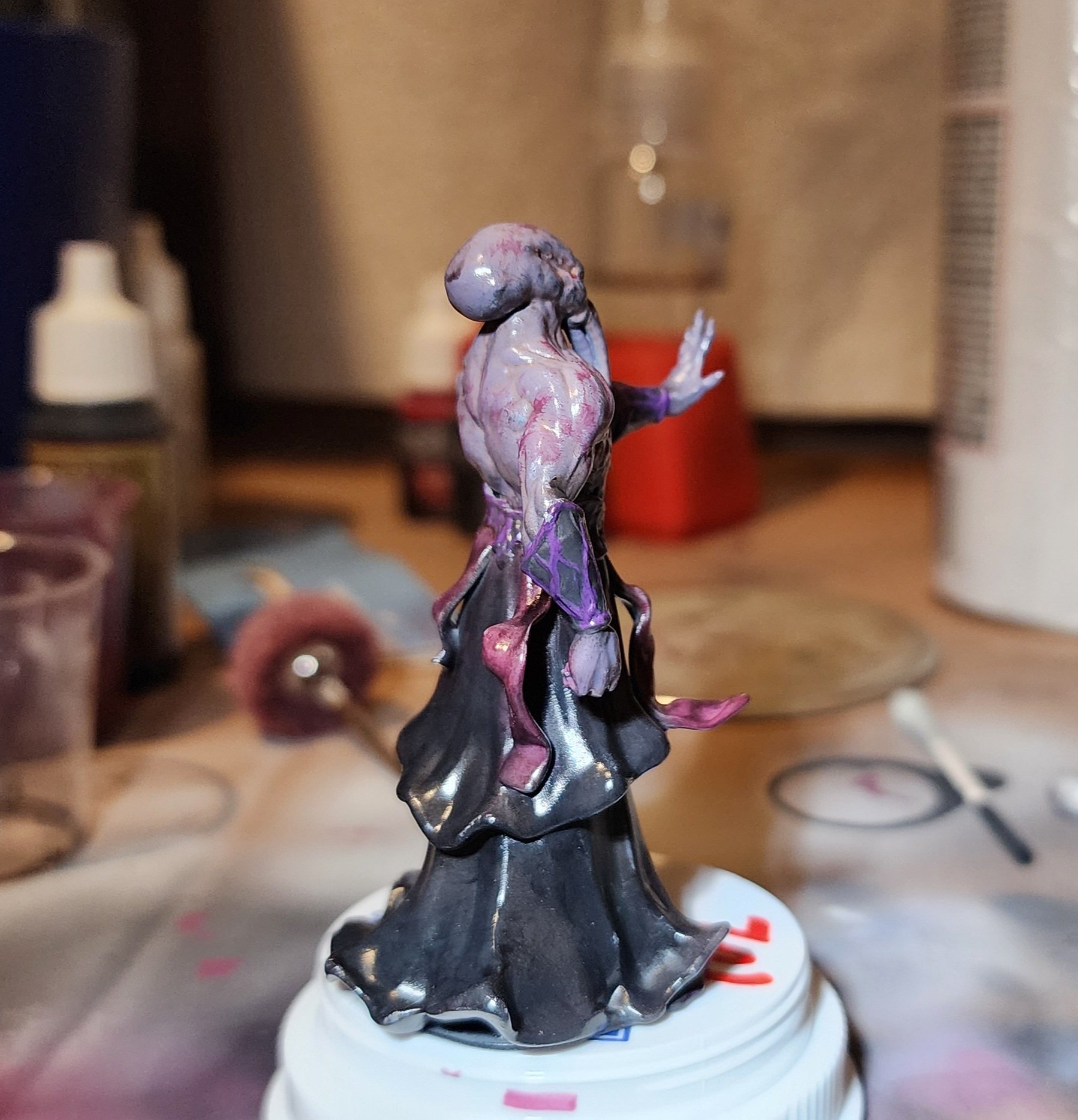
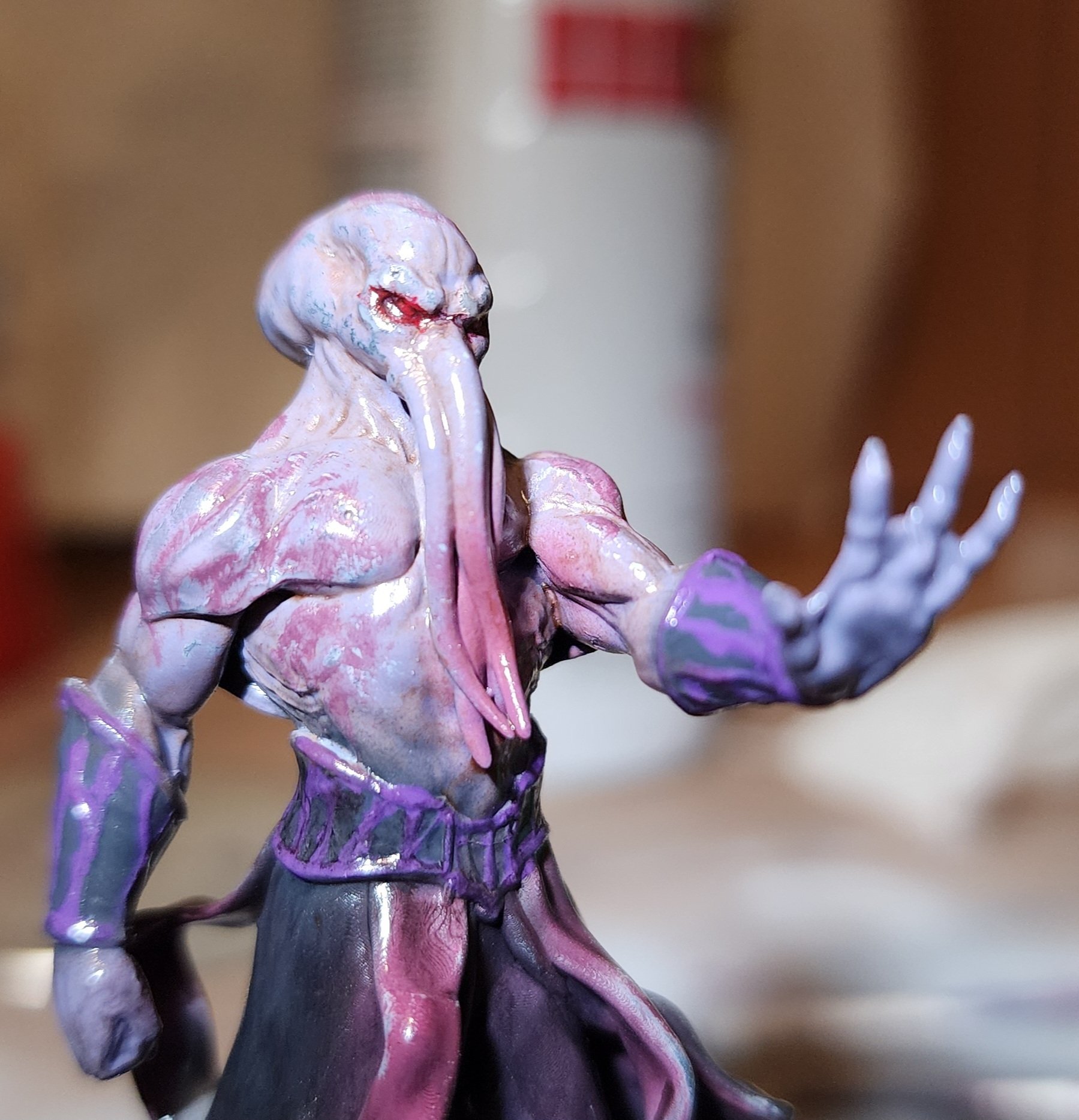
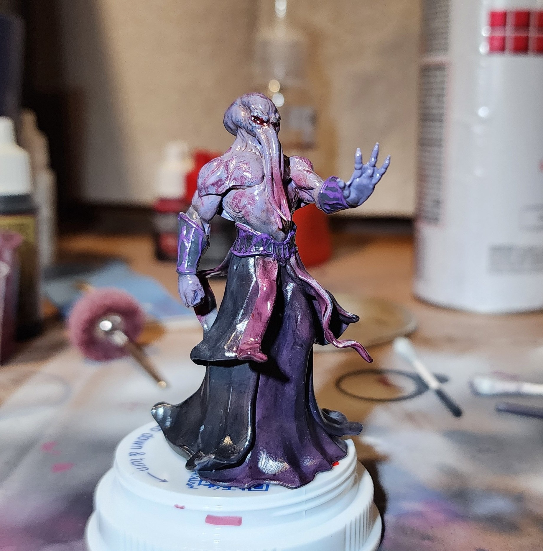
This is my paint job on Yasashii's "Mind Flayer / Illithid Tabletop Miniature" from Thingiverse.

This was one of the first prints off of my resin printer, and the first piece I attempted air brushing; to make both of these a little easier, I scaled him up a bit, so he isn't quite "tabletop minature" scale, but still much smaller than what I'd been used to painting (~70mm tall).

Everything except for the red eyes and purple highlights on the armor was done with a 0.3mm airbrush.

Here are a couple different angles:

Mindflayer rear

Mindflayer close-up

Unfortunately one of the robe dangly bits snapped off the back before I could start painting. I didn't expect the paint job to turn out this decent so I didn't bother reprinting, kinda wish I had.


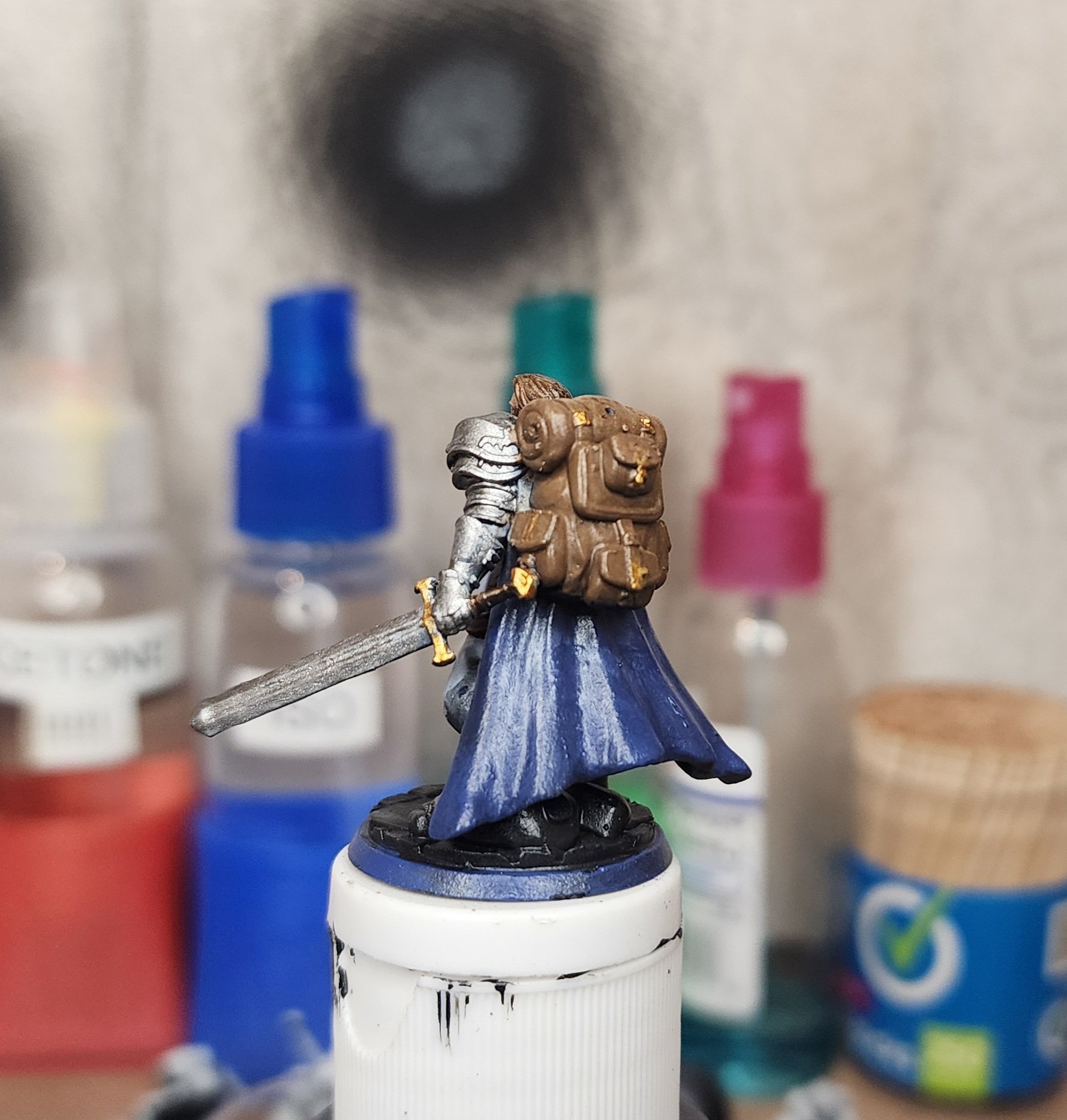
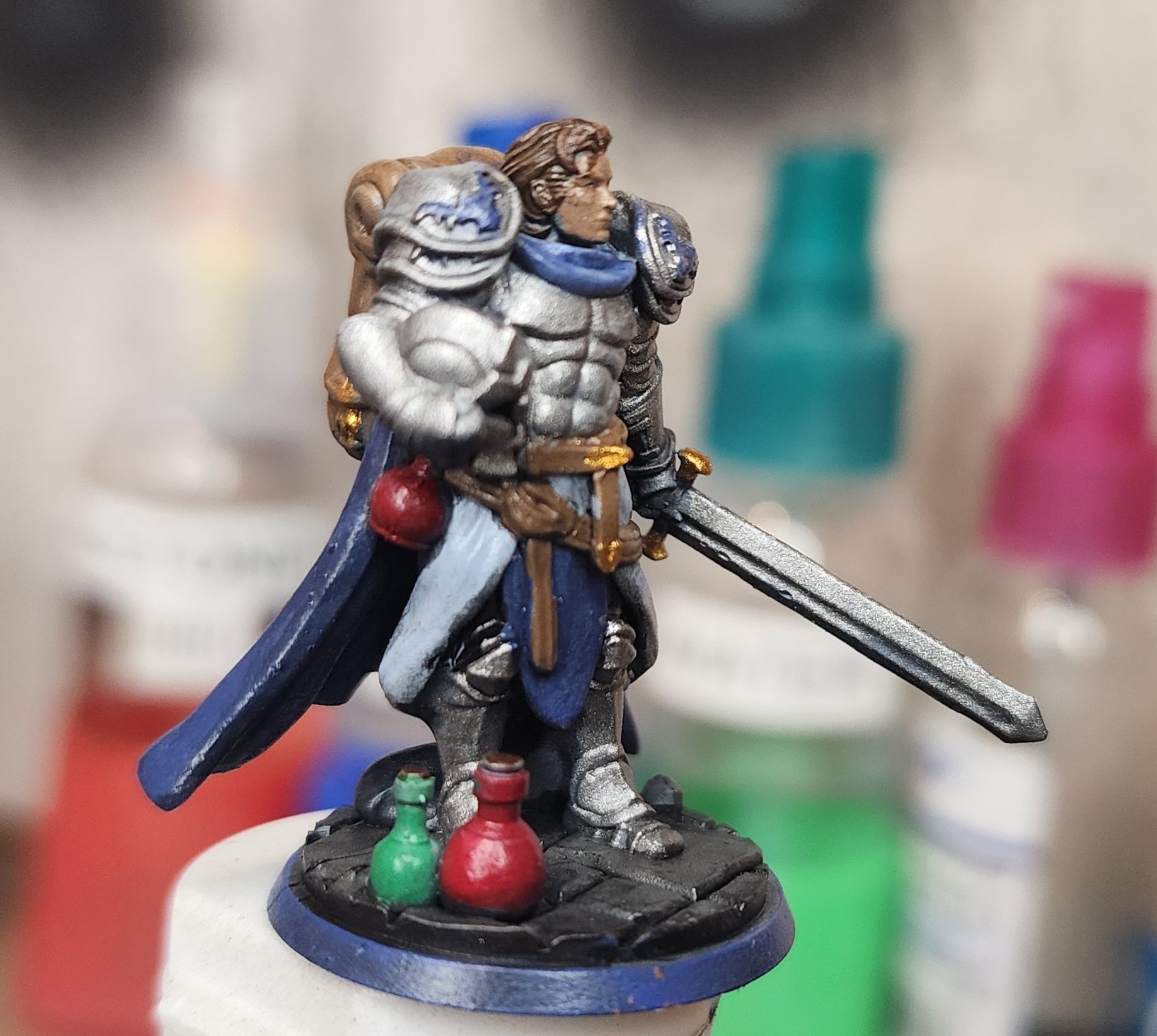
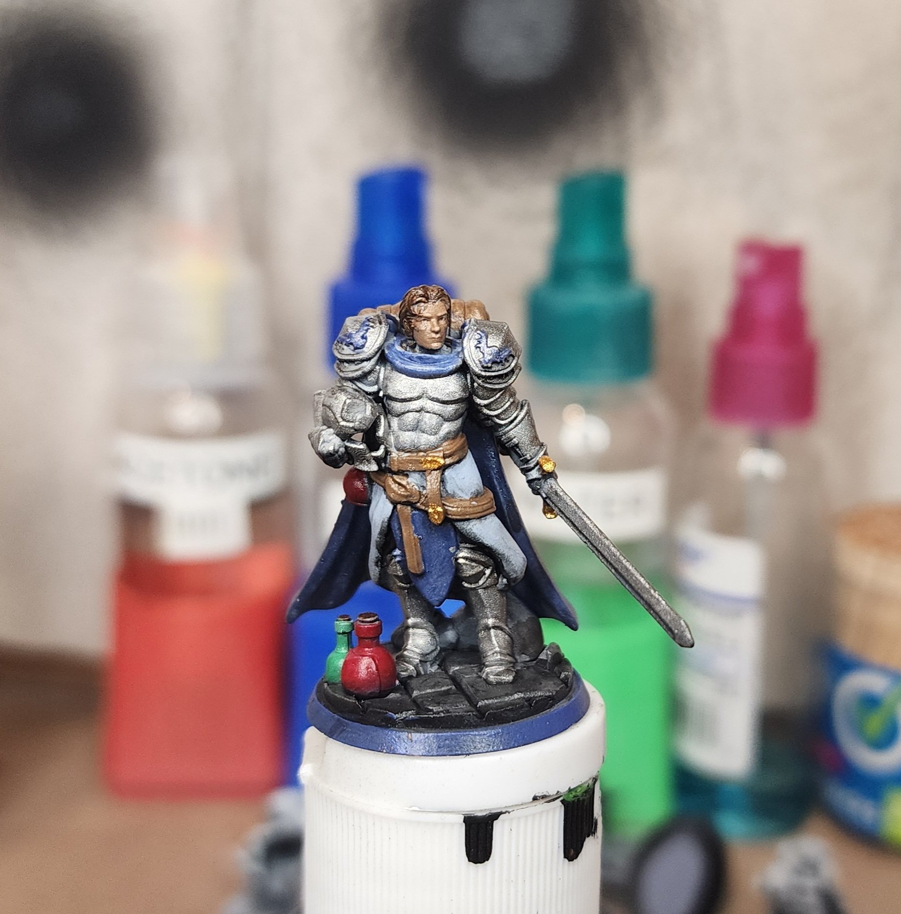
This is a miniature from TitanCraft's "RPG Mini Starter Kit" on thingiverse. I painted him up just to get some practice painting minis as I'm just starting out on the small scale stuff.

Here he is from a couple of different angles:

paladin from rear

paladin side close-up

I wish that the paint on his face came out a little better, it's something I've always struggled with.

I may be preaching to the choir here, but if you haven't already heard of it, check out TitanCraft. It's another mini maker website, but you can actually download minis that you make for free (they have paid and free assets, but there's a ton of free ones and you don't have to pay anything to download an all-free model). I'm not affiliated with them in any way, but I've been showing it to all my DnD friends and a few of them are sending me minis to print out for them, and it costs us nothing but the $0.25 of resin.


I've been resin printing for maybe a month. I've noticed that on all of the resins that I've got, and all of the profiles I've downloaded for them, the lift speed is usually at least 3 to 4 mm. However, when listening to my printer operate, I can tell that it is fully separating the print within the first millimeter or so. I've changed almost all of my resin profiles to only lift 1 mm, cutting each layer time down like 2 seconds, and absolutely zero change in any quality whatsoever. Am I just lucky with my printer configuration, or my fep is especially tight? Or why else would such a large distance be commonly recommended?


I'm dumb and sometimes tell my phone to do things I don't actually want it to do, like hide posts I actually want to check out. I can't find a way to look at those to bring them back.


I've been helping someone diagnose a technical issue through Lemmy PM's the last month or so, and have accumulated a lot of messages back and forth. (Around 130 I'd say.)

When I get a new message, the total number of messages that I've received shows as a notification for a while, until it eventually disappears. (I haven't fully tested it but I think it disappears on reboot once I've replied.) Receiving comment replies or a new pm brings the notification back.

The screenshot shows what I see when filtering for unread messages. Thus, there are no unread messages, let alone 130 of them.

The entire conversation has been had in the same message thread. Not sure if this is a Lemmy issue or boost issue.


Hi all, got a bit of a technical problem I'm trying to solve and I've got very little programming experience.

Basically, I'm trying to create a folder with a bunch of filament profile cfg files, with things like retraction distance, temperature, flow rate etc preloaded into them. That way, I can slice a model for a 0.6mm nozzle, send it to Klipper, and run it with any filament I want without having to re-slice, just change which cfg file is loaded.

This is going pretty well and I've figured out how to get most of what I want into the cfg. However, I want to limit my print speed by my maximum volumetric flow rate, a variable that Klipper does not support (and Kevin has more or less denied requests to have it added). To solve this issue, I want to limit the max speed instead, using a formula like this:

print speed = (max vol. flow) / (nozzle width) / (layer height)

(max vol. flow) and (nozzle width) would be defined manually by me for each profile. The only issue is (layer height), which of course can change from print to print. I know that my slicer puts the layer height and total number of layers in the header of the gcode, I also understand that that's where Klipper gets this info from and how it displays those numbers once you've selected a file. What I'm having trouble figuring out is how I can send that number into the above formula; I found this which seems to be almost what I need, but I can't figure out how to use the "print_stats object" in my cfg.

A potential workaround is to find my maximum layer height for each nozzle/filament combo and set the max speed assuming that later height, but if I'm printing something at say half my maximum layer height that's going to severely unnecessarily reduce my print speed.

Any advice?


Please I spent all my money on fentanyl

view more: next ›