this post was submitted on 04 Sep 2024
244 points (96.2% liked)
movies
1775 readers
215 users here now
Warning: If the community is empty, make sure you have "English" selected in your languages in your account settings.
A community focused on discussions on movies. Besides usual movie news, the following threads are welcome
- Discussion threads to discuss about a specific movie or show
- Weekly threads: what have you been watching lately?
- Trailers
- Posters
- Retrospectives
- Should I watch?
Related communities:
Show communities:
Discussion communities:
RULES
Spoilers are strictly forbidden in post titles.
Posts soliciting spoilers (endings, plot elements, twists, etc.) should contain [spoilers] in their title. Comments in these posts do not need to be hidden in spoiler MarkDown if they pertain to the title’s subject matter.
Otherwise, spoilers but must be contained in MarkDown.
2024 discussion threads
founded 1 year ago
MODERATORS
you are viewing a single comment's thread
view the rest of the comments
view the rest of the comments

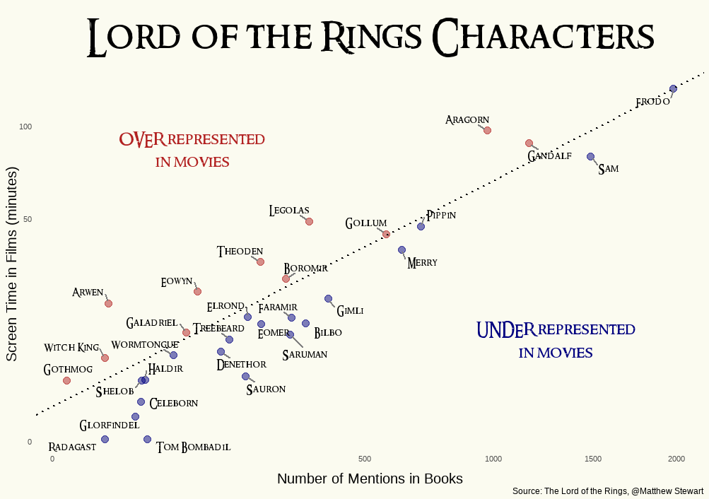
The scale is neither linear nor logarithmic. What?
How else can you make it look like a linear grouping?
Data processing isn't about making it look like something unless you are purposefully manipulating it.
But that's what happened here. The x-axis has been unevenly distributed.
I think it is logarithmic, it's just marked linearly.
Logarithmic cannot start at 0 and would have equal spacing between 500, 1000 and 2000.
I am confused because the font seems to be Aptos, the current default in Micro$oft Office, but Excel does not allow any other type of scale on X-Y plots.
That's not equal spacing - 1000-1500 is a bit longer than 1500-2000.
The graph is almost certainly logarithmic. Only the markings are stupid.
Every time a number doubles (or increases 10×, or 𝑒×, whatever), it moves a constant distance on a log scale because its base-whatever logarithm increases by a constant amount. Hence my expectation of equal distance from 500 to 1000 and 1000 to 2000. I am ignoring 1500 here because it does not form a geometric sequence with any two other numbers so it can't easily be used for this check.
Because the point isn't to compare 2 characters, but to see how one character performs in the books and in the movies.
And for that, it doesn't matter. But they could have used a bar graph instead.
Well, I'd like to know if Arwen's screentime/mention ratio is 2x or 3x that of the Frodo baseline. This arbitrary scale makes it impossible. It would not hurt to add more values to the axes, and perhaps a faint grid.