419
there is no need
(lemmy.ml)
Welcome to Programmer Humor!
This is a place where you can post jokes, memes, humor, etc. related to programming!
For sharing awful code theres also Programming Horror.
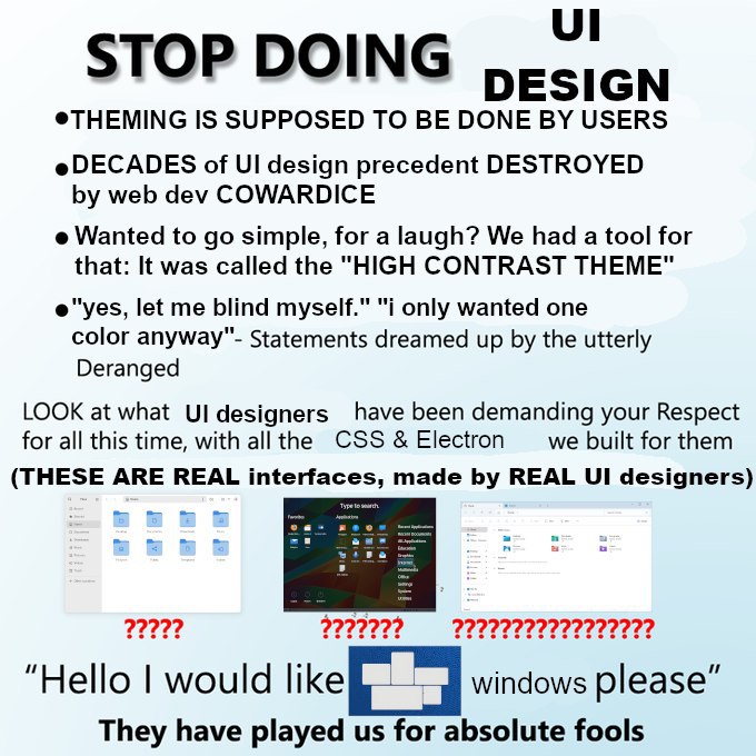
It's like getting into a car you haven't driven before and you hit the wipers instead of the indicator ×1000. Or playing an FPS and E is now F, C is now Ctrl, X is Shift, and you tap+hold instead of tap. WHY?!?! You can remap, but suddenly there's conflicting keys for shit the tutorial hasn't even introduced to you yet, so you don't know what you can or can't get away with.
Some designer or dev has a personal opinion they think is better than everything else and now we all gotta live with it on the hopes that'll be the new standard. And there's so many of those arseholes and their DVORAK layouts and putting "Cancel" on the left and "Confirm" on the right of a dialogue popup. "I think it's better this way and the world will thank my big brain!"
YES I'm ranting, lol.
Wait confirm shouldn't be on the right? Like I am 99% sure most windows pop-up/modal Dialogs had ok on the left and cancel on the right but I am not entirely sure about Linux (also factorio has them left to right as in "go back and go forward" but I dunno if that is RTL dependent...)
No, no, they have to be on top of each other! Vertically aligned is the way of the future.