politics
Welcome to the discussion of US Politics!
Rules:
- Post only links to articles, Title must fairly describe link contents. If your title differs from the site’s, it should only be to add context or be more descriptive. Do not post entire articles in the body or in the comments.
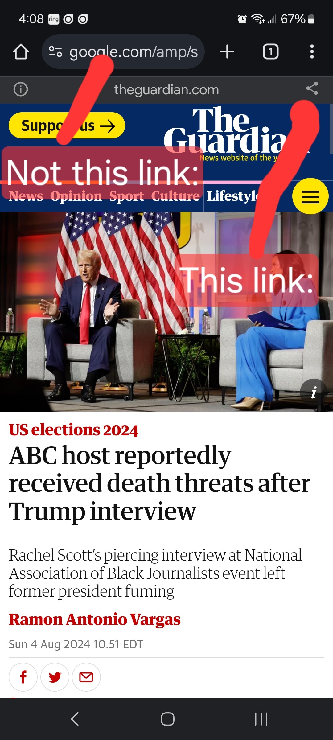
Links must be to the original source, not an aggregator like Google Amp, MSN, or Yahoo.
Example:

- Articles must be relevant to politics. Links must be to quality and original content. Articles should be worth reading. Clickbait, stub articles, and rehosted or stolen content are not allowed. Check your source for Reliability and Bias here.
- Be civil, No violations of TOS. It’s OK to say the subject of an article is behaving like a (pejorative, pejorative). It’s NOT OK to say another USER is (pejorative). Strong language is fine, just not directed at other members. Engage in good-faith and with respect! This includes accusing another user of being a bot or paid actor. Trolling is uncivil and is grounds for removal and/or a community ban.
- No memes, trolling, or low-effort comments. Reposts, misinformation, off-topic, trolling, or offensive. Similarly, if you see posts along these lines, do not engage. Report them, block them, and live a happier life than they do. We see too many slapfights that boil down to "Mom! He's bugging me!" and "I'm not touching you!" Going forward, slapfights will result in removed comments and temp bans to cool off.
- Vote based on comment quality, not agreement. This community aims to foster discussion; please reward people for putting effort into articulating their viewpoint, even if you disagree with it.
- No hate speech, slurs, celebrating death, advocating violence, or abusive language. This will result in a ban. Usernames containing racist, or inappropriate slurs will be banned without warning
We ask that the users report any comment or post that violate the rules, to use critical thinking when reading, posting or commenting. Users that post off-topic spam, advocate violence, have multiple comments or posts removed, weaponize reports or violate the code of conduct will be banned.
All posts and comments will be reviewed on a case-by-case basis. This means that some content that violates the rules may be allowed, while other content that does not violate the rules may be removed. The moderators retain the right to remove any content and ban users.
That's all the rules!
Civic Links
• Congressional Awards Program
• Library of Congress Legislative Resources
• U.S. House of Representatives
Partnered Communities:
• News
view the rest of the comments
There's chunk of the bottom of the screen encouraging you to do those things, but it doesn't in any way keep you from reading the article if you don't, and you can just click the 'x' to remove it from the screen entirely.
It did on my phone (otherwise I would have read it instead of posting a 'Paywalled' comment here), and I didn't see any X to click on, though granted the screen was very busy with a lot of stuff going on.
~Anti~ ~Commercial-AI~ ~license~ ~(CC~ ~BY-NC-SA~ ~4.0)~
On my phone, the 'x' is just above the 'to' in the words "A Post subscriber gave you free access to this article."
I honestly didn't see it until you pointed it out now.
It's so small and it's so close to the sign-in button, that I took it as part of the sign-in stuff, and trying to click on the X the first time actually clicked on the sign-in stuff instead.
I actually went looking for the X by scrolling down.
Too bad they didn't move it more to the right away from the sign-in link, and made it a bold font like they did the wording right below it, as it seems like such a small unbolded font that have the X be displayed as.
I'm not going to change my original comment, and I still stand by it. If they obfuscate the way of closing the pop-ups by making the close button so small and insignificant compared to the other likewise texting around it, to me that still paywalling, as they're trying to trick people into signing up for an account to read the article.
~Anti~ ~Commercial-AI~ ~license~ ~(CC~ ~BY-NC-SA~ ~4.0)~
It's pretty big and visible on my phone. Not hard to find at all.
It's a smaller font size and non-bolded right next to other text around it that's larger font size. Oh and it's also pushed up next to another thing that does the complete opposite, instead of observing proper spacing between UI interaction items; bad UX.
~Anti~ ~Commercial-AI~ ~license~ ~(CC~ ~BY-NC-SA~ ~4.0)~
It's in the top right corner of the relevant dialog, which is pretty much where the 'close this thing' icon is on every other UI.
Yeah but it's obfuscated by being a smaller size crammed up next to something else that's a larger size, and right above in the same area as other things that are in a larger font size.
It is not at the normal absolute upper right hand corner of a dialogue like the close button is on normal dialogues, and we both know that.
~Anti~ ~Commercial-AI~ ~license~ ~(CC~ ~BY-NC-SA~ ~4.0)~
All I can say is that it sounds like it renders differently for you than it does for me
The irony is that I increased the font size of everything on my phone, and it's still appears small.
~Anti~ ~Commercial-AI~ ~license~ ~(CC~ ~BY-NC-SA~ ~4.0)~