this post was submitted on 23 May 2024
196 points (97.6% liked)
British Columbia
1834 readers
43 users here now
!britishcolumbia@lemmy.ca
News, highlights and more relating to this great province!
founded 4 years ago
MODERATORS
you are viewing a single comment's thread
view the rest of the comments
view the rest of the comments

As a data analyst / engineer, I usually go through a similar journey producing those percentages.
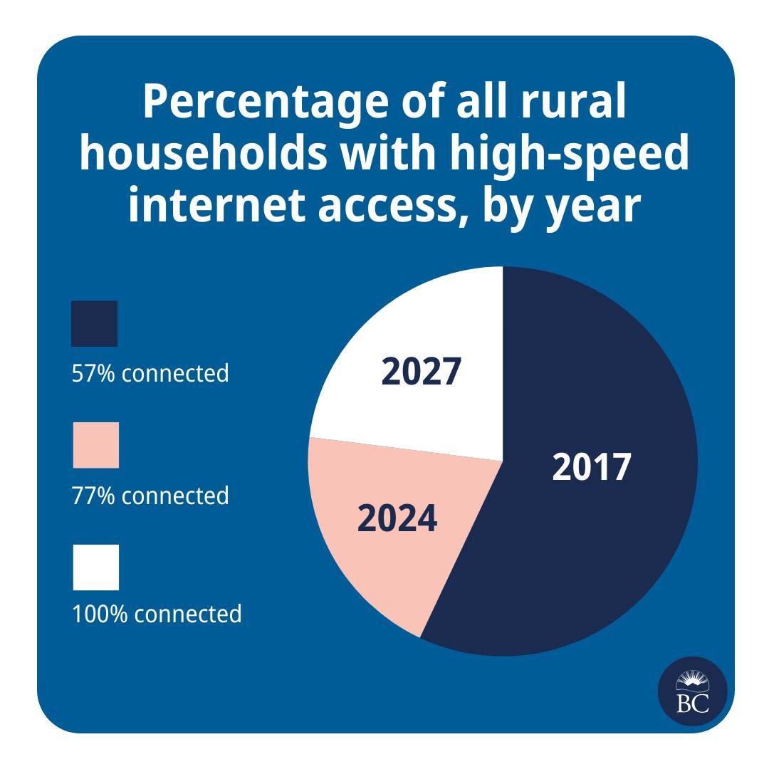
Boss: "I need to know when we'll reach 100% of households having high speed internet."
Analyst: "Good morning to you too! Who has the data?"
Boss: "I thought you do?"
Analyst: "No, I'm pretty sure I haven't seen any, uh, internet speed data in our warehouse."
Boss: "Have you looked in the computer?"
Analyst: "... I'll talk to Marc, he's got his contacts with the ISPs, we'll figure something out. What does high speed mean?"
Boss: blank stare
Analyst: "Right, I'll talk to the Definitions Department. How should I calculate the forecast? Average over the..."
Boss: "Right, I gotta head to a meeting. You've got until tomorrow EoB."
Analyst: Hectically mashes a dozen different data shapes of historical reports into a unified model, plots the progress so far, curses, tosses some generic trend formula at it because fuck trying to actually figure out the semantics