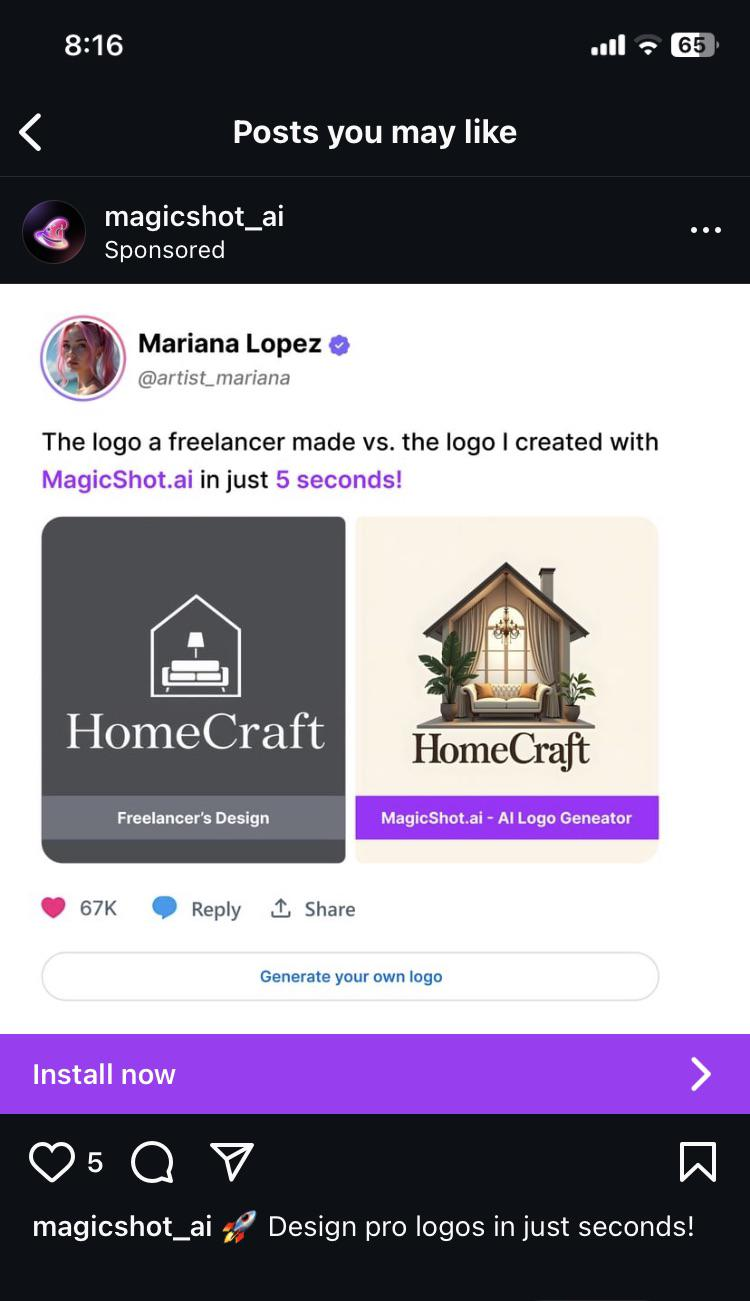
Spoken like someone who has no clue about graphic design
Fuck AI
"We did it, Patrick! We made a technological breakthrough!"
A place for all those who loathe AI to discuss things, post articles, and ridicule the AI hype. Proud supporter of working people. And proud booer of SXSW 2024.
The Dunning-Kruger tool.
Mariana Lopez should have at least said which freelancer she got the sample from. What an insult to their work.
That thing just screams AI slop.
I hate that some real people actually think like this and don't see the problems here.
I know, that's not the point of this post, but does anybody else miss, when logos had more than 2 colours? I see it as a sign of enshitification. Every company now has a monochrome logo made of simple shapes, so it's cheaper to print on t shirts and easier to spot on a phone screen.
Right? I miss fun logos. I get everyone wants to shit on ai but minimalist logos are booooooring
I do prefer the AI font choice unfortunately
when it somehow produces coherent letters, the fonts to be an average of what we are used to seeing on every similar logo so they generally have the right feel.
I'm not a huge fan of the current ai crap but i would like if it was possible to output typable fonts in standard formats. for logos I would want it to be able to produce editable vector graphics but the only attempt at that I've seen made what should be a solid single shape as a million some odd blobs jigsawed together, so editing manually would require redrawing all of it. currently I'd be better off following some youtube tutorials for how to use inkscape or something.

