this post was submitted on 12 Feb 2024
116 points (100.0% liked)
games
20527 readers
383 users here now
Tabletop, DnD, board games, and minecraft. Also Animal Crossing.
-
3rd International Volunteer Brigade (Hexbear gaming discord)
Rules
- No racism, sexism, ableism, homophobia, or transphobia. Don't care if it's ironic don't post comments or content like that here.
- Mark spoilers
- No bad mouthing sonic games here :no-copyright:
- No gamers allowed :soviet-huff:
- No squabbling or petty arguments here. Remember to disengage and respect others choice to do so when an argument gets too much
founded 4 years ago
MODERATORS
you are viewing a single comment's thread
view the rest of the comments
view the rest of the comments

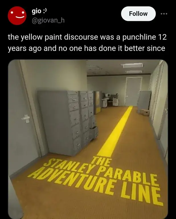
Good intentions, bad execution. Here's a shot of Returnal which I think does the same "climbable edge highlighting" really well
As per a couple of other comments in this thread, I think this Returnal screenshot is a good example of how to execute well on a solution to problem that should ideally be handled at a more core design level. Granted, game design is very hard, but in a perfect world you wouldn't need to come up with a visual indicator for "you can interact with this" because the game design allows you to interact with things that look like you ought to be able to interact with them, even if the developers don't necessarily intend for you to interact with them. The visual cue should be that you can see the thing, not that it's highlighted so that it can be discerned from the stuff that also looks like you might be able to interact with it but can't.
One of the things I absolutely love about Larian's games, as an example, is that they make it very clear what parts of the environment are accessible, and then give the players tools to engage with the environment as they like. There's an intended path, or maybe a handful of potential intended paths, but it's fair game if you use the tools to bypass the intended path, or solve a problem in an unintended way. Ledge-indicators, even when they're properly-executed visual cues that fit the art style, are still a potential signal of lazy design that relies too heavily on the game controlling how the player experiences the game.
It should be said that "lazy design" refers to the decisions made about how to make the game, not to the effort put in by the development teams, who are usually busting their asses under very intense conditions that generally also arise from bad design decisions.
That specific case isn't the entire game of course, it's an affordance made for visibility in some of the darkest rooms in these deep-sea/bioluminescent art style biomes. All edges are actually climbable even if they're not highlighted with these little plants, better-lit areas don't use them and things like stone structures are perfectly visible on their own and also don't use them.
In the more earth-like and better-lit environments they're able to use more earth-like and natural art and it's all still perfectly visible.
Yeah, that makes sense. It’s not making up for bad overall game or art design, it’s just augmenting choices made in specific parts of the game where there’s a reason to give players a little extra visual signal. And again, I do agree that it’s very well executed.